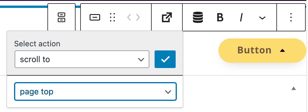
To create a scroll-to-top button, place the block “Greyd Buttons” on your website, then click on the trigger picker and select “scroll to”. You can now select “page top”.
Tip: A common use case for scroll-to-top buttons is to leave the button empty (no text) and add an arrow icon.
Learn more about GREYD buttons:
-
Hi, this is Sandra from GREYD. Today I’d like to show you the features of the GREYD button block compared to the standard button in Gutenberg. This button comes with some very nice additional options. After placing the GREYD button on your page you can then define the alignment of the button in the wrapper element and place as many buttons next to each other as you like.
In the button itself you will then find the following options. You can at first select one of the global button or link styles. You can also work with the GREYD trigger picker, a feature for which we have a dedicated tutorial video in our Helpcenter. And here on the right you will also find some text formatting options like italic, uppercase or crossed out. The text can be typed directly in the editor.
On the right you can then define the appearance of your GREYD button in more detail. For example, you can define the size. The width can be defined individually for each breakpoint and comes with several different units. Additionally, you can also add an icon to your button and define its position, size and spacing.
If you want to deviate from your global button or link style just activate the option down here and you will find all styling options from the customizer. You will still be able to switch between your global styles, only the options that you’ve set down here will then differ from the selected style.
So as you can see there’s a lot of additional options in the GREYD button compared to the standard button of Gutenberg.
For more videos and information please visit our Helpcenter.
Learn more about the GREYD.SUITE Trigger Picker:
-
Hi, this is Sandra from GREYD. Today I’d like to show you two features we have added to several blocks in Gutenberg: the trigger picker and dynamic tags. The trigger picker enables you to trigger different actions on click, for example open a pop-up, link or email window. Let’s have a look at it in the backend and use the group block as an example. Whenever you find this arrow icon in a block, the trigger picker is available. You can then select from various actions: link, back, scroll to, pop-up, email, download, trigger event and dynamic links. Depending on the action you select, you can then define the link, anchor, pop-up email data, download file or trigger event. And sometimes you can for example define whether to open a link in a separate tab or not. You can select the scroll to anchor, pop-up, you have to enter the email data. For trigger events we have a dedicated tutorial video. These can also be triggered directly on hover, so not only on click.
And with dynamic links you can link for example to your home page or for posts to the post author or post image. And as the name indicates, dynamic links are dynamic. Thus they adapt automatically to each post or also if you change for example your home page.
You can use the trigger currently in the blocks group, button and content box, but further blocks might follow in the near future. Let’s move on to dynamic tags, which you can also find in many blocks.
With them you can enter dynamic values like your page title, the date or post details. Depending on the type of value, you can then also set a link and or define the format in more detail. Or a symbol: You can for example include a copyright symbol. Or for example link to your website title. And so on.
For more videos and information please visit our Helpcenter.