When displaying content in a post slider, a common issue is that the length of your dynamically inserted content may vary and thus the individual posts in your slider have different heights. If you want to display several posts next to each other and want to stretch them to the same height, this is the way to do it:
- Wrap the query in a column
- Use the option “stretch elements to same height” in the advanced block settings of your column block. You can even make that breakpoint-related.

- Use a stack or group in your Dynamic Template
- With the alignment option “space between” you can make sure that the elements get aligned accordingly

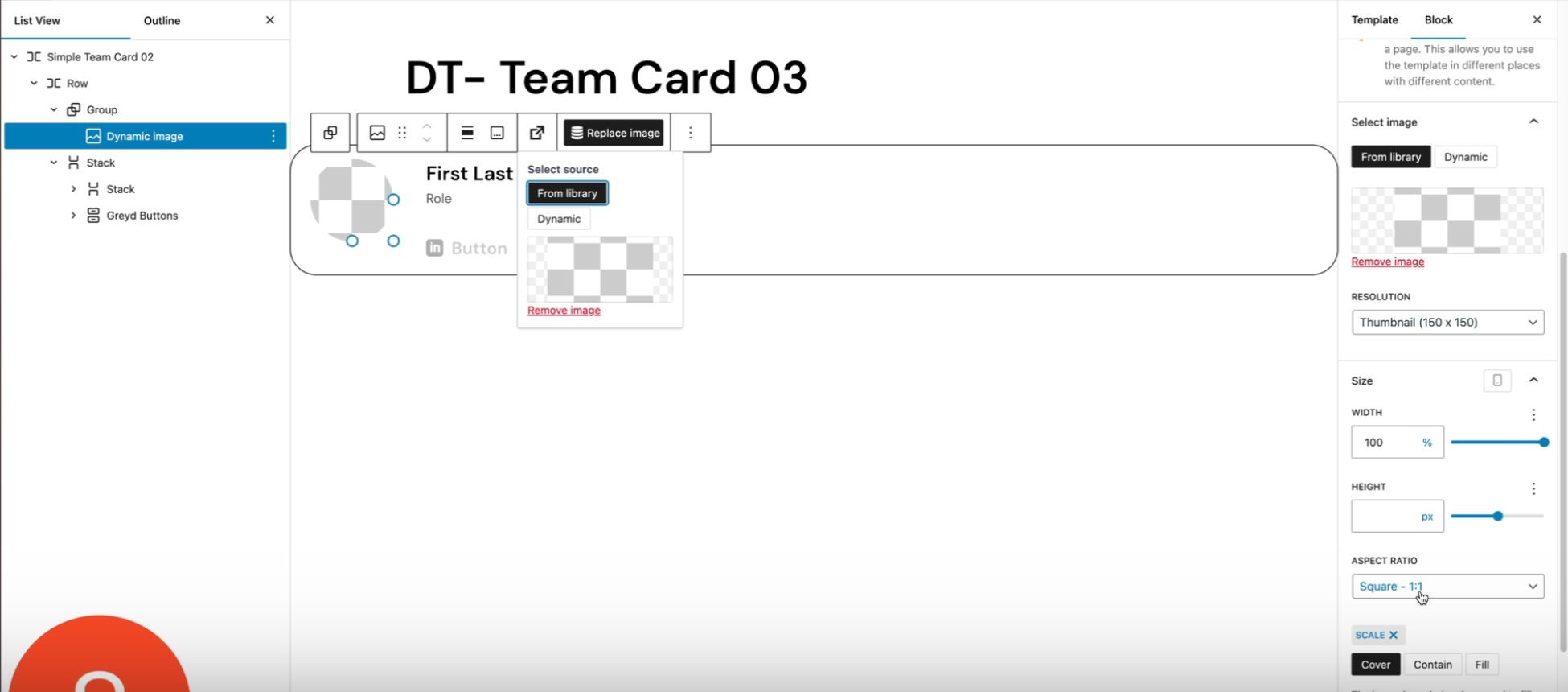
- In this example, you can use the width and aspect ratio of the dynamic image to have more control over the height
- The outer element (in this case a row) should use “stretch to fill” option

That way the posts in your post slider will all have the same height on all screen sizes even if the content length varies.
Video
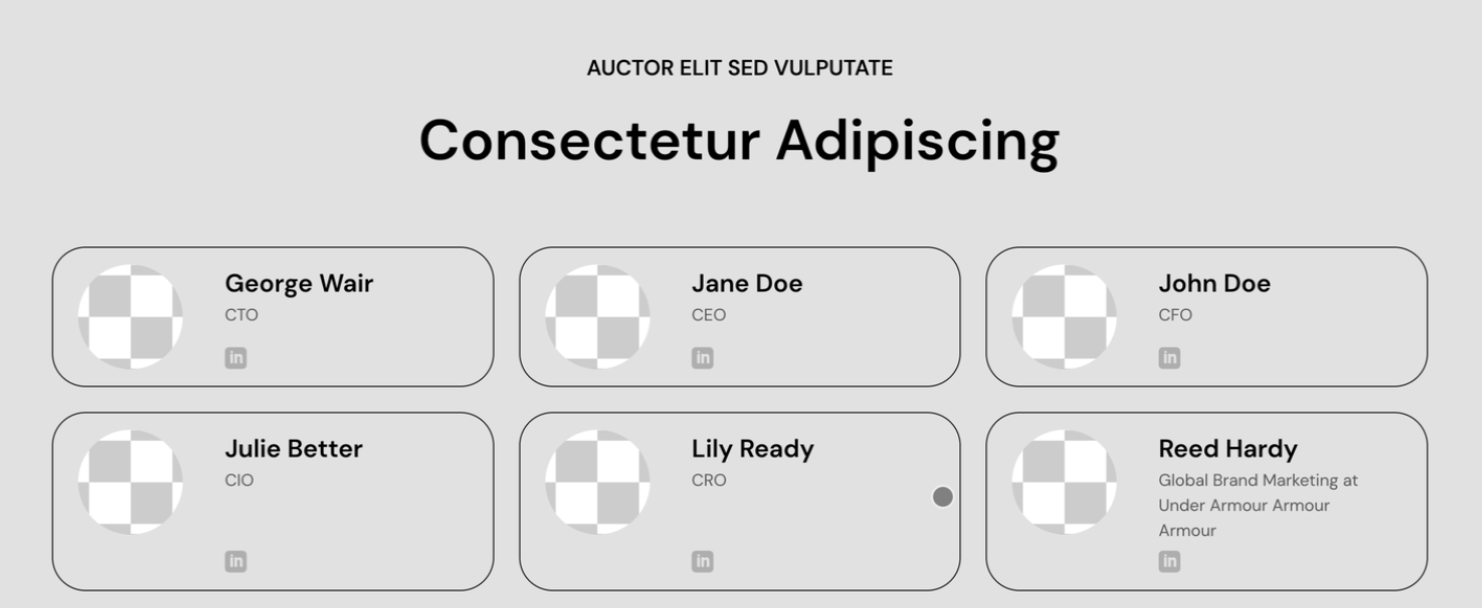
So, let’s say these are the posts that you put in your post slider, and you discover that your buttons do not nicely align to the bottom, although you did stack. Like here.
This is the page where we’re just looking at the query loop with the pulse slider, and in my case, the design for the grid is inside the template.
So, let’s see what happens when I edit the template.
It has a stack, and in the stack everything seems to be set correctly, right? There’s space between the elements, so they would stretch from top to bottom equally. And the elements are stretched horizontally, so they do not go behind each other. And still you have this problem.
Well, that’s because you have to stretch the post. And Greyd has a special feature for that.
You go to your page and above the query loop you add a column. So you click on the three dots add, before and you type forward slash column. And you pick the single column. Then you drag your query loop inside that. Then you go up one level to the parent, columns.
You open settings. You go to advanced and under stretch elements to same height. It says don’t stretch. Well, we’re going to stretch it
for tablet and larger. All right. Saving this one to see what it looks like now. And now all the buttons are nicely aligned at the bottom.
But we have another problem now because suddenly there is this weird space and nothing looks the same. It is all going up and down.
Well, that’s because we have to edit the stacks. So we’re going back to the template and we’re going to group the image, the title and the excerpt together. And then we’re going to create a stack of these. Which you can do here. And here’s the stack.
Now before you move on there’s something you need to do. This is correctly saying Align top. But here the justification needs to be set to Stretch items. You save your template. And now when you refresh the page you will see everything is aligned as we hoped for.