The Style section lets you customize the appearance and structure of your Pop-up down to the smallest detail. Any change you make is reflected instantly in the preview inside the block editor, allowing you to test everything live as it would appear in the frontend.
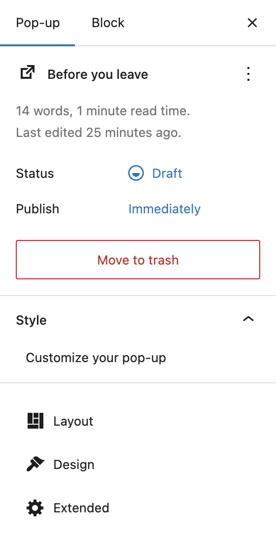
You can access the Style section in the block editor’s right sidebar when editing a pop-up. If the sidebar is hidden, click the small sidebar icon in the top-right corner next to the Publish button. Then make sure you’ve switched to the Pop-up tab (not the Block tab). You’ll find the “Style – Customize your pop-up” section directly below the general post info.
The Style area is divided into three sub-sections: Layout, Design, and Extended.
Layout
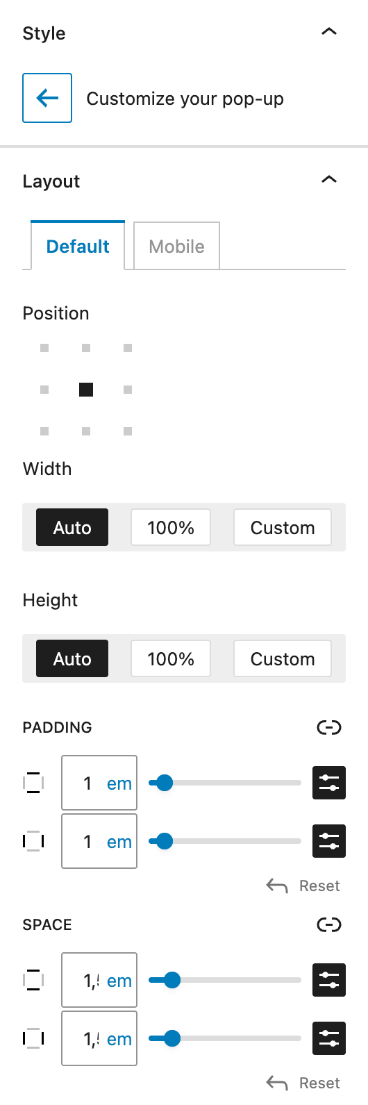
Click the Layout card to enter layout configuration. You’ll see two tabs at the top: Default and Mobile. These allow you to define settings for desktop screens and optionally override them for mobile breakpoints.
The first setting is Position, where you can select from 9 preset placements:
- top left
- top center
- top right
- center left
- center center
- center right
- bottom left
- bottom center
- bottom right
Next, you’ll find Width. Here, you can choose from:
- Auto – adapts to the content inside the pop-up
- 100% – stretches to full available width
- Custom – enter your own width using
px,%,em,rem,vw, orvh
Height offers the same options: Auto, 100%, or Custom. When height is not set to Auto, the additional setting Alignment of the Content appears, allowing Top, Centered, or Bottom alignment of the content within the pop-up.
Padding defines inner spacing on all sides. It uses the DimensionControl component for spacing sizes. You can find all detailed settings in the linked article.
Space controls the outer margin between the pop-up and the screen edges — important for edge-aligned pop-ups. For more information about the detailed setting options, see the above link to the DimensonControl component.
Design
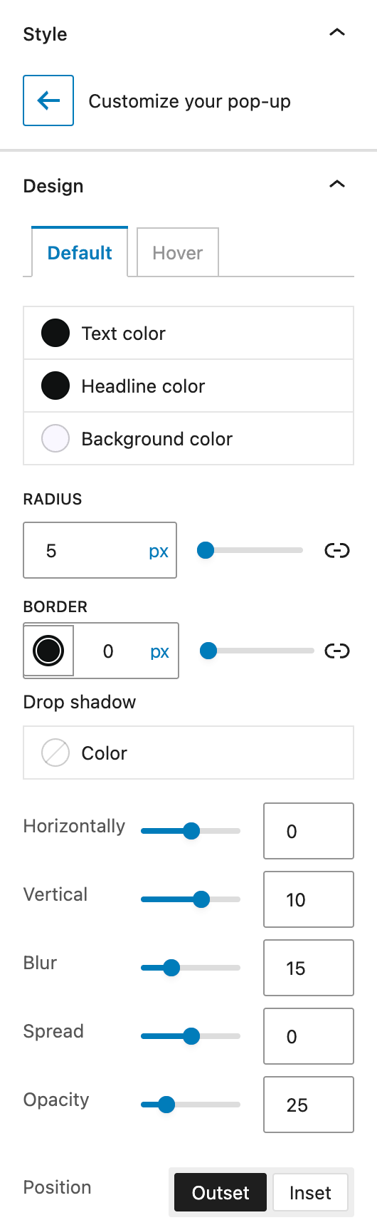
Click on the Design card to open visual styling options. Like Layout, Design has two tabs: Default and Hover. The Hover state overrides styles on hover.
The Color section includes settings for Text Color, Headline Color, and Background Color. For Text and Headline Color, you can only select solid colors, while the Background Color also supports gradients.
Radius controls corner rounding (border-radius) of the pop-up. For detailed setting options, see the DimensonControl Border Radius component documentation.
Border lets you set border color, style (solid, dashed, dotted) and thickness. By default, all sides are given the same settings but you can choose to switch to the individual mode by clicking on the link icon on the right.
Drop Shadow options include shadow color, vertical/horizontal offset, blur, spread, and opacity. For more details, see the DropShadowControl component documentation.
Extended
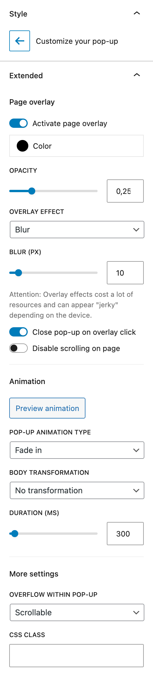
The Extended section contains advanced behavior options.
Page Overlay toggles a full-page background behind the pop-up. If active, you can set background color, opacity, and apply an overlay effect, where you can choose from the following options:
- None
- Blur
- Brightness
- Contrast
- Grayscale
- Hue-Rotation
- Invert
- Saturation
- Sepia
Each effect has its own control with a slider and an input field for adjustment. Please note that overlay effects can impact performance or browser rendering. For best results, use None when in doubt.
There are two more toggles for the overlay settings:
- Overlay Click – clicking the overlay closes the pop-up
- Disable Scrolling on Page – locks background scroll while the pop-up is open
The Animation section includes a preview button and animation type selector. Types include:
- None
- Fade In
- Scale Up
- Slide in (either Top, Right, Bottom, Left)
- Flip in (either Vertical, Horizontal, 3D)
Body Transformation animates the website behind the pop-up. You can:
- Move – shift content with horizontal/vertical settings as input fields, default units can be used
- Scale – shrink or expand the background, choose an origin position and horizontal and vertical position in %
- Rotate – apply rotation from a defined origin, choose an origin position and an angle with an input field for the angle degree
You can also choose the animation duration for every body transformation. Click on the Preview animation button to test.
The More Settings section contains:
- Overflow within pop-up – choose Scrollable, Visible, or Not Visible
- CSS Class – assign a custom class (add it without the dot) for styling or scripting