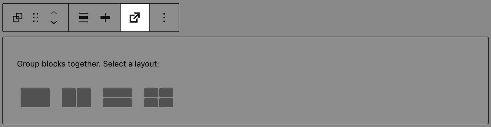
The Group block in Greyd is upgraded with several powerful layout and interaction features, making it a flexible wrapper for complex sections.
Trigger
A major feature is the Trigger system integration. A Trigger button appears in the toolbar, allowing you to assign dynamic actions to the block (e.g. scroll to, toggle popup, custom event). Additionally, the Group block can be targeted by a Trigger Event, which you define in the Actions sidebar panel. This makes the block reactive and a key part of interactive layouts. For full configuration details, see the Trigger documentation.
Styles
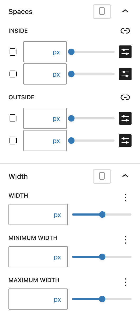
You can define inner and outer Spaces using Dimension Control Spacing component, as well as fine-tune Width and Height settings with minimum, maximum, and default values — all per breakpoint.
Advanced settings
The Advanced panel includes support for the Styles class, CSS animation, Hide per breakpoint, Disable element / Hide (entirely) and Inline CSS for applying scoped custom styles. See the Advanced section documentation for more details.