
Blocks

The Greyd Forms plugin comes with many blocks to let you build flexible, dynamic forms in the block editor. Learn how each block works, what it can do, and how to customize it for your forms.

Options

Several Greyd Forms field blocks let you define selectable options through an Entry Type setting. Depending on the block, up to five entry types are available, always in the same order:

  • Child Blocks: each option is added as its own child block within the field, allowing it to be configured individually.
  • Individually: each option is entered as a label-value pair, added one at a time using an “Add option” button. A Pre-selected on load option lets you define which option is selected by default. Depending on the block, additional fields may be available per option — for example, Image panels also let you set an image and alt text for each entry.
  • Collectively: multiple option values are entered in a single field, separated by a comma or the Enter key, similar to entering tags in WordPress. Each entry can optionally be split into a label and a value using the format label=value — only the label is then shown to visitors, while the value is submitted with the form.
  • Posts: options are generated automatically from the posts of a selected post type. For each option, you choose which post field is used as the label and which as the value — Title, Slug, and ID are always available, with further fields depending on the post type. A Sort setting controls the order of the generated options, and a Maximum number of options setting limits how many are generated.
  • Terms: works the same way as Posts, but generates options from the terms of a selected taxonomy. Only Title, Slug, and ID are available for Label and Value.

Not every block supports all five entry types, and some blocks add further settings specific to their type — for example, Image panels also let you assign an image to each option generated via Posts or Terms, either selected manually from the media library or generated dynamically from a field of the post. See the individual block documentation for details.

Dynamic form values

In most text fields of the Greyd Forms blocks there’s a button in the block toolbar called Dynamic form values. It’s the one right in front of the bold styling, showing two circles inside the outer circle. If you click on this button and it invertes the color and you click into the label again, it shows a selection of all available fields in your form. If added, it will show the value of the field in that label.
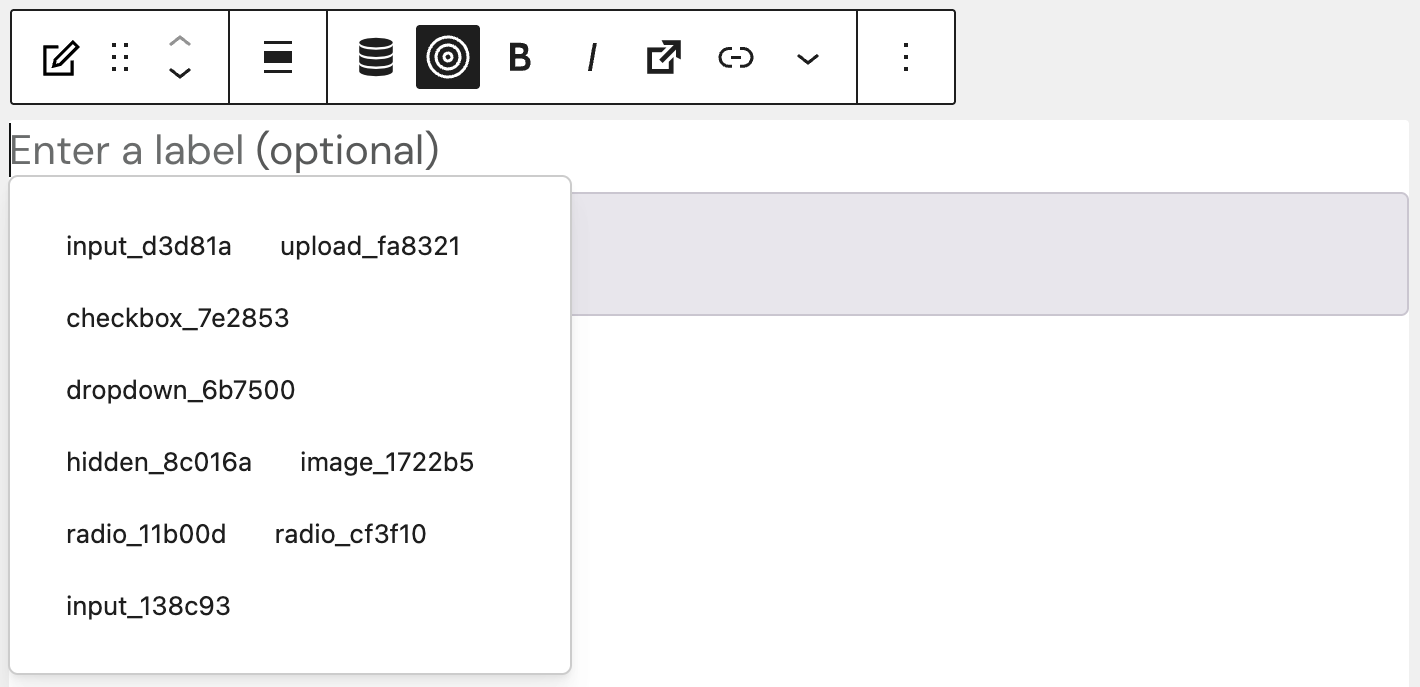
Screenshot of Dynamic form values button clicked and field selection shown, explained in the paragraphs above and below.

The dynamic form values are heavily used in the Mathematical field block, where you can create custom calculations based on values entered through a form. In our form patterns, you can find the “Mathematical Annuities Calculator” pattern to look at as an example of how to use dynamic form values.

Dynamic overwrites

Most Greyd Forms field blocks include a Dynamic Overwrites option in their settings. This option lets you mark specific attributes of a field as dynamic, so their value can later be overwritten when the form is embedded using the Dynamic form block.

The label of every field can be made dynamic. Depending on the block, the placeholder text or the field’s value and choices can also be marked as dynamic. Which attributes are available depends on the block type — see the individual block documentation for details.

For more information on embedding a form with dynamic values, see the Dynamic Forms documentation.
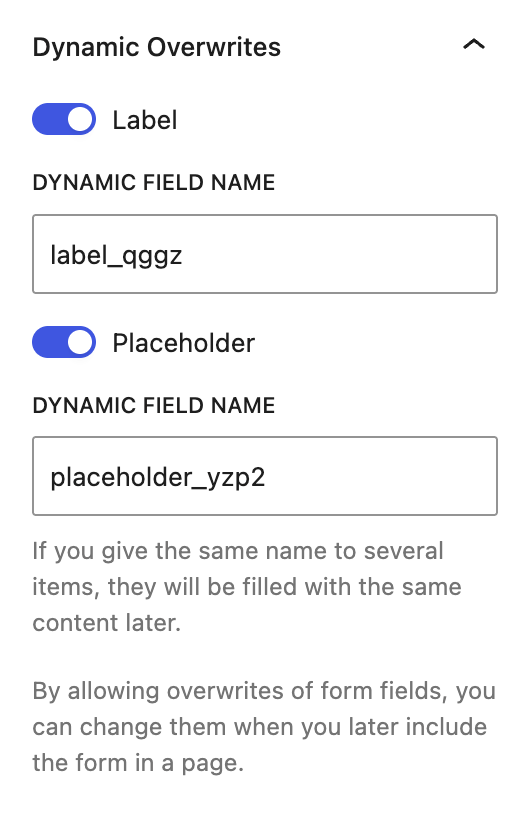
Screenshot of an example of activated Dynamic Overwrite label and placeholder, which show the dynamic field name, explained in the following paragraph.

When a Dynamic Overwrites toggle is enabled, an additional Dynamic field name input appears, prefilled with an automatically generated name that can be edited to something more descriptive. This name identifies the field when its value is filled in later, for example through the Dynamic form block. Giving the same name to several dynamic attributes — even across different fields or blocks — causes them to be filled with the same value.

More in this section

  • Checkbox

    The Checkbox block in Greyd Forms allows you to add a single checkbox element to your form. Once inserted, you can directly edit the label text within the editor. For the label, default styling options (bold, italic, other inline styles) are available. You can also set links or triggers. Settings The block includes a Dynamic […]

    Read more

  • Conditional fields

    The Conditional fields block in Greyd Forms allows you to create dynamic form behavior by conditionally displaying or hiding content based on user input. This block serves as a wrapper for other form blocks. Any content placed inside it will appear or disappear live on the frontend, depending on the form values entered by the […]

    Read more

  • Dropdown

    The Dropdown block in Greyd Forms allows you to insert a dropdown field into a form. After placing the block, you can immediately edit the label and placeholder text directly within the editor. While there are no styling options for the placeholder, the label text can be set to bold, italic or other inline styles, […]

    Read more

  • Form

    The Form block lets you place a form you’ve already created under Forms onto any page or post. You don’t build the form here — you simply choose which one to display, and the block always shows the current version of that form. If you later edit the form under Forms, every page using it […]

    Read more

  • Hidden field

    The Hidden field block in Greyd Forms allows you to transmit values invisibly through a form. These values are not displayed in the frontend but can be used for backend processing or integrations. This is especially useful for tracking data like campaign parameters or quiz results. Settings The block includes a separate Dynamic Overwrites section, […]

    Read more

  • Image panels

    The Image panels block in Greyd Forms allows you to add selectable image tiles to a form. These function similarly to radio buttons. Each tile includes an image and a label and is organized using a parent-child structure, where the parent block manages overall field behavior, and each child block represents an individual selectable panel. […]

    Read more

  • Input field

    The Input field block in Greyd Forms allows you to insert a general input field into your form. It supports various input types such as text, email, link, date, and number. Once added to the form, the block provides a flexible set of configuration and styling options for adapting it to a wide range of […]

    Read more

  • Live survey

    The Live Survey block in Greyd Forms enables you to embed a real-time survey into a form. It functions as a block variation of the radio buttons block and uses a parent-child structure. In the frontend, users can select an option and immediately see a visual progress or results bar reflecting how others have voted. […]

    Read more

  • Mathematical field

    The Mathematical field block in Greyd Forms allows you to perform advanced calculations within your forms. It supports both static values and dynamic input from other fields, making it ideal for use cases such as cost estimations, score calculations, or conversions. After inserting the block into the editor, you can immediately build your desired formula […]

    Read more

  • Multistep container

    The Multistep container block in Greyd Forms allows you to create multistep forms within your layout. It uses a parent-child architecture where each step of the form is represented by a child block. You can easily add or remove steps directly in the editor. Each step can contain any type of field or block, giving […]

    Read more

  • Password

    The password field is used in forms where users can be created or registered. It is only relevant when the form operates in a mode that allows user management. The label and placeholder text can be edited directly within the block itself, right after inserting it. Settings The block includes a Dynamic Overwrites section, which […]

    Read more

  • Radio buttons

    The Radio buttons block in Greyd Forms allows you to add a group of selectable options to a form. After inserting the block into the editor, you can immediately modify the label text directly within the interface. This block has a parent-child structure. The parent block defines the group settings, while each individual option is […]

    Read more

  • reCAPTCHA

    The reCAPTCHA block in Greyd Forms integrates a Google reCAPTCHA into the frontend of your form to help prevent spam submissions. Before using the block, a reCAPTCHA site key must be added under Forms → Settings. If no site key is defined, a warning message will appear in the editor indicating that the reCAPTCHA cannot […]

    Read more

  • Slider

    The Slider block in Greyd Forms allows users to select a numeric value by dragging a handle along a visual scale. After inserting the block into a form, you can directly edit the labels that appear before and/or after the slider in the editor interface. Settings The block includes a Dynamic Overwrites section, which lets […]

    Read more

  • Submit button

    The Submit button block in Greyd Forms allows you to insert a submit button into your form. After placing the block, you can directly edit the label within the editor, if you want it to be different from “Submit” or the translation of the website’s language, if that is available. Settings The block includes a […]

    Read more

  • Turnstile

    The Turnstile block in Greyd Forms integrates a Cloudflare Turnstile check into the frontend of your form to help prevent spam submissions. Before using the block, the Cloudflare Turnstile site key and secret key must be added under Forms → Settings. If no site key is defined, a warning message will appear in the editor […]

    Read more

  • Upload

    The Upload block in Greyd Forms allows you to insert a file upload input field into your form. After inserting the block, you can edit both the label and the placeholder text directly within the editor interface. Settings The block includes a Dynamic Overwrites section, which lets you mark the label and placeholder as dynamic […]

    Read more

Last updated: