
The Radio buttons block in Greyd Forms allows you to add a group of selectable options to a form. After inserting the block into the editor, you can immediately modify the label text directly within the interface.
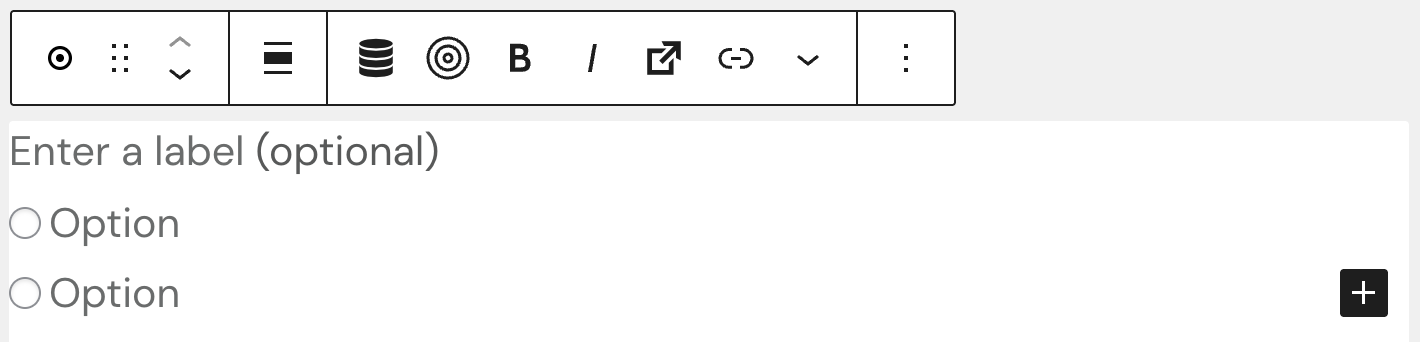
This block has a parent-child structure. The parent block defines the group settings, while each individual option is handled by a Radio button child block.
Settings
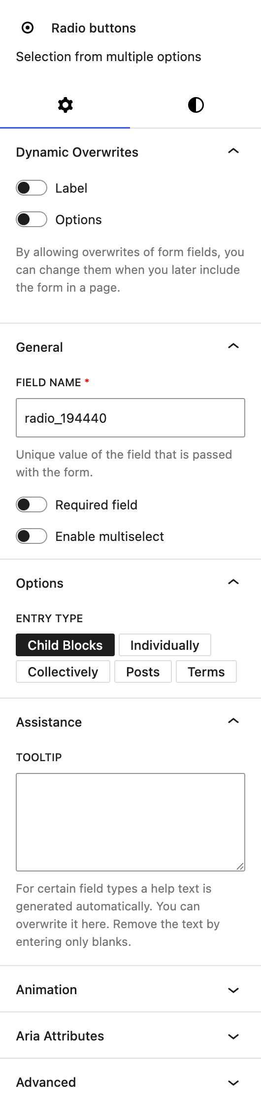
The block includes a Dynamic Overwrites section, which lets you mark the label and options as dynamic so their values can be overwritten when the form is embedded using the Dynamic form block. See the Dynamic Overwrites section for details.
Under the General section of the settings tab, you can customize the automatically prepopulated field name that will be sent with the form submission. Additionally, there is an option to make the field required, ensuring the user must select one of the provided options before submitting the form. You can also enable the multiselect functionality. Please note that the multiselect mode is not accessible to screen readers and should be used with caution in accessibility-sensitive contexts.
In the Options section, you define the selectable entries using an Entry Type setting: Child Blocks, Individually, Collectively, Posts, or Terms. See the Options section for details on each entry type.
The Assistance section provides an input for tooltips. This tooltip will appear next to the label.
The block also supports Animations. In the Advanced section, you can find settings for additional CSS classes, the Greyd Styles Class and toggles to hide the block per breakpoint.
Styles
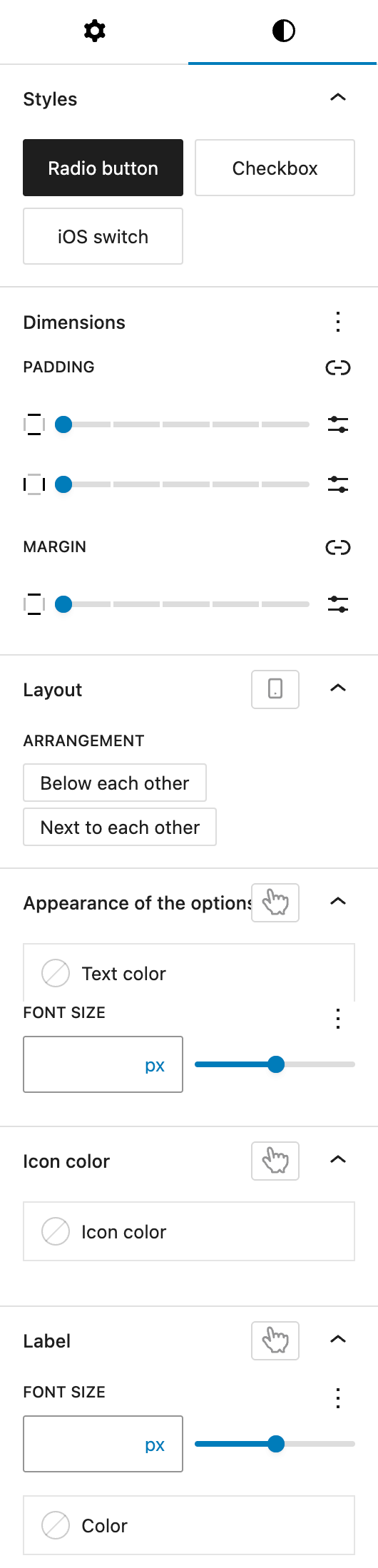
In the Styles section, you can choose between three base styles: classic radio buttons, checkboxes, or an iOS-style switch. This selection controls the visual appearance but does not affect the logical behavior of the field.
The Dimension settings allow you to control padding of all sides and top and bottom margin for the component, leveraging core WordPress styling tools.
In the Layout section, you can define whether the options are displayed vertically (below each other) or horizontally (next to each other), depending on the space and form flow. This setting can be also adjusted per breakpoint.
The Appearance of the options section allows you to customize the font size and color of the option labels. The font size setting offers various options through the Range Unit Control component. You can also change these settings for hover and active states.
The Icon color setting defines the color used for the radio button or checkbox icons. Different colors can be set for hover and active states.
Under the Label section, you can adjust the font size and color of the main label for the block. The font size setting offers various options through the Range Unit Control component. You can also change these settings for the hover state.
Radio button child block
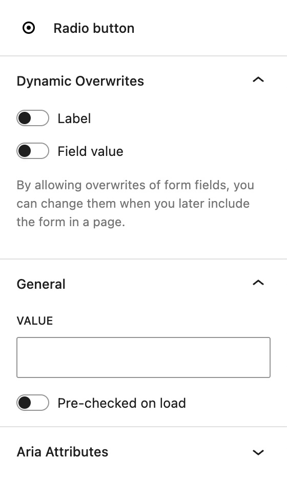
The block includes a Dynamic Overwrites section, which lets you mark the label and field value as dynamic so their values can be overwritten when the form is embedded using the Dynamic form block. See the Dynamic Overwrites section for details.
Under General, each radio button added as a child block can be assigned a specific value. This value is what gets transmitted when the form is submitted and is used to identify the user’s selection in backend processing.
Video
Hi, this is Sandra from GREYD. GREYD.Forms is a powerful form generator for WordPress that is natively integrated in GREYD.SUITE. In this video I am going to show you the setting options for radio buttons. With radio buttons you can make your user select one of several options. After placing the radio buttons block in your form, you can then directly enter the label – the text above the radio buttons – as well as the particular options in the editor.
You will also find the settings to align and format the buttons and select from your styles like checkbox style, iOS switch button style or regular radio buttons, the alignment options and several text formatting options for the label. On the right, you can then edit the unique name of the parent element that will then be submitted in the backend and also you can define whether the selection should be mandatory and whether you want the user to be able to select more than one option at once. Here under layout you can then position the radio buttons next or below each other.
You can then define color and size of the text. You can also create a hover and active state here with different stylings. Same here for the button icon: different color, different actions. Also the label and font size and color and here you can also create a hover effect. If necessary you can also give additional information to the user that will be then accessible via such an info icon and last but not least please do not forget if you need to overwrite the individual field values of the particular options.
For more videos and information please visit our Helpcenter.