The Checkbox block in Greyd Forms allows you to add a single checkbox element to your form. Once inserted, you can directly edit the label text within the editor.
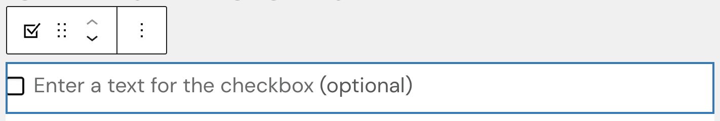
For the label, default styling options (bold, italic, other inline styles) are available. You can also set links or triggers.
Settings
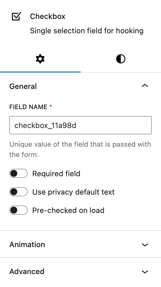
Within the General settings, you can change the automatically populated field name that is submitted with the form. Additionally, there are options to make the checkbox a required field, enable a default privacy text (which is configured in the global forms settings), and pre-check the checkbox when the page loads.
The block also supports Animations. In the Advanced section, you can find settings for additional CSS classes, the Greyd Styles Class and toggles to hide the block per breakpoint.
Styles
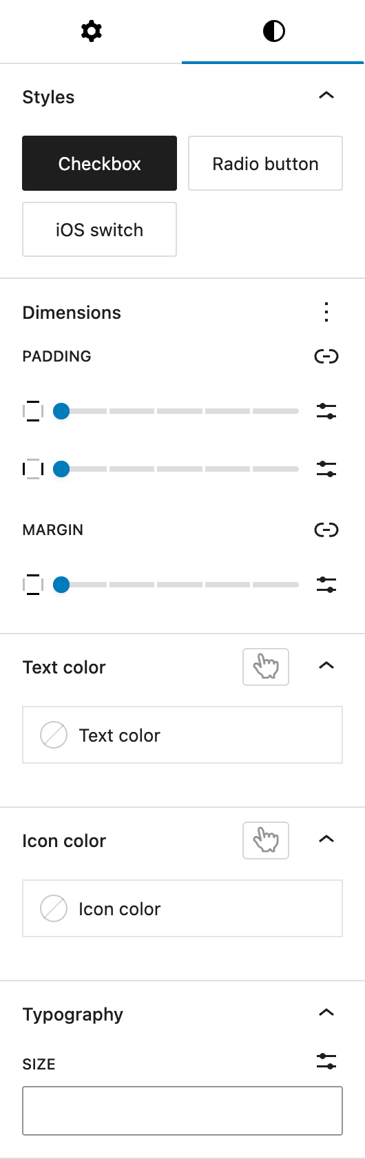
Under Styles, you can choose between three different base styles for the checkbox appearance:
- Checkbox
- Radio button
- iOS Switch
Under Dimensions, the block supports Core spacing controls, allowing you to set paddings for all sides and margins for top and bottom as needed.
Under Text color, you can define the color of the text label that appears next to the checkbox. It’s also possible to change the color on hover by toggling the button with the pointing finger above. See the pseudo-classes documentation for more details.
Under Icon color, you can set an individual icon color different from your text color, if needed. The icon color can have hover and active states, see the pseudo-classes documentation for more details.
Under Typography you can adjust the font size of the checkbox label. The options include selecting from a preset defined in the global styles or entering a custom size.
Video
Hi, this is Sandra from GREYD. GREYD.Forms is a powerful form generator for WordPress that is natively integrated in GREYD.SUITE. In this video I am going to show you the setting options for checkboxes. A checkbox can be used for example to ask for the user’s consent to privacy policies or terms and conditions.
After placing the block checkbox in your form, you can now directly define the checkbox style in the editor and go with a regular checkbox style, radio buttons or also iOS switch. You will also find different text formatting options up here and can then directly enter the text in the editor or alternatively select default privacy text here on the right and the form will then inject automatically your standard privacy text which you can define in the form settings in the menu on the left.
Other than that, you can edit the field name for your checkbox to define which information should be submitted in the backend. You can make the field mandatory. Depending on the use case, you can also have the checkbox pre-selected from the beginning. Next, it’s about colors including the possibility to create a hover effect for both the text and the checkbox icon. For the icon you can also create an active color. And down here it’s about the font size.
For more videos and information please visit our Helpcenter.