The Upload block in Greyd Forms allows you to insert a file upload input field into your form. After inserting the block, you can edit both the label and the placeholder text directly within the editor interface.

Settings
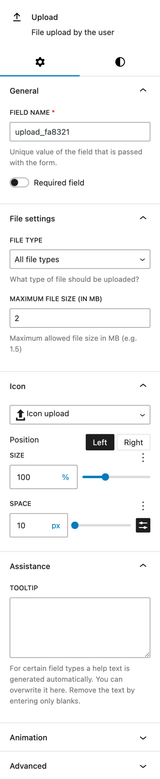
Under the General section, you can adjust the automatically prepopulated field name that will be submitted with the form. Additionally, you can configure the field to be required by enabling the corresponding option.
The File settings section offers configuration options related to file uploads. You can define which file types are allowed by selecting from a predefined list, including ZIP archives, PDFs, text files, audio, video, and images. There’s also a custom option where you can enter one or more specific types manually, by using the correct file endings like .xlsx, .xls or .doc. Allowing “All file types” poses a security risk and should only be used with caution.
You can also set the maximum file size (in megabytes) that users are allowed to upload. This value is defined via a numeric input field. Please note that this limit is additionally constrained by your server’s PHP configuration, specifically the upload_max_filesize and post_max_size values in the php.ini file on your server or hosting environment.
In the Icon subsection, you can select an icon using the icon picker. See the Button Icon Control component for more details.
The Assistance section provides a tooltip input. There’s a default tooltip provided and you can overwrite it in this input field.
The block also supports Animations. In the Advanced section, you can find settings for additional CSS classes, the Greyd Styles Class and toggles to hide the block per breakpoint.
Styles

Under Styles, you can choose between two base styles — “Primary field” and “Secondary field” — as defined in the global styles. These presets allow consistent styling across multiple forms.
In the Dimension section, you can set padding and margin values using the native Core controls.
Under Label, you can adjust the font size and color of the field label. For the font size there are multiple options available, see the Range Unit Control component documentation.
The Width section allows you to control the field’s width. It’s also providing multiple options with the Range Unit Control component.
Within Individual field, you can enable a switch to override the global design settings. See the Custom Button Styles component documentation for more details.
Video
Hi, this is Sandra from GREYD. GREYD.Forms is a form generator for WordPress that is natively integrated in GREYD.SUITE. In this video I’m going to show you the setting options for upload fields. With the block upload you enable your users to upload a file to your form. As usual you can directly enter the label – which is the text above the field – as well as the placeholder in the editor.
You can then select one of your global field designs here. You can define the field alignment and you will find several text formatting options for the label. On the right, you can edit the unique name of your upload field to be submitted in the backend and define whether the upload should be mandatory or not. Next, you select which file type should be allowed to be uploaded. If you’d like to allow several formats but not all, just select “other” and enter all formats that should be accepted. If you’d like to restrict the size of the uploaded file, enter the maximum size in megabytes here.
You can also add an icon to your upload field and define where it should be placed, how big it should be, and how much space you want between the icon and the placeholder. Here you can adapt the size and color of the label including the possibility to create a hover effect. If necessary, provide your user with more information on the upload that will be accessible via such an info icon. The field width can be set individually for each breakpoint and also in different units.
If you don’t want to go with one of your preset form field designs, just activate this toggle here and you will get all the design options as you know them from the Customizer.
For more videos and information please visit our Helpcenter.