The Image panels block in Greyd Forms allows you to add selectable image tiles to a form. These function similarly to radio buttons. Each tile includes an image and a label and is organized using a parent-child structure, where the parent block manages overall field behavior, and each child block represents an individual selectable panel.
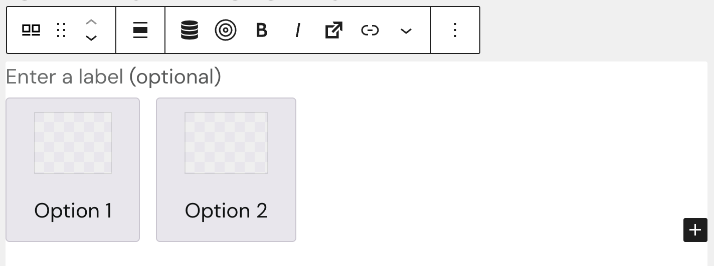
Images can be inserted directly in the editor by clicking on the image placeholder. Likewise, the label text beneath each image can be edited inline — just click into the text field and begin typing. Both the individual panel labels and the general label have style options like bold, italic, inline style options and you can add links and a trigger.
Settings
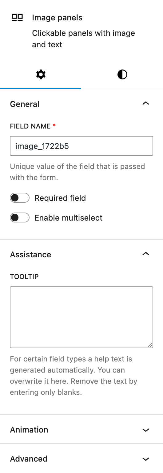
In the General section, you can change the automatically populated field name that is submitted with the form. This is also where you can mark the field as required or enable multiselection. Please note that the multiselect mode is not accessible to screen readers and should be used with caution in accessibility-sensitive contexts.
The Assistance section provides a tooltip input. This tooltip will appear next to the label.
The block also supports Animations. In the Advanced section, you can find settings for additional CSS classes, the Greyd Styles Class and toggles to hide the block per breakpoint.
Styles
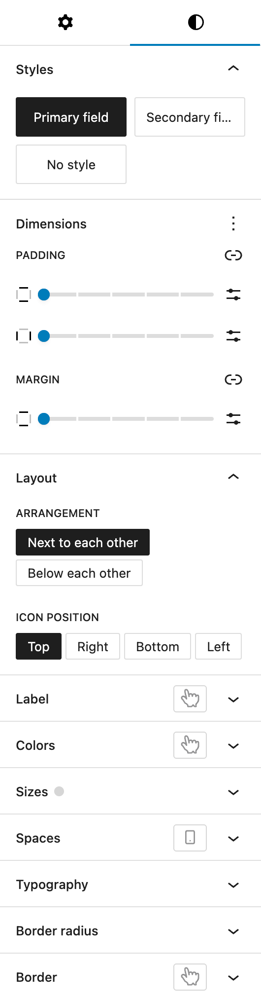
Under Styles, you can choose from three predefined base styles, which are managed globally in the Global Styles settings: primary field, secondary field, and no style.
The Dimension section includes padding controls for all sides and margin controls for top and bottom, provided by WordPress Core.
In the Layout section, you can configure the flexbox-based layout:
- Arrangement: choose how the tiles are arranged — either side by side or stacked.
- Define the image (or “icon”) position relative to the label. Options include: Top, Right, Bottom, and Left.
The Label settings allow you to define the label’s font size and color. The font size setting provides multiple different option, see the Range Unit Control component for more details. You also have the option to change the hover color for label settings, see the pseudo-classes documentation for more details.
In the Colors section, you can define:
- the tile background color
- the text color
- the opacity of the entire panel in percent
The colors can be individually configured for hover and active styles as well.
The Sizes section includes options to change the image height and the tile width. There is also a Same height toggle, which ensures uniform height across all tiles. Both height and width offer all options of the Range Unit Control component.
Under Spaces, you can define the spacing between the image and the tile content, also individually per breakpoint.
The Typography section lets you set the font size of the tile text. You can choose between globally defined presets and custom values.
In the Border Radius section, you can configure the rounding of tile corners, for all four sides or individually.
Lastly, the Border section lets you define border color, border styles and border width for the tile. The border can also be styled differently on hover, see the hover pseudo-class documentation.
Image panel
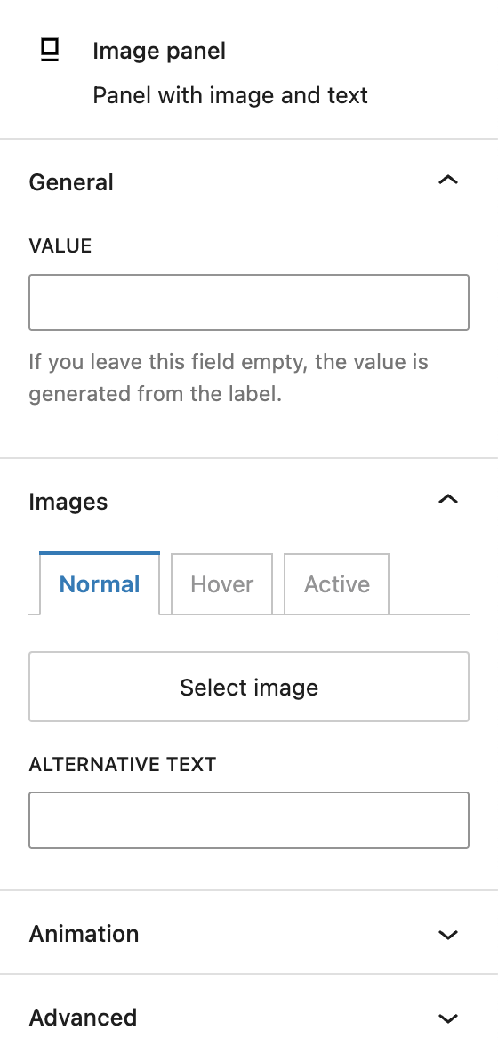
When selecting an individual image panel, you can customize the value of the panel. By default, the value is generated from the label but can be adjusted if you work with special characters for example.
Under Images, you can define different images for normal, hover and active states. If an image is selected, you see a preview here too. For each image, you can add a custom alternative text.
The block also supports Animations. In the Advanced section, you can find settings for additional CSS classes and toggles to hide the block per breakpoint.
Video
Hi, this is Sandra from GREYD. GREYD.Forms is a form generator for WordPress that is natively integrated in GREYD.SUITE. In this video I am going to show you the setting options for our image panel block. Image panels are very handy module in GREYD.Forms. They allow you to offer your user very stylish selection options with images instead of only simple checkboxes or radio buttons. This also pushes your conversion rates. After placing the block in your form, you can directly edit the label – the text above the field – as well as the text in the individual panels in the editor.
You can also add additional panels and by clicking on the plus symbol here, you can also directly select an image, icon or similar for the panels. Here on the left, you can also choose one of your global field styles or also work without any preset styling. You can define the alignment and you will find several text formatting options for the label. On the right, you can now overwrite the individual field name as it will be submitted in the backend. You can also make the field mandatory and decide whether the user should be able to select more than one option at once. Under layout, you can define whether you want the panels to be placed below each other or next to each other and how you’d like the text and image to be placed. You can have the image on top, on the right, below or on the left of the text.
Down here you can edit the label in terms of color and size including the possibility to create a hover effect. If necessary, you can also add an info text that will be available via such an info icon. Next is the appearance of the individual panels. You can define colors for both the panel and its text including a toggle for the opacity. Here you now have 3 different states that can be styled individually: the normal state, the hover state and the active state, which is when the panel was clicked Next is the size. You can define the height and width of the panel and also stretch the panels to full width.
The padding – which is the inner space between the border and the content of the panel – can be defined individually for each side and also individually for each breakpoint. Here we can edit the font size for the text with different units. And with the border radius you can make the corners of the panels round – again possible for each side individually. Same here for the border itself, which you can define in size, type and color – again for all sides and 3 individual states.
And last but not least we’ll now have a look at the settings for the individual panels. At first you can overwrite the field value to be submitted in the backend. You might already have uploaded an image for the normal state. If you’d like to, you can now upload up to 2 more images for the same panel to be shown on hover or after clicking on the panel. Here you can see some frontend examples of image panels with borders, hover effects, icons as well as clickable images.
For more videos and information please visit our Helpcenter.