The Live Survey block in Greyd Forms enables you to embed a real-time survey into a form. It functions as a block variation of the radio buttons block and uses a parent-child structure. In the frontend, users can select an option and immediately see a visual progress or results bar reflecting how others have voted. In the backend, survey results are accessible through the survey overview page.

Once the block is added, you can directly edit the label and radio option texts within the block editor.
Settings
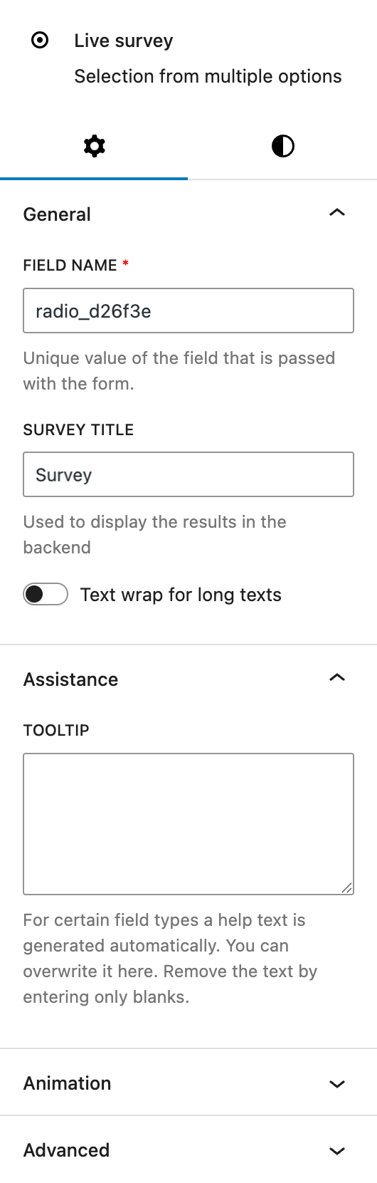
Under the General section, you can customize the automatically prepopuplated field name used for form submission. You can and assign a separate survey title to the survey. This name is used to display results in the backend interface. There’s also an option to enable text wrapping for longer option labels.
The Assistance section provides an input for tooltips. This tooltip will appear next to the label.
The block also supports Animations. In the Advanced section, you can find settings for additional CSS classes, the Greyd Styles Class and toggles to hide the block per breakpoint.
Styles
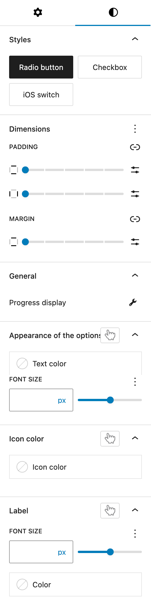
In the Styles section, you can choose between three visual base styles for your options: Radio button, Checkbox, or iOS Switch.
The Dimension section provides padding (all sides) and margin (top and bottom) controls provided by the WordPress Core.
Within the General subsection, a dedicated button opens the settings for the progress bar. See the next section for more details.
The Appearance of the options section allows you to customize the font size and color of the option labels. The font size setting offers various options through the Range Unit Control component. You can also change these settings for hover and active states.
The Icon color setting defines the color used for the radio button or checkbox icons. Different colors can be set for hover and active states.
Under the Label section, you can adjust the font size and color of the main label for the block. The font size setting offers various options through the Range Unit Control component. You can also change these settings for the hover state.
Progress bar settings
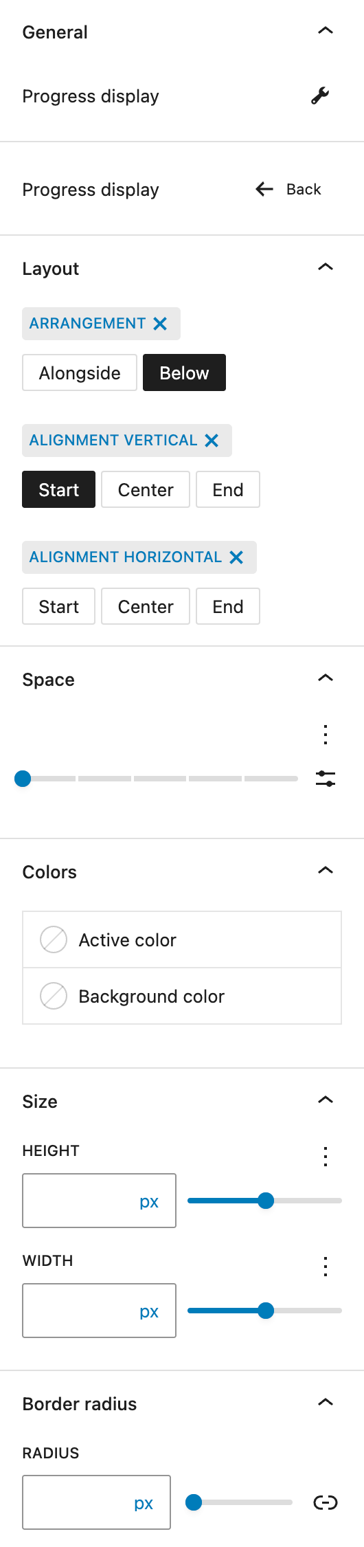
In the Layout section you can adjust the Arragement, whether the progress bar appears below or next to the radio button label. You can also define vertical and horizontal alignment for the buttons.
In the Space section, you can modify the spacing between the progress bar and radio button labels. You can select a preset or use any of the custom options provided with the Range Unit Control component.
In the Colors section you can customize the active fill and background colors of the progress bar.
The Size section allows you to adjust the width and height of the progress indicator. The settings are provided by the Range Unit Control component, offering you various options to define the right size.
Lastly, under Border Radius, you can set the corner rounding for the progress bar. See the Dimension Control Border Radius component for more details.
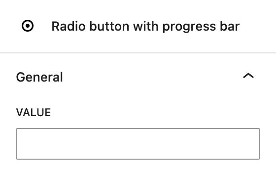
Radio button with progress bar child block
Each radio button inside the survey block is called Radio button with progress bar and is different from the regular radio button child block. It can be assigned a value. This value is what the system uses when tallying results in the backend.