The Buttons (Greyd) block is a custom alternative to the default WordPress Buttons block. It acts as a simple wrapper that displays a row of buttons using only Button (Greyd) child blocks. The parent block provides minimal options, while each child button can be configured in detail (see Button (Greyd) block documentation). The block is available in the Greyd category of the inserter.
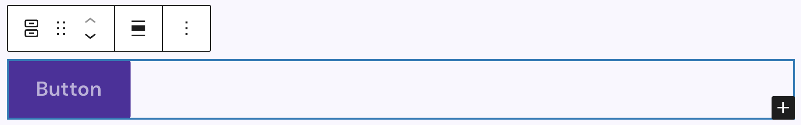
An empty Buttons (Greyd) block is just an empty wrapper. By default, one Button (Greyd) child is inserted and can be edited further. You can add more child buttons at any time using the plus icon in the bottom right corner.
The toolbar includes the basic block controls and the Align control to set the alignment of the buttons row with these options available: wide width, full width, align left, align center and align right.
Settings
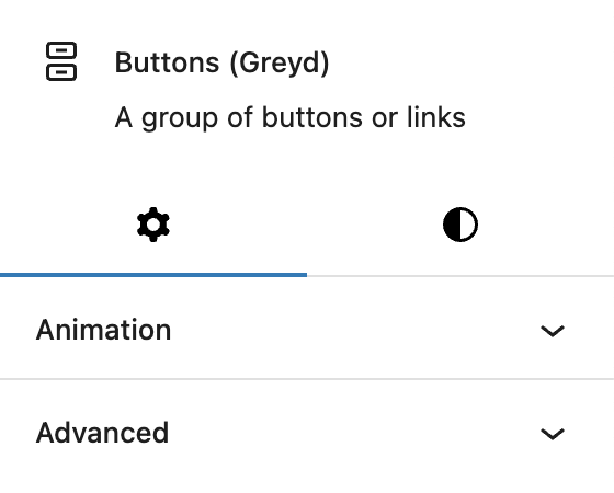
There are no specific settings for this block. The block supports Animations. In the Advanced section, you can find settings for HTML anchor, additional CSS classes and toggles to hide the block per breakpoint.
Styles

The Styles tab provides controls for Padding, Margin and Block Spacing, which are default WordPress controls.