The List (Greyd) block is a flexible alternative to the core List block. Unlike traditional list blocks, it uses individual child blocks — such as List element, Group, or Content Box — to build the list structure. This allows each list item to contain not just plain text, but any combination of blocks and content.
Each list item can even override the global settings for style and structure.
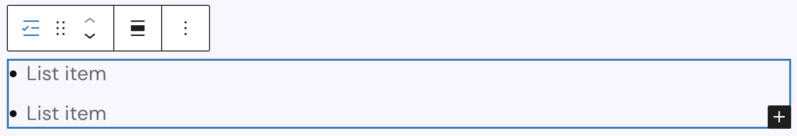
When first inserted, the block shows a simple list with circle bullet points and two List element child blocks by default. You can add more items, nest a List (Greyd) block within another, or use Content Box or Group blocks as children. This enables deeply structured and styled lists with full flexibility.
In the toolbar, you’ll find the standard block controls plus an alignment option to control the text alignment inside the list items. Available alignments are: none, wide width, full width, left, center, and right alignment.
Settings
One of the core strengths of the List (Greyd) block is its advanced layout control, which goes far beyond basic ordered or unordered lists. The Appearance setting defines the base list style, and additional sub-options adjust how bullet points look globally (per item overrides are handled in the List element block).
The available appearances include:
- Paragraphs only, no further options available
- Bulletpoints (default)
- Numbering
- Icon
- Image
The Position of the bullet points section varies based on the chosen appearance and is fully responsive.
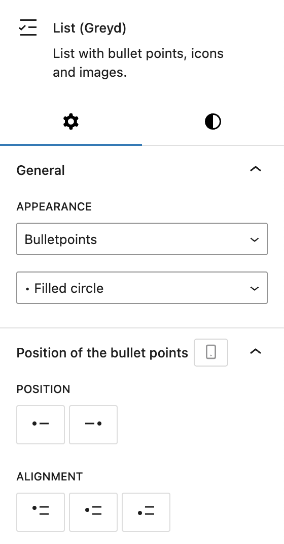
If Bulletpoints is selected, there are three types of bullet points available:
- Filled circle: •
- Open circle: ◦
- Filled square: ▪
The Position of the bullet points options are:
- Position: Left or Right
- Alignment: Top, Centered, or Bottom
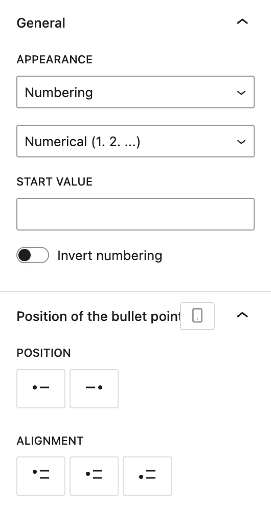
If Numbering is selected, there are seven types of numerical bullet points available:
- Numerical (1. 2. …)
- Numerical with zero (01. 02. …)
- Roman small (i. ii. …)
- Roman capitals (I. II. …)
- Greek small (α. β. …)
- Alphabetical small (a. b. …)
- Alphabetical capitals (A. B. …)
Additional options include:
- Start value: sets the starting number
- Invert numbering: toggles descending order
The Position of the bullet points options are:
- Position: Left or Right
- Alignment: Top, Centered, or Bottom
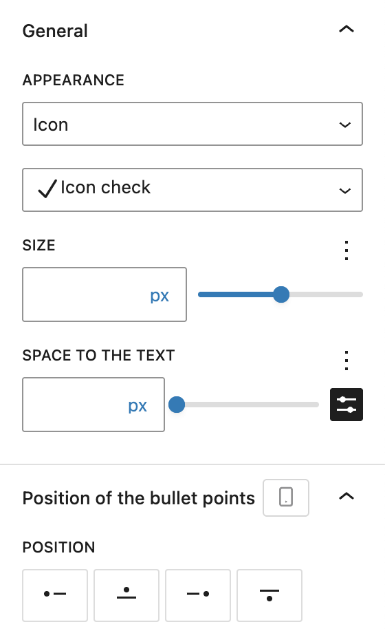
If Icon is selected:
- Icon (with the Icon Picker component)
- Size (with the Range Unit Control component)
- Space between icon and text (with the Range Unit Control component and optional space preset selector)
The Position of the bullet points options are:
- Position: Left, Top, Right, or Bottom
- Alignment options depend on position, visible after position has been selected:
- Left/Right selected: Top, Center to first line, Centered, Bottom
- Top/Bottom selected: Left, Center, Right
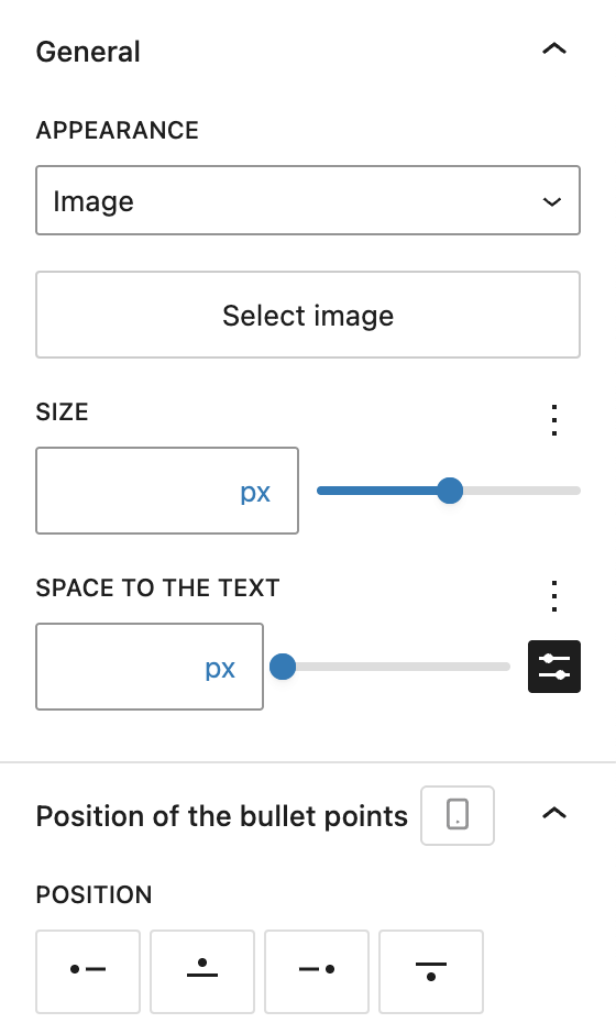
If Image is selected:
- Image (via MediaUpload)
- Size
- Space between image and text
The Position of the bullet points options are:
- Position: Left, Top, Right, or Bottom
- Alignment options depend on position, visible after position has been selected:
- Left/Right selected: Top, Center to first line, Centered, Bottom
- Top/Bottom selected: Left, Center, Right
The block also supports Animations. In the Advanced section, you can find settings for HTML anchor, additional CSS classes, CSS animations, toggles to hide the block per breakpoint and inline CSS.
Styles
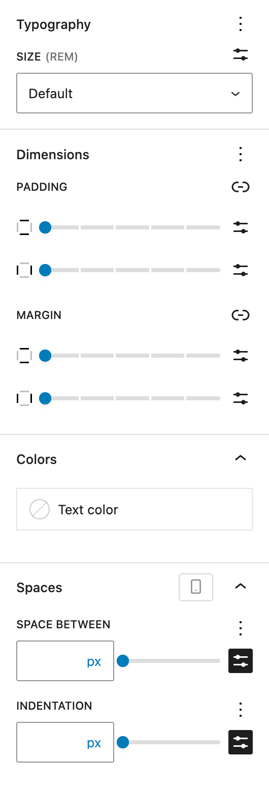
In the Styles tab, you’ll find standard style options:
- Typography: Size is visible by default, Appearance and Letter case can be optionally activated
- Dimensions: Padding and Margin
You can also choose a text color for the entire list. If the Icon appearance is selected, there will be a separate color picker for the icon color.
Under Spaces, you can set the space between list items and the indentation of subelements. Both settings offer the options of the Range Unit Control component with spacing preset selection available and can be adjusted per breakpoint.
List element block
The List element block is a dedicated child block of the List (Greyd) block. It provides an isolated editing experience for individual list items, enabling rich formatting and flexible styling. While it inherits most visual settings from the parent block, each List element can override its appearance individually. This block is only available within the List (Greyd) block.

In the editor, each List element appears as a RichText field with a visual bulletpoint — either a symbol, icon, or image — depending on what’s defined in the parent block. The RichText interface supports all standard formatting options via the toolbar.
To improve editing, a few keyboard shortcuts are implemented:
- Backspace (at start): Merges this element with the previous one and removes it from the list.
- Enter: Splits the current List Element into two at the cursor position.
- Tab: Adds one indent level (can also be triggered via the “Indent” button).
- Shift + Tab: Removes one indent level (“Outdent” button).
The toolbar includes:
- Standard block controls
- Indent / Outdent buttons to manage list hierarchy levels
- Dynamic Tags support (see Dynamic Tags documentation)
- Full Core RichText formatting options
- Trigger support (see Trigger documentation)
Settings
In the sidebar, the List element inherits the overall Appearance type from its parent (e.g., bulletpoints, icons, or images). However, the specific Style of each item — like which icon or image to use — can be customized per element.
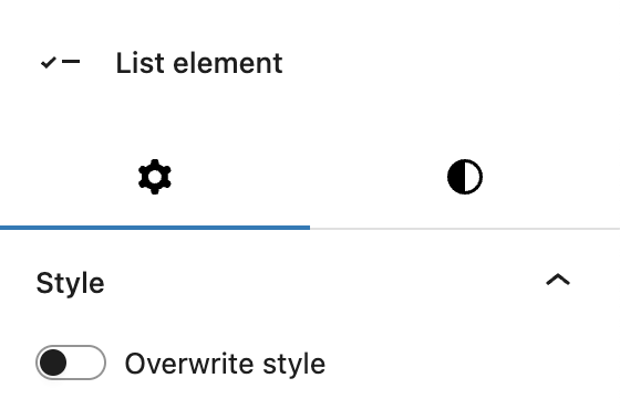
When enanbling Overwrite style, different options appear depending on the Appearance selection at the parent block. See the settings on the parent block for more details:
- Bulletpoints: sama dropdown as on parent block
- Numbering: same dropdown as on parent block
- Icon: select anonther icon, change icon color
- Image: select another image
Styles
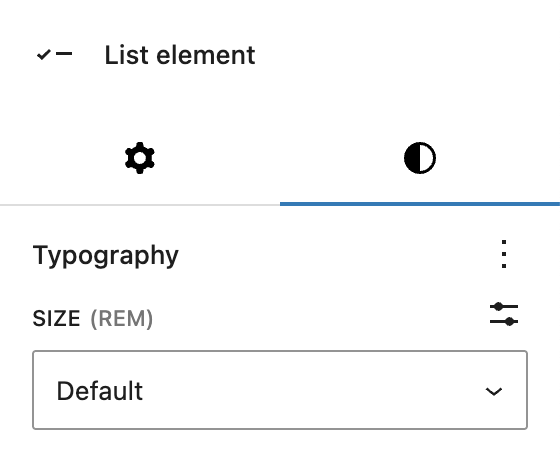
In the Styles tab, the block supports basic typography adjustments. You can set the text size individually for each list item.
Video
Hi, this is Sandra from GREYD. Today I’d like to show you what you can do with the list block in GREYD.SUITE. This block makes creating any list design and layout possible.
After placing the list block on your page, there are some general settings for the entire list first. You can work with different kinds of list icons, for example paragraphs only, different types of bullet points or numberings, or also with icons or images. Depending on your selection you will then see different settings. For bullet points for example you can choose from different kinds of bullet points you can set the text color as well as the position and alignment of the bullets. You can even vary the latter for different screen sizes by clicking on the mobile toggle up here.
For numbered lists there are similar options and additionally you can define the start value and also change the order if you want to.
For icons and images you have the selection of the icon or image of course, but also options for size and color. And you can define the space between icon and text. Next to left and right you can also position the text over or under the icon and set the alignment individually.
Independently from the type of list icon you choose, you can then define the space between the list items and if you indent some, how far the indentation should be. And there are some general typography settings for the text itself.
So now let’s fill our list with content. You can just enter your content in the editor and will find the usual formatting options, and can also work with our dynamic tags, links, etc.
To add a new list item, just hit enter or click on the plus symbol. To indent an item, use tab or these buttons up here. But this is not all yet!
With the GREYD list, you can also vary the appearance of individual list items, for example to highlight one of them visually. Therefore just open the list item settings and activate the option overwrite style.
So as you can see there are unlimited possibilities to create individual lists without much effort. And you can also use the list block for layouts that have nothing to do anymore with classical lists. For instance, like this example here, the list block is super to place text centered to an image for example.
For more videos and information please visit our Helpcenter.