The Pop-up block is a dedicated child block of the Popover block and cannot be placed on its own. It serves as the container for the content displayed when the Popover is triggered. Functionally, it behaves like a fully customizable wrapper block — similar to the core Group block or the Content Box — and can hold any other block as a child.
Depending on the chosen variation, the Pop-up can be displayed in a variety of ways: as a traditional pop-up floating element, a dropdown positioned relative to the Popover button, or as an offcanvas or overlay that covers part or all of the screen.
In the editor, the Pop-up is rendered according to its settings in the Sidebar. For example, the Pop-up variation may appear as a floating container, whereas Offcanvas slides in from the side. The Dropdown variation is positioned relative to the Popover button or burger.
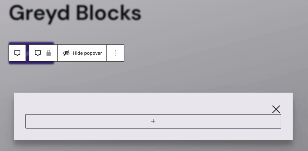
The toolbar contains a Hide popover button, which closes the Pop-up in the editor so you can return to editing the main page content. Note that clicking anywhere outside the Pop-up in the editor preview will also close it automatically.
The Pop-up offers four variations with minimal different settings:
- Pop-up (default)
- Offcanvas
- Overlay
- Dropdown
Settings
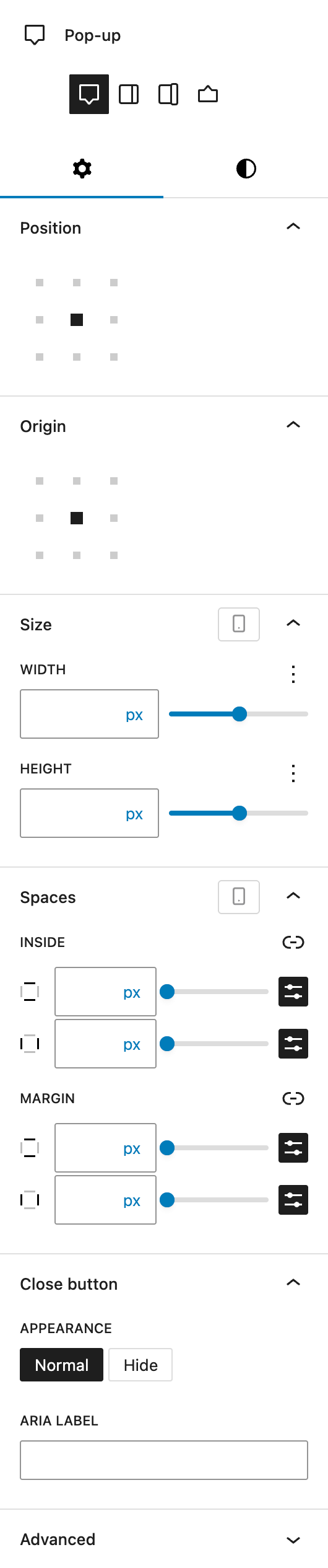
Under Position, the Pop-up variation uses an Alignment Matrix Control, where you can select the exact position on a grid. The default is set in the center. This position sets the pop-up in relation to the viewport. If you choose the bottom right icon in the grid, the pop-up will appear in the bottom right corner of your website.
For all other variations, you can set the position to Left, Top, Bottom, or Right. For the Dropdown variation, the position sets it directly next to the button, while Offcanvas and Overlay sets it related to the viewport.
The Origin setting is only available for the Pop-up variation. It uses the same Alignment Matrix Control setting. With this setting the opening animation will start from the selected position.
Under Size, you can overwrite the default Width and Height for the pop-up with the Range Unit Control component. The Dropdown has an additional setting Triangle, which uses the same component. With this, you can change the size of the small triangle pointing to the button. All of these settings can be adjusted per breakpoint.
Under Spaces, you can set a custom spacing for inside the pop-up (padding) or outside the pop-up (margin). The spaces can be adjusted per breakpoint.
All pop-ups have a Close button added by default. Under Appearance, you can change the visibility from Normal to Hide. You can also customize the Aria Label to improve the accessibility for the close button.
In the Advanced section, you can find settings for HTML anchor, additional CSS classes, the Greyd Styles Class and toggles to hide the block per breakpoint.
Styles
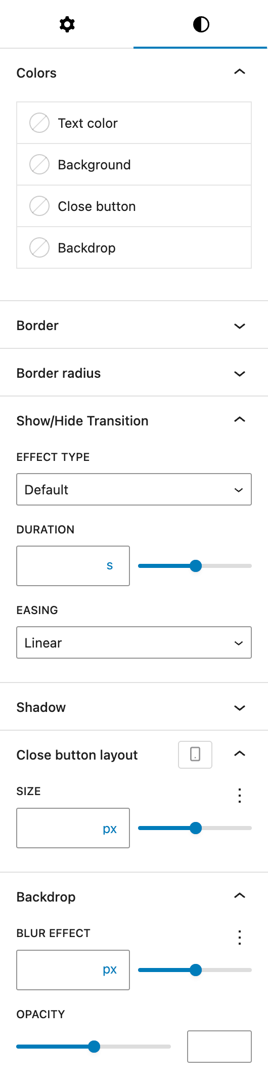
Under Colors, you can set colors for different parts of the pop-up:
- Text color
- Background
- Close button (only if not hidden)
- Backdrop (not available on the Dropdown variation)
Under Border, you can set a border for the pop-up. The Border radius can be adjusted as well.
Under Show/Hide Transition, you can change the animation behaviour for the pop-up. The Effect Type can be Default, Scale only, Fade only, Scale & Fade or None. You can set a custom Duration in seconds and change the Easing settings to either Linear, Ease-in, Ease-out, Ease-in-out or Cubic-bezier.
Under Shadow you can change the shadow settings with the Drop Shadow Control component.
The Close button layout section is only available only if the Close button is visible. You can change it’s Size with the Range Unit Control component and it can be adjusted per breakpoint.
The Backdrop section is only available if the variation is not Dropdown, where there is no backdrop. You can change the Blur Effect with the Range Unit Control component as well as the Opacity as a simple slider with numbers ranging from 0 to 100 to reflect the percentage of opacity.