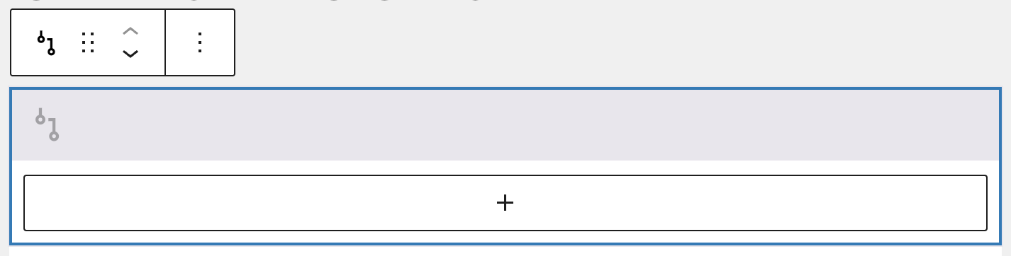
The Conditional fields block in Greyd Forms allows you to create dynamic form behavior by conditionally displaying or hiding content based on user input. This block serves as a wrapper for other form blocks. Any content placed inside it will appear or disappear live on the frontend, depending on the form values entered by the user.
Settings
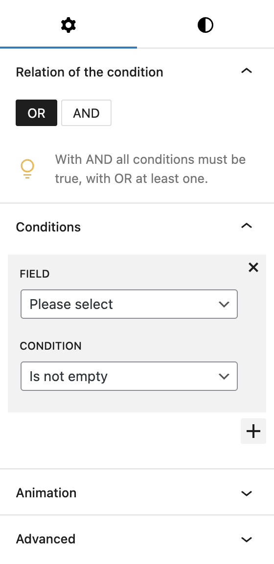
Within the block settings, you can define how the conditions are evaluated. The Relation of the condition option lets you choose between and or or. Selecting and means all defined conditions must be met for the content to be shown. Choosing or allows the content to be shown if at least one of the conditions is met.
In the Conditions section, you can add multiple conditions. Each condition requires selecting a field which is looked at and a rule that defines the logic. The available condition types include, the words in brackets are the internally used values:
- Has the value (
is): checks if the field has the exact value specified. - Contains the value (
has): checks if the field contains the specified value. - Has not the value (
is_not): checks if the field does not have the specified value. - Is empty (
empty): checks if the field is empty. - Is not empty (
not_empty): checks if the field is not empty. - Greater (>) (
greater): checks if the field value is greater than a given number. - Greater than or equal to (>=) (
greater_equal): checks if the field value is greater than or equal to a given number. - Smaller (<) (
smaller): checks if the field value is smaller than a given number. - Less than or equal to (<=) (
smaller_equal): checks if the field value is smaller than or equal to a given number.
The block also supports Animations. In the Advanced section, you can find settings for additional CSS classes and toggles to hide the block per breakpoint.
Styles
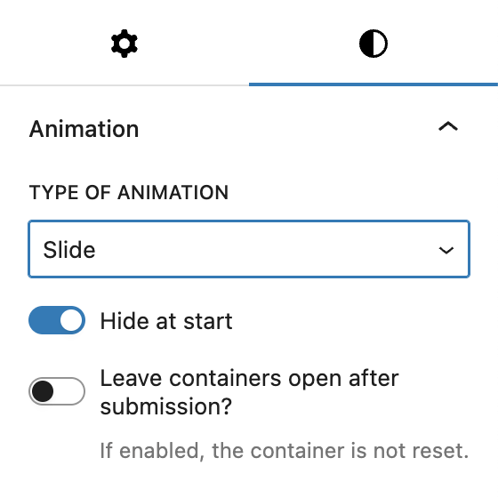
Under Styles, there’s a separate section for Animations, which is specific to how the showing and hiding works when the set conditions match or don’t match. You can choose between four Types of animation:
- Slide
- Fade in and out
- Slide and fade
- None
By default, Hide at start is activated, so any fields inside the block are hidden when loading the form. Additionally, you can decide to Leave containers open after submission, which means that the form doesn’t reset to it’s original setup but persists the show/hide settings even after submission of the form.
Video
Hi, this is Sandra from GREYD. GREYD.Forms is a form generator for WordPress that is natively integrated in GREYD.SUITE. In this video I’m going to show you the setting options for our conditional container block. Conditional containers, thus interdependent fields, allow you to tailor your form to your user. Depending on which data the user enters or which selections he or she makes, you can hide or show different fields.
I want to show how it works with 2 examples. In my first example I want additional fields to be displayed as soon as the user starts entering his or her email address. So let’s go to the backend and see how it works. I’ve already prepared the form including all additional fields that I want to display which are currently hidden. And what I now do is to add a conditional container to my form.
On the right you can now define your condition. At first it’s about whether you want an “and” or an “or” condition. This is only relevant if you define more than one condition. Do you then want the container to be triggered only if all conditions are true — which would be “and” — or is it enough if one of them is met — which would be “or”.
Next, you define which field should act as the reference field. You can also define more than one field here, thereby creating even the most complex conditions very easily. You only need to take care to not define any contradicting conditions, since that would lead to errors and may prevent the user from being able to submit a form.
For our example, the reference field is the email field and the condition is that a field is filled, thus is not empty. To hide and show fields in correlation with the user’s entries, you can now select from different animations like slide or fade. And you can also define the initial state of the form. In our case, we need the additional fields to be hidden on load, since we only want them to be displayed after the user has filled the email field.
Down here, you can also define what should happen after the form was submitted. By default, the form will go back to its initial state, but you can also leave all the containers open if you want to. So now, after defining the condition, we can place all additional fields in the container.
Let’s update and see what happens in the frontend. At first nothing, but as soon as I type here, the additional fields appear. For my second example, I want different questions to be asked depending on which of these 2 options a user selects. So again, we will add a conditional container, or better said 2 conditional containers, to our form.
For the first container I define as a condition that the selected value of the first field is “forms”. I then want 2 more fields to appear plus a submit button. In the second container I use the same reference field, but the condition is that the value is “hub” instead. And I then want to ask a different question and again I want to place the submit button.
By the way, you can fill your container like I do it here by preparing all fields in advance and then drag and drop them, or you can also of course directly create the fields in the container. So if I now select GREYD.Forms, there are 2 questions asked plus the submit button. However if the user selects GREYD.Hub, another question appears and the submit button.
For more videos and information please visit our Helpcenter.