The Dropdown block in Greyd Forms allows you to insert a dropdown field into a form. After placing the block, you can immediately edit the label and placeholder text directly within the editor.
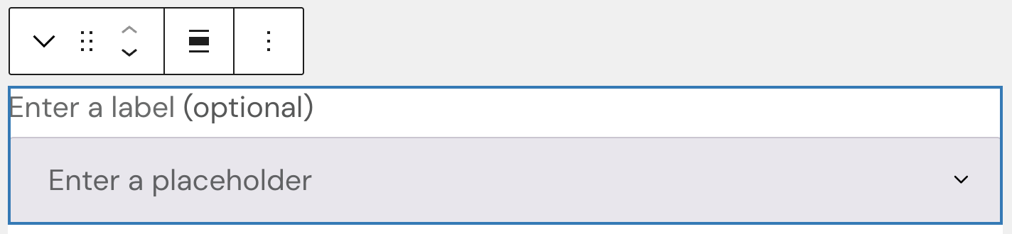
While there are no styling options for the placeholder, the label text can be set to bold, italic or other inline styles, set a link or a trigger.
Settings
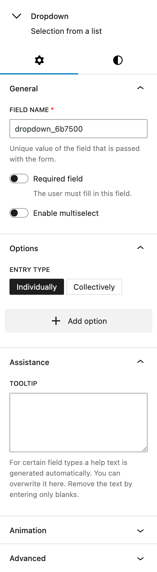
Under the General section, you change the automatically prepopulated field name that will be submitted with the form. You also have the options to make the field required and enable multiselect functionality. Please note that the multiselect mode is not accessible to screen readers and should be used with caution in accessibility-sensitive contexts.
In the Options section, you define the selectable entries. There are two input modes:
- With Individually, each option is entered as a label-value pair using the “Add option” button.
- With Collectively, you can paste or type multiple options in one field, using either just values or label=value pairs. Each entry must be separated by a comma or the Enter key.
The Assistance section provides an input for tooltips. This tooltip will appear next to the label.
The block also supports Animations. In the Advanced section, you can find settings for additional CSS classes, the Greyd Styles Class and toggles to hide the block per breakpoint.
Styles
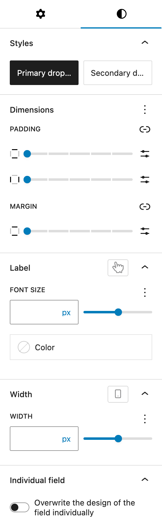
In the Styles section, you can choose between two base styles that are defined globally: primary dropdown and secondary dropdown.
The Dimension settings come from WordPress Core and allow you to set padding values for all sides and margin values for top and bottom.
Under Label, you can define the label’s font size and color. The font size setting provides multiple different option, see the Range Unit Control component for more details. You also have the option to change the hover color for label settings, see the pseudo-classes documentation for more details.
The Width section lets you set the width of the dropdown. It uses the same Range Unit Control component for defining custom sizes. The width can also be set per breakpoint.
Finally, the Individual field toggle allows you to override the design of this particular field. See the Custom Button Styles component for more details.
Video
Hi, this is Sandra from GREYD. GREYD.Forms is a form generator for WordPress that is natively integrated in GREYD.SUITE. In this video I’m going to show you the setting options for dropdown fields. The dropdown block can be used wherever you want the user to select one or several options from a list of options. After placing the block in your form, you can directly edit the label — which is the text above the field — as well as the placeholder directly in the editor.
On the left, you can then select from your global field designs. You will find the option for the alignment and also different text formatting options for the label. On the right you can then adapt the individual field name that will be submitted in the backend. You can make the field mandatory. And if you want to, you can also enable the user to select more than one option at once.
Next, you define the individual options for the user. You can either enter them one by one. The field on the left is what will be displayed for the user and the field on the right is what will be submitted in the backend. With the plus you can add additional options. Alternatively, you can also enter all options at once. If the display text should not be the same as the submitted value, enter it in the form like it is displayed here with an “=”.
Here you can edit the label in terms of font size and color. You can also create a hover effect. If necessary, you can add an info for the user that will then be available via an info icon.
The field width can be designed individually for each breakpoint. Should you not want to go with your global field design, just tick this option here and you will find all styling options as you know them from the Customizer.
For more videos and information please visit our Helpcenter.