The Input field block in Greyd Forms allows you to insert a general input field into your form. It supports various input types such as text, email, link, date, and number. Once added to the form, the block provides a flexible set of configuration and styling options for adapting it to a wide range of use cases.

In the block toolbar, there are various styling options available for the label, including bold, italic, inline styling options as well as setting a link or a trigger.
Settings
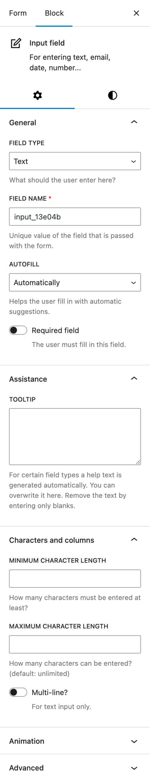
In the Settings tab, you’ll find several configuration options that determine how the input field behaves.
Under General, you can change the Field Type to your preferred input field. Options include:
- Text
- Phone number
- Link
- Number
- Time
- Date
- Date and Time
- Week (week number and year)
- Month (month as text, e.g. “January” and year)
For email, phone number, link and number the tooltips get generated automatically with predefined text, depending on the selected field type. These tooltips can be individually changed as well.
The Field name will be generated automatically with a random string at the end, but can be individually edited. It is the identifier for this field in the form and also used for the dynamic form values.
There’s also a dropdown for configuring the Autofill behavior. This helps users fill in the field using browser-based suggestions. Available options include:
- Automatically
- Off
- Name
- First name
- Last name
- Phone number
- Street and house number
- Zip code
- City
- Country
- Country abbreviation
You can also mark the field as Required to ensure it must be filled before submission.
In the Assistance section, you can provide a tooltip to guide users when filling out the field. For some input types, a contextual help text is generated automatically. This text can be overwritten or removed entirely by entering only blank spaces.
Under Characters and columns, additional options can appear based on the selected field type:
- Text: minimum and maximum character length and a toggle to make this input a multi-line field. When activated, you can set the number of lines, which defaults to five and can be extended up to 15.
- Email, phone number, link: minimum and maximum character length
- Number: start value, minimum value, maximum value, steps
- All date related field types: start value, minimum value, maximum value. For all value fields, certain formats must be adhered to:
- Time:
18:00 - Date:
2020-12-31 - Date and time:
2020-12-31T18:00 - Week:
2020-W52 - Month:
2020-12
- Time:
The Animation section allows you to apply visual effects. In the Advanced section includes settings for additional CSS classes, the Greyd Styles class and hide by breakpoint options. For more information about both of these sections, see the respective linked documentation.
Styles

The Styles tab defines the visual appearance of the input field.
Under Styles, you can choose between two base styles — “Primary field” and “Secondary field” — as defined in the global styles. These presets allow consistent styling across multiple forms.
In the Dimension section, you can set padding and margin values using the native Core controls.
Under Label, you can adjust the font size and color of the field label. For the font size there are multiple options available, see the Range Unit Control component documentation.
The Width section allows you to control the field’s width. It’s also providing multiple options with the Range Unit Control component.
Within Individual field, you can enable a switch to override the global design settings. See the Custom Button Styles component for more details.
Video
Hi, this is Sandra from GREYD. GREYD.Forms is a powerful form generator for WordPress that is natively integrated in GREYD.SUITE. In this video I’m going to show you the setting options for the input field block. You can use this block everywhere you want the user to fill something in.
After placing the block in your form, you can then directly edit the label – which is the text above the field – as well as the placeholder in the editor. Up here you can then select one of your global form field designs, set the alignment and you will find several text formatting options for the label.
On the right you then define what type of input the user should enter. Let’s start with a simple text field, for example for name or address entries. You can then edit the unique name of the field that will later be submitted in the backend and below you can also activate the autofill feature to help your user filling the form. Here you can also make the field mandatory.
For the label, you can adapt the font size and color and also create a hover effect. For the width, you can work with different units and you can define it individually for the different screen sizes. If necessary you can also add additional information on how to fill the field that will then be placed behind such an info icon.
Depending on the type of input, you can also further narrow down what exactly the user should be able to enter, for example a maximum or minimum of characters. You can also display the field with several rows and define here how many you want to display.
And should you not want to go with your global form field designs just activate this toggle here and you will find all design options as known from the Customizer. Instead of text you can of course also select other field types which also changes some of the setting options below. For example if you select number, you will be able to define the start value, minimum and maximum value and also the steps in between. Same applies for the different time and date options that you can select. Please note that minimum and maximum values here have to be entered in a certain way as it is described here.
For more videos and information please visit our Helpcenter.