The Multistep container block in Greyd Forms allows you to create multistep forms within your layout. It uses a parent-child architecture where each step of the form is represented by a child block. You can easily add or remove steps directly in the editor. Each step can contain any type of field or block, giving you full flexibility over your form’s structure.

In the above screenshot, a step has already been added to the multistep container. Navigation between steps is handled using the dedicated Next/Back button block, which can be placed wherever needed within the form. A progress bar is enabled by default to visually indicate the user’s progress through the steps. An additional quiz mode is available that lets you transform the multistep form into a quiz with answer validation.
Settings
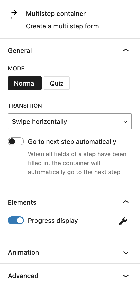
In the General section, you can select the mode of the multistep container. Available modes are “Normal” and “Quiz.” When the quiz mode is selected, only one question should be added per step. If you insert an input inside the multistep container in quiz mode, a new input field will appear in the block’s settings sidebar to define the correct answer. For radio buttons, you can toggle that this is the correct answer in the individual radio button’s sidebar.
Under Transition, you can configure the transition behavior between steps. Available transition effects include swipe horizontally, move vertically, fade, or none.
If the multistep container is in normal mode, an additional option appears: Go to next step automatically. When enabled, the form automatically advances to the next step as soon as all required fields in the current step are completed. Please note that this option is not ideal for accessible forms. The automatic step change doesn’t work reliably with keyboard navigation or screen readers.
The Elements section includes a toggle to enable or disable the progress bar. Once enabled, a button appears that links directly to the Progress Bar Settings section.
The block also supports Animations. In the Advanced section, you can find settings for HTML anchor, additional CSS classes, the Greyd Styles Class and toggles to hide the block per breakpoint.
Progress bar settings
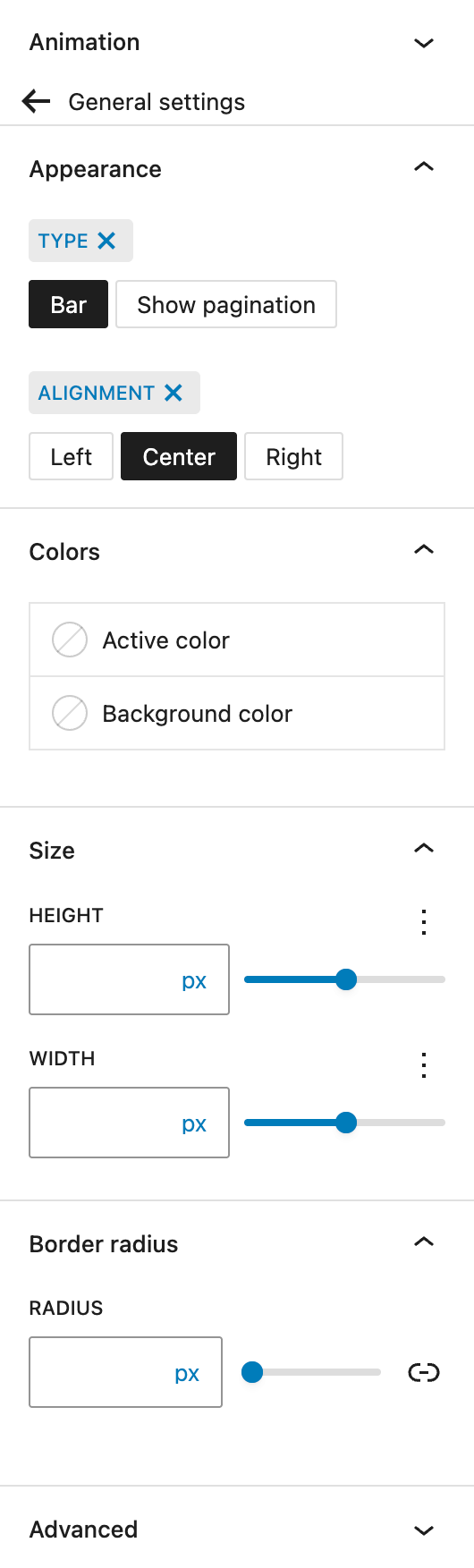
In the Appearance section, you can choose the visual type of the progress indicator: a traditional progress bar or pagination dots. Alignment options for the indicator include left, center, and right.
In the Colors section, you can define both the active progress color and the background color of the progress bar.
The Size section allows you to adjust the width and height of the progress indicator. The settings are provided by the Range Unit Control component, offering you various options to define the right size.
Lastly, under Border Radius, you can set the corner rounding for the progress bar. See the Dimension Control Border Radius component for more details.
In the Advanced section, you can find settings for HTML anchor, additional CSS classes, the Greyd Styles Class and toggles to hide the block per breakpoint.
Next/Back button
The Next/Back button is exclusive to the Multistep container block. Adding this button allows the users to go back and forth through all steps. When creating a new step, a next button is added automatically, which is right aligned. Other alignment options are left, center and none.

Settings
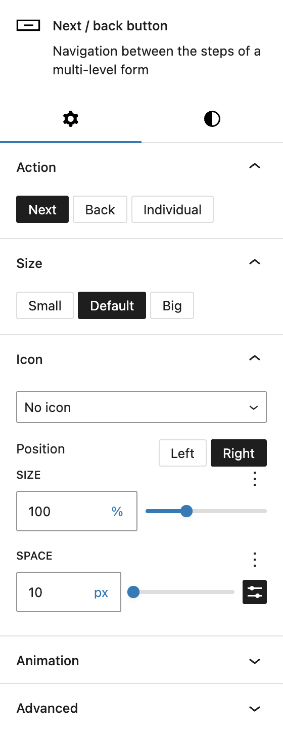
In the Action section, you can define which action the button should trigger. Next is selected by default. Other options include Back and Individual. If Individual is selected, a separate input field appears called Go to step number. You can add a step number here to skip steps. This is especially useful in combination with conditional fields, when the user has selected a specific option and can skip a section if it’s not needed.
Under Size, you can set if the button should appear either smaller or bigger, which are predefined settings that can be configured in the Greyd Global Styles.
In the Icon section it’s possible to add an icon to the button to be shown alongside the text. See the Button Icon Control component for more details.
The block also supports Animations. In the Advanced section, you can find settings for HTML anchor, additional CSS classes, the Greyd Styles Class, toggles to hide the block per breakpoint, and inline styling.
Styles

Under Styles, you can select one of the predefined button styles: primary, secondary, alternative, link and secondary link.
You can define a custom width for the button, with various options provided by the Range Unit Control component. You can also set different widths per breakpoint.
Under Individual button, you can enable design settings to be overwritten individually. For more details, see the Custom Button Style component documentation.
Video
Hi, this is Sandra from GREYD. Today I’d like to show you how easy you can build even complex multi-step forms with our form generator GREYD.Forms. For a positive user experience – and with this better conversions – it can be good, especially with longer forms, to not show them entirely from the beginning, but to have the user fill the form step by step. You can either prepare your form first and then move your fields into the multi-step container or you can build your form directly as a multi-step form. Both is possible. I will now build my example form directly with several steps. Therefore I place the block multi-step container in my form. Before dealing with the individual form steps, let’s have a look at the general settings first.
To start with, you can select the transition animation with which the form moves between its steps. Down here, you define that after filling all required fields within a step, the form will automatically go to the next step. Alternatively you can work with back and next buttons, which I will show you in a minute. You can also define whether you want to show a progress bar to the user either in form of a bar or with a pagination. For both you can then define the alignment, colors, size, border radius and for the pagination the space between the dots.
Let’s now create all form steps. Up here you can add and delete any number of steps. And in the box below, you then place the respective form field or fields for each step. Just enter for example an input field, and you can also restyle and layout your form as usual, for example with several columns.
As mentioned before, you can also add next and back buttons to your form. You will find a dedicated block that can be placed in each form step and comes with the usual formatting, design and layout options for buttons. The important setting is now, what the button should do. You can define it as a regular next or back button or you can also use it to jump to individually defined form steps. That way, you can make the user skip or repeat a form step. What you need to take care of is to not skip any required fields as otherwise the user will have problems submitting the form later.
When you now combine this feature for example with conditional fields, you can easily create complex automations in your forms. For example here: With conditional fields you could show all users that select option 1 a regular next button and all users that select option 2 will get a different next button that skips one or two form steps for example. So there are absolutely no limits here. And by the way, GREYD.Forms also helps you tracking and monitoring your forms as you can see here with each step the URL adapts, so I can see with analytics tools exactly where you lose a user at which step in your form.
For more videos and information please visit our Helpcenter.