The password field is used in forms where users can be created or registered. It is only relevant when the form operates in a mode that allows user management.

Settings
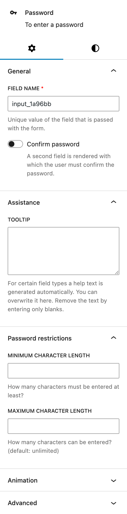
Under the General section, you can change the automatically populated field name that will be used when the form is submitted. Additionally, there is an option called Confirm password. If enabled, a second input field appears, prompting the user to enter the password again for confirmation. This helps prevent input errors during registration.
In the Assistance section, you can add a custom tooltip to guide users. By default no tooltip is shown, it appears next to the label if text is entered.
The Password restrictions section allows you to enforce minimum and maximum character lengths. By default, the maximum length is unlimited unless specified. The minimum character length helps ensure stronger passwords.
The block also supports Animations. In the Advanced section, you can find settings for additional CSS classes, the Greyd Styles Class and toggles to hide the block per breakpoint.
Styles
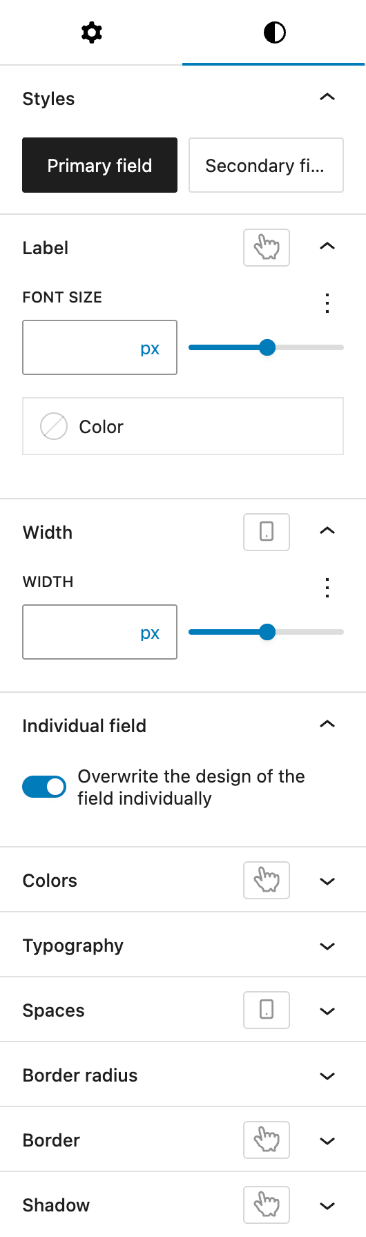
The Styles tab defines the visual appearance of the password field.
Under Styles, you can choose between two base styles — “Primary field” and “Secondary field” — as defined in the global styles. These presets allow consistent styling across multiple forms.
Under Label, you can adjust the font size and color of the field label. For the font size there are multiple options available, see the Range Unit Control component documentation.
The Width section allows you to control the field’s width. It’s also providing multiple options with the Range Unit Control component.
Within Individual field, you can enable a switch to override the global design settings. See the Custom Button Styles component for more details.