The Submit button block in Greyd Forms allows you to insert a submit button into your form. After placing the block, you can directly edit the label within the editor, if you want it to be different from “Submit” or the translation of the website’s language, if that is available.

Settings
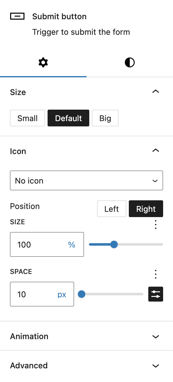
Under the Size section, you can choose between three predefined button sizes: small, default, and big. These presets are managed globally via the Global Styles panel.
The Icon section allows you to select an optional icon using the integrated icon picker. See the Button Icon Control component for more details.
The block also supports Animations. In the Advanced section, you can find settings for HTML anchor, additional CSS classes, the Greyd Styles Class and toggles to hide the block per breakpoint.
Styles
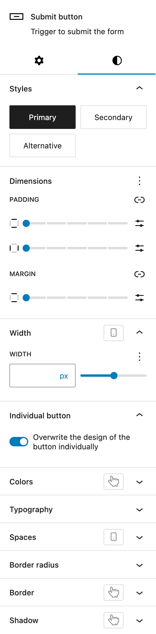
In the Styles section, you can choose between three different base style presets for the button: Primary, Secondary, and Alternative. These presets are defined and managed in the Global Styles panel.
The Dimension section provides options for padding for all sides and margin for top and bottom, powered by Core dimension controls.
Within the Width section, you can control the width of the button. Refer to the Range Unit Control component documentation for details. The width can also be adjusted per breakpoint.
Finally, the Individual Button section provides a link to the component for customizing a single button independently of global styles. See the Custom Button Styles component for more details.