The Forms section in the WordPress backend provides an overview of all created forms. This view uses the standard WordPress post type interface, displaying a list of all available forms with the title of the form and the date it was published.

Existing forms can be managed or removed through the familiar post management options in the post overview. To export a form, use the Export link when hovering over the preferred form entry. Exported forms can be imported again via the Import function next to the Create Form button, allowing forms to be transferred between sites or used as templates. Forms can also be exported in bulk by selecting multiple forms and using the Bulk actions dropdown at the top or bottom of the entries table.
Creating forms
New forms can be created using the Create Form button at the top of the overview screen. This will create a new post in the Forms post type and upon entering the editing page, you’ll be shown one of the existing patterns that have been curated to start off with.

Managing forms
When editing a form, it opens the familiar block editor. In addition to the regular that are provided by Core or the Greyd Plugin, you also have the ability to add custom Greyd Forms blocks. For an overview of all available blocks, see the Greyd Forms Blocks documentation.

The Settings allow fine-grained control over what happens after form submission, which emails are sent, and how interfaces and data retention are handled. The metabox is located below the form editor and is divided into several tabs, each covering a specific area of configuration: General, Emails, Interfaces, Automatic deletion of entries and Extended.
General
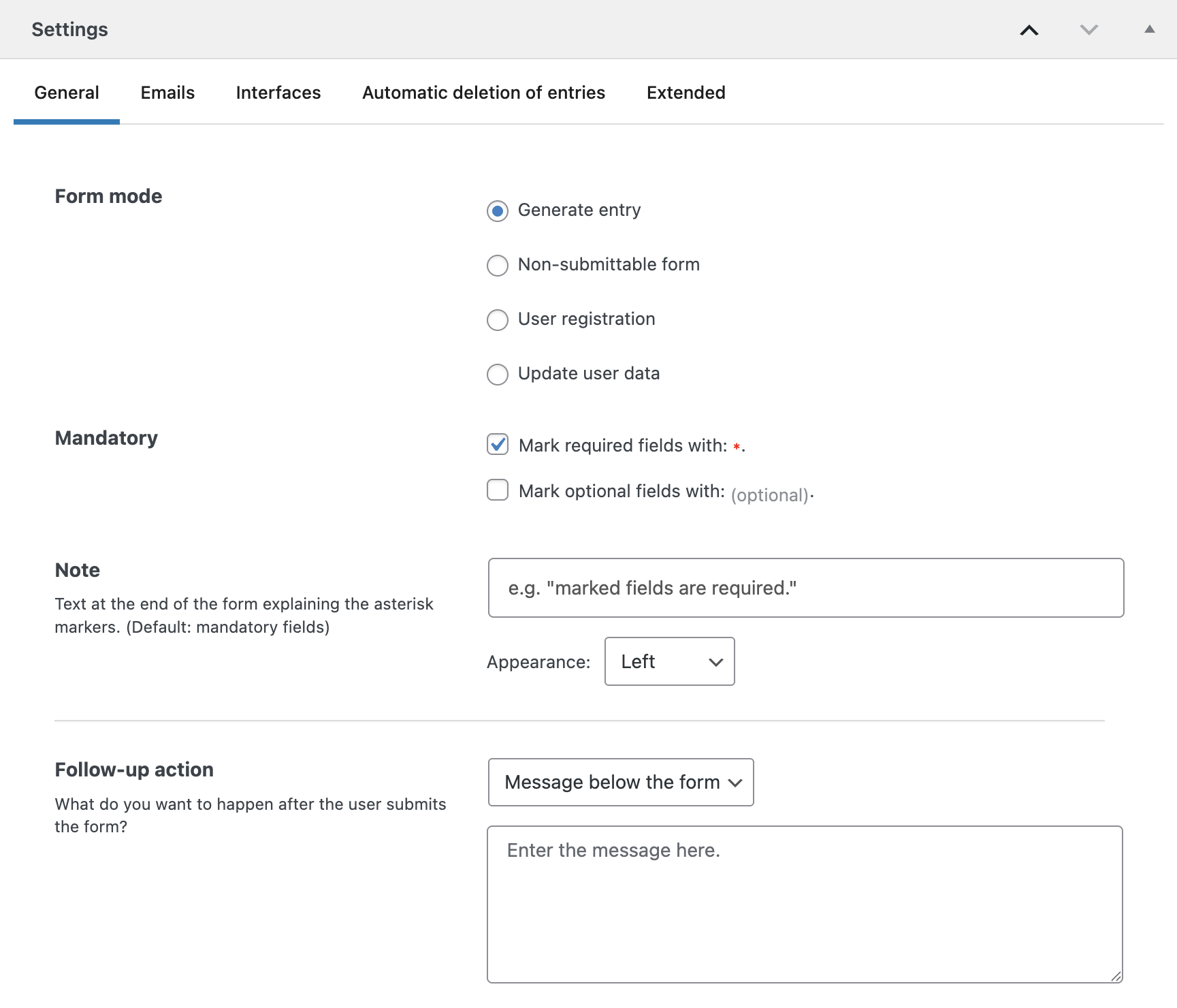
Under Form Mode, you can define what should happen after a user submits the form. Available options include generating an entry, using the form as a non-submitting calculator, registering a new user, or updating existing user data. These options are presented as radio buttons.
Under Mandatory, there are two optional checkboxes to customize the display of required and optional fields. The first adds an asterisk to all required fields, while the second adds the word “(optional)” to all non-required fields. A text input at the bottom lets you provide a short explanation about the asterisks shown in the form. By default, this is set to “Required fields.”
In the Follow-up action section, you can configure what the user sees after submitting the form. Available options include:
- A message below the form, entered directly in a text field.
- A pop-up above the form or a fullscreen pop-up. In both cases, a template named
form_popup_XXXXmust be created to define the design. A color picker allows you to define the background color of the pop-up. - A redirect to a specific page, selectable from a dropdown.
Emails
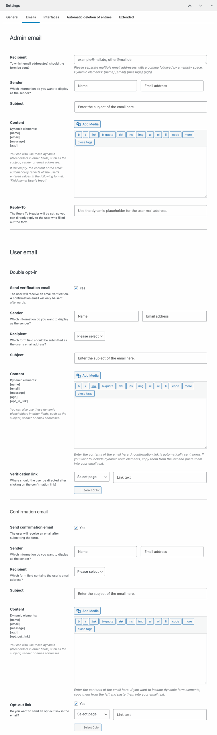
The email tab is divided into two sections: Admin Email and User Email.
In the Admin Email section, you can define the recipient addresses — multiple addresses should be separated by a comma and space. Placeholders for dynamic elements (if present in the form) are available below the input field and can be used dynamically throughout the settings.
You can also configure sender details, the email subject, and the content. If the content field is left empty, the system will automatically send all user input in a Field Name: User Input format.
The User Email section supports sending confirmation emails to users. To activate it, enable the checkbox for either the Double opt-in and/or the confirmation email. This reveals additional settings for sender details, recipient mapping (based on a specific form field), subject, and content. Again, if the content is left empty, the full form submission will be included.
If double opt-in is enabled, the user receives a verification email before the confirmation email is sent. You can also include a confirmation link in the email content and change all available fields for both emails if needed. If desired, an opt-out link can be added to the user confirmation email. Once enabled, you can define the redirect page, link text, and link color.
Interfaces

Interfaces configured globally in the general Greyd Forms Settings can be individually adjusted here. Each active integration offers mapping settings that allow you to assign form fields to the target system’s data structure. The setup depends on the interface you’re choosing.
In the screenshot, there’s an example setup for the Hubspot interface with just one field. The Create contact checkbox lets you automatically add a contact if the form is submitted.
Below you can assign fields from the form to the corresponding Hubspot entry. You can remove existing fields with the x icon and add new fields via the Add field icon below. Each interface is different in available options, but this is the common way to map form fields to any interface’s data points. For more information on the individual interfaces, see the Settings documentation.
Automatic deletion of entries

This tab controls automated deletion of form entries. You can choose which types of entries should be deleted: unconfirmed, withdrawn, or errored entries.
The deletion interval can be set to daily, weekly, or monthly. You can also define the minimum age (in days) of entries that qualify for deletion.
A deletion log can be emailed to a specific recipient and also multiple recipients, separated by comma and an empty space. Sender email and sender name can also be customized.
Extended

In the extended settings, you can enable tooltips to be hidden in the frontend, effectively reducing visual noise for the user.
You can also adjust the date format used for displaying form entries, ensuring consistency with regional or organizational standards.
