This section documents the custom blocks and core block extensions included in the Greyd Plugin. There is also a separate section for Greyd Components, which explains general functionality used across many of the Greyd blocks.
Skip to table of contents
Blocks
-
Accordion
The Accordion block allows you to display collapsible content on your page. It uses a parent–child structure where the parent block is the Accordion, and each child block is an Accordion Section. You can insert any other blocks inside an Accordion Section. Accordion Sections can be added directly in the editor using the plus sign […]
-
Anchor
The Anchor block allows you to define a target on the page that can be used in links and navigation menus to scroll to a specific section. This is especially useful for long pages where users need to jump between sections easily. When the block is added, a straightforward input field appears, letting you specify […]
-
Conditional Content
The Conditional Content block allows you to display content only when specific conditions are met. It’s a wrapper block that renders its child blocks only if the defined logic evaluates as true. If the condition is not fulfilled, no output is generated — meaning no markup is rendered at all, not even hidden via CSS. […]
-
Content Box
The Content Box block is a custom alternative to the Group block. It offers extended layout and design features, including sticky and pinned variations, advanced background options, as well as responsive and hover-specific styling values. Content Boxes can receive dynamic images as backgrounds (see Dynamic Images documentation) and can also be used as child blocks […]
-
Core Block Extensions
The Greyd Plugin extends the functionality of native WordPress core blocks with a variety of features that seamlessly integrate into the Block Editor. These enhancements are active automatically when the Greyd Plugin is installed and do not require separate activation. Features Unlike individual features, “Core Block Extensions” are a collective set of improvements made directly […]
-
Dynamic Image
The Dynamic Image block is a flexible alternative to the native WordPress Image block. While it includes most features of the core block, it extends its functionality with powerful dynamic image sources. These dynamic features are based on the Greyd Plugin’s Dynamic Tags system, allowing you to pull images directly from post meta, user data, […]
-
Greyd Components
We have created some custom components for our blocks. Beyond individual components, we have separate documentation for the settings in the Advanced section of each block, our Breakpoints feature and our implementation of the Pseudo-classes (normal, hover, active). Button Icon Control The ButtonIconControl component is a wrapper for settings related to setting an icon to […]
-
Hotspot
The Hotspot block allows you to overlay interactive hotspots on images or animations. These hotspots can trigger popovers containing any block-based content. It’s ideal for creating rich visual explanations, infographics, or guided interactions. A Hotspot block with a background image added. Two Hotspot Spots have been added as well in the top area and both […]
-
iFrame
The iFrame block allows you to embed external content via an iFrame directly into your post or page. When inserted, the block initially presents a simple input field where a URL can be entered. This makes it easy to display external web content such as maps, videos, or other websites. Once added, the block toolbar […]
-
List (Greyd)
The List (Greyd) block is a flexible alternative to the core List block. Unlike traditional list blocks, it uses individual child blocks — such as List element, Group, or Content Box — to build the list structure. This allows each list item to contain not just plain text, but any combination of blocks and content. […]
-
Popover
The Popover block is a custom block that displays a button which opens a popover or pop-up when clicked. Both the button and the pop-up are fully customizable, allowing a wide range of popover styles and behaviors. A Popover consists of a strict set of three blocks: the Popover wrapper containing exactly one Popover button […]
-
Post Table
The Post Table block is a custom layout block for rendering query results as a table. It can be found in the “Greyd” category of the Inserter and is used inside a Query Loop, just like the Post Template or Post Slider variations. Unlike those blocks, Post Table does not contain child blocks. Instead, each […]
-
Search (Greyd)
The Search (Greyd) block allows you to build dynamic, interactive search interfaces directly within the Block Editor. It serves as a container for other search-related blocks such as filter dropdowns, search fields and sort options. Combined, these elements enable users to create powerful custom searches that work in real-time and integrate seamlessly with query loops. […]
-
Tabs
The Tabs block allows you to organize content into easily navigable tabs. It uses a parent–child structure where the parent block is the Tabs container, and each child block is an individual Tab. You can insert any other blocks inside a Tab content area. New Tab blocks can be added directly in the editor using […]
-
Understanding the width options in Full Site Editing can be tricky. Sometimes blocks let you choose between content, wide and full width, sometimes they don’t. Here’s what you need to know:
With the option “Inner Blocks use content width” you can control whether inner blocks of a container have their own width options (content width, wide width, full width) or not. This setting is particularly important if you create page templates. If you don’t see the width options in a block, it is because the “inner blocks use content width” option has not been activated in the template or parent container.
Activate this option when
- pages in the backend (page editor) are to contain flexible content in different widths
- you have layouts where blocks are to be individually aligned between content, wide and full widths
Best Practice: Always activate it in the template if users need flexibility when maintaining content. Only deactivate it if all content is to be displayed in full width.
You will find this option in the site editor in you page template or the corresponding template part. Select the container block that contains the dynamic content (often a group). In the sidebar you will find the option “inner blocks use content width”.
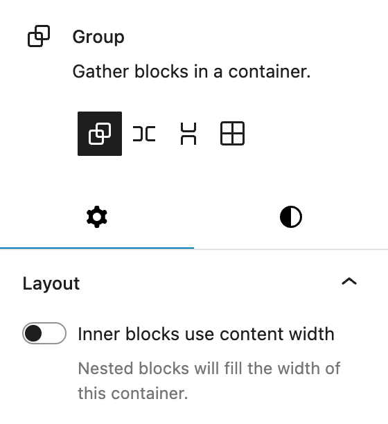
In the group block you will find the “inner blocks use content width” setting Interaction of template, content block and page backend
Level Task Page Template (FSE) Defines the layout for a type of pages (e.g. standard pages). Content Container Contains the placeholders for the actual page content. Page Backend This is where you insert the content – the width options depend on whether “Inner blocks use content width” has been activated in the template. How blocks behave
Setting Result Activated Inner blocks (except paragraph) have alignment options (content, wide, full width). Deactivated All inner blocks are automatically stretched to full width Exception 1: Paragraph Block
- The paragraph block never has its own width options.
- With the option activated: It always uses content width.
- With deactivated option: It is always displayed in full width.
Exception 2: Dynamic Template
- In these templates, there is never a width setting on the first level because the template does not know in which context it will be used later.
- The actual width options therefore not defined in the template itself, but only in the integrated page/instance.