The Button (Greyd) block is used exclusively as a child of the Buttons (Greyd) block and provides an individual editing experience for each button. Because it is a child block, it cannot be inserted on its own and is only available inside a Buttons (Greyd) wrapper. This block inherits styling and behavior from its parent while offering additional per‑button customization options.
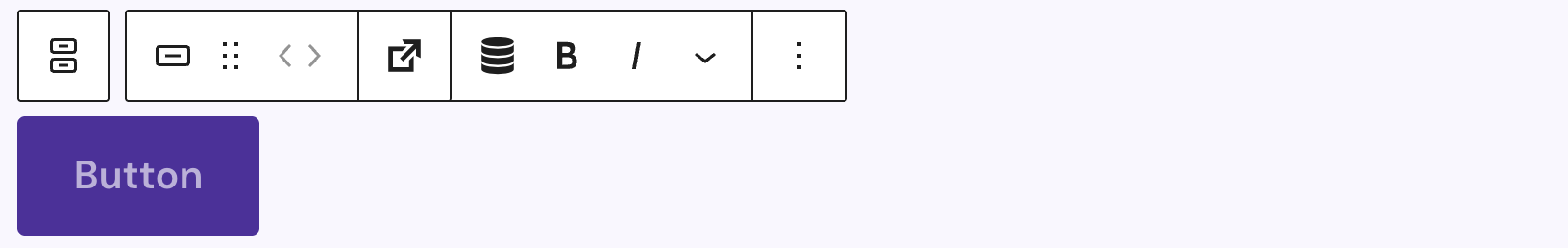
In the editor, the button label is a RichText field rendered inside a button element. You can format the text using the standard inline tools, and the preview reflects the style chosen in the Sidebar settings for a consistent editing experience.
The toolbar combines standard block controls with RichText formatting tools. From here, you can insert Dynamic Tags into the label for context‑aware content and use the dedicated Trigger button to add interactive actions.
Settings

Under Icon, you can enhance the button with an icon selected from the built‑in picker. See the Button Icon Control component for more details.
The block also supports Animations. In the Advanced section, you can find settings for HTML anchor, additional CSS classes, the Greyd Styles Class, toggles to hide the block per breakpoint and Inline Styling.
Styles
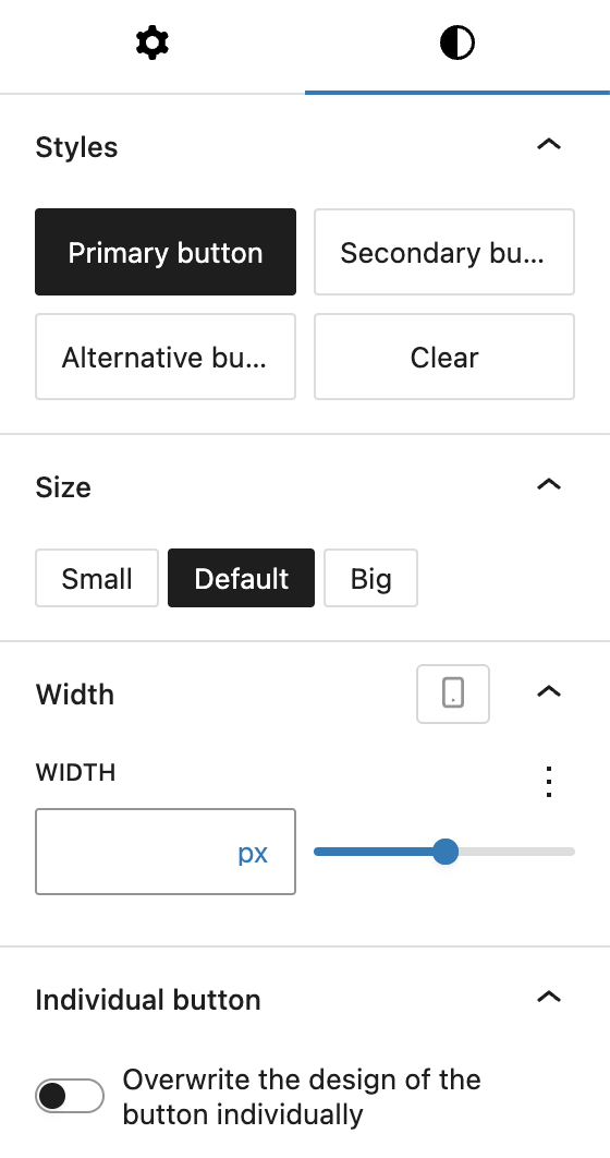
Use the Styles tab to refine the button’s design. The block includes several predefined visual styles such as Primary button, Secondary button, Alternative button, and Clear.
You can choose a Size of Small, Default, or Big, which changes the font size and padding.
You can also set a Width and choose an option from the Range Unit Control component. When a fixed width is defined, an additional alignment toggle appears. If enabled, Align content (labeled Align Icon with Text if an icon is present) and set horizontal alignment to left, center, right, or spreaded. If an icon is added, it sits by default at the outer edge; the alignment controls let you adjust its position relative to the text.
For full design control, activate Overwrite the design of the button individually. This reveals the Custom Button Styles component panel, allowing this button to override the inherited design from its parent container.
Video
Hi, this is Sandra from GREYD. Today I’d like to show you the features of the GREYD button block compared to the standard button in Gutenberg. This button comes with some very nice additional options. After placing the GREYD button on your page you can then define the alignment of the button in the wrapper element and place as many buttons next to each other as you like.
In the button itself you will then find the following options. You can at first select one of the global button or link styles. You can also work with the GREYD trigger picker, a feature for which we have a dedicated tutorial video in our Helpcenter. And here on the right you will also find some text formatting options like italic, uppercase or crossed out. The text can be typed directly in the editor.
On the right you can then define the appearance of your GREYD button in more detail. For example, you can define the size. The width can be defined individually for each breakpoint and comes with several different units. Additionally, you can also add an icon to your button and define its position, size and spacing.
If you want to deviate from your global button or link style just activate the option down here and you will find all styling options from the customizer. You will still be able to switch between your global styles, only the options that you’ve set down here will then differ from the selected style.
So as you can see there’s a lot of additional options in the GREYD button compared to the standard button of Gutenberg.
For more videos and information please visit our Helpcenter.