The Content Box block is a custom alternative to the Group block. It offers extended layout and design features, including sticky and pinned variations, advanced background options, as well as responsive and hover-specific styling values.
Content Boxes can receive dynamic images as backgrounds (see Dynamic Images documentation) and can also be used as child blocks of the List (Greyd) block (see List (Greyd) documentation).
You can find the Content Box block in the Greyd category of the block inserter. An empty Content Box is essentially a blank wrapper that can hold any other block. Blocks can be inserted using the standard block inserters.

In addition to the standard block controls, the toolbar includes:
- Align: Controls the horizontal alignment of the box. Alignment only has an effect if a Maximum width is set.
- Trigger: Adds dynamic trigger actions to the block (see Trigger documentation).
Settings
The Content Box offers different block variations:
- Content Box (default): A standard wrapper element for grouping any content.
- Sticky Box: Remains at the top of the viewport while scrolling, but only within the boundaries of its parent container.
- Pinned Box: Fixed in the viewport and always visible, even when scrolling.
- Floating Box: Positioned independently from the surrounding layout, disappears when scrolling.
The Sticky Box has some additional Sticky Settings, while the Pinned Box and Floating Box share the same set of Position Settings.
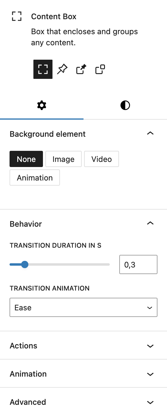
Under Background element, the Content Box offers extensive settings, see the next section below for more details.
Under Behaviour, you can change the transition duration in seconds and the transition animation, for example when setting different hover colors. You can choose from these options:
- Ease
- Linear
- Ease in
- Ease out
- Ease in out
Under Actions, you can assign a Trigger Event to the Content Box here (see Trigger documentation).
The block also supports Animations, including background animation. In the Advanced section, you can find settings for HTML anchor, additional CSS classes, the Greyd Styles Class, CSS Animation, toggles to hide the block per breakpoint and Inline Styling.
Background element
The Background element can be an image, video, or animation. This feature is also shared with the Content Box block. You start by selecting the type of background via a button group: None, Image, Video, or Animation.
For all background types other than “None”, you can also configure opacity and scroll behavior. The scroll behavior determines how the background moves: it can scroll with the content, be fixed, or apply vertical/horizontal parallax effects. Since fixed and parallax behaviors can cause rendering issues on iOS, they are disabled on mobile by default. You can override this with a toggle and fine-tune the Parallax speed with a percentage-based control (−200% to +200%).
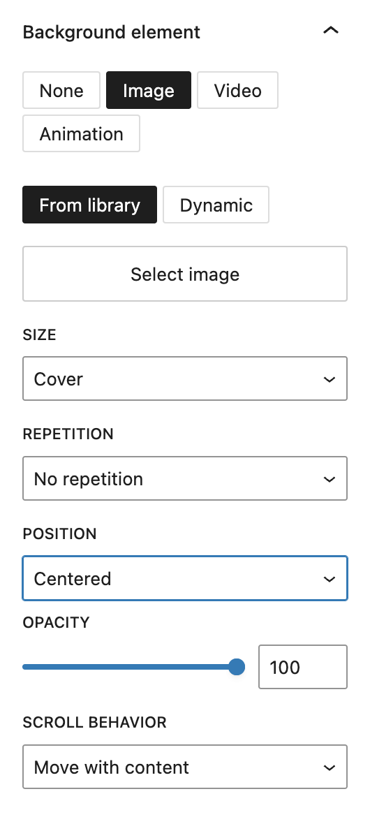
If you choose Image, you can select either a static image or a dynamic one in the sidebar. The dynamic images can be the featured image, website logo or any additional field on the post type that is a “file/media” field type.
A block toolbar button also allows replacing the image easily but only shows the selection settings.
Additional image settings include size (Cover, Contain, Initial), repetition options (horizontally, vertically or both), and positioning (Top, Center, Bottom and for each of these Left, Center, Right).
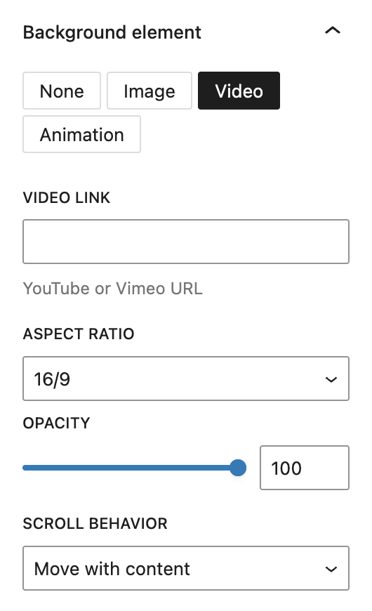
If you choose Video, you can embed a video from YouTube or Vimeo by pasting a URL. You can also define the aspect ratio (16/9, 21/9, 4/3, or 1/1).
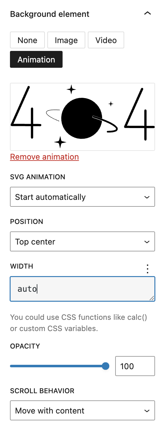
When using Animation, you can upload a .json animation file (see the Lottie documentation). Available settings include playback behavior at SVG animation (e.g. Start automatically, Start as soon as visible, Sync with scroll), positioning, and width. For width it’s possible to use CSS functions like calc() or custom CSS variables.
Sticky Settings

Available only when the variation is set to Sticky Box. A sticky box remains at the top of the viewport while scrolling, but only within the boundaries of its parent container.
With the Offset setting, you can change the space between the top of the screen and the Content Box, when the box remains at the top of the viewport. By default there is no space and you can either add a positive or negative value. The setting is based on the Range Unit Control component and can be adjusted per breakpoint.
The Show preview button allows you to activate a live preview in the editor. You can deactivate this preview by clicking the button again.
Position Settings

The Position settings are only available when the variation is set to Pinned Box or Floating Box. Like in the Sticky Settings, there’s a Show preview button to preview the behaviour of the Content Box in the editor.
The options for Top, Right, Bottom and Left are empty by default. If a value is added, the box will be positioned to the side where the value is set, with the value as gap between the viewport side and the Content Box. All options offer the settings of the Range Unit Control component, with spacing presets available to choose from. Every option can also be individually set per breakpoint.
Styles

In the Styles tab under Colors, you can set a text and background color for the Content Box. You can also set a separate color for the hover state.
Under Spaces, you can set spacing for Inside (padding) and Outside (margin) the Content Box. The settings are combined for top and bottom as well as left and right, which can be separated. The setting offers various options based on the Range Unit Control component, with spacing presets available as well. All values can be also adjusted per breakpoint.
Under Size, you can set a Minimum height and Minimum width with the Range Unit Control component. If a maximum width is set, a separate setting called Alignment appears below with the options Left, Center and Right. The Alignment of the content setting is always available, with the options Top, Center, Bottom and Spreaded. All settings can be adjusted per breakpoint.
Under Border radius you can set rounded corners via the Border Radius component.
Under Border you can set border width, style and color and adjust it for the hover state.
Under Shadow you can set a drop shadow for the popover with the Drop Shadow Control component.
Video
Hi, this is Sandra from GREYD. Today I’d like to show you the features of our content box block. Content boxes are ideal if you want to highlight certain content sections, link them or have a background or effect. To some extent content boxes do the same as the group block, but they offer you a lot more options. After placing a content box on your page, you can fill it with any content. So let’s just fill it with a heading and some text.
If you want to link your box or trigger an event with it, the trigger picker is available to this block. If you want to learn more about that, we have a dedicated tutorial video in our Helpcenter. But now let’s have a look at the content box settings on the right. At first you can define colors for the text and a background. You can select from your global colors or also work with any individual color of your choice.
For the background you can also set a gradient. Therefore you can place as many color points as you like and you can also create hard edges by placing two color points on top of each other. For linear gradients you can also individually adapt the angle or switch to the radial one.
For the color settings and also several other options that we will cover later in this video, you can also activate a hover effect by clicking here, so the appearance will change when the user hovers over the box. And you will find the same options as before a second time for the hover state.
Next it’s spaces. You can define paddings and margins, thus an inner space between a border and the content, as well as a space around for each side and with different units and also individually for each breakpoint. Under size you can set a minimum height, which can also be varied per breakpoint.
With the border radius you can round the box corners again individually for all four corners. For the border itself, you will find different styles as well as controls for the width, color, hover effect and again all four sides individually.
You can also add a drop shadow easily and define it horizontally and vertically, define how big it should be, how much you want it to stretch or blur, how much opacity you want and where it should be positioned.
Independently from whether your content box has a background color, you can also add an image, video or animation and will find different settings including scroll behavior and parallax effects. Should you not see the animation settings here, please have a look at your GREYD.SUITE settings — you may need to activate Lottie Library there.
Under behavior you can also define the hover effect in detail in terms of pace and the type of animation.
Content boxes can also be used for trigger events. If you want to learn more about that, we have a dedicated tutorial video for you in our Helpcenter.
And last but not least you will find usual anchor and CSS settings down here. Before we finish, let’s have a look again at the frontend, where I have prepared some content box examples.
Up here I have a classic box with a background color and border radius and a hover effect so color and border change on hover and there’s different content in my box.
In the next example I have placed two content boxes on top of each other, one with a background color gradient with low opacity and one with a background image. I have also made the text transparent in the normal state and white in the hover state, which creates a really nice hover effect.
And down here I have a variant with a gradient and very small paddings. But there’s actually even more. A while ago we added some variations to the content box block that you can select up here. So we have the regular content box as discussed earlier and then we have sticky box, pinned box and floating box.
Let’s have a look at some examples in the frontend to see what’s the difference. Sticky box, as the name already indicates, remains sticky at the top of the page as soon as it reaches it. If you want to, you can define an offset, so for example if you don’t want it sticky right on the top but maybe below the header you can add an offset here. The other options are exactly the same as we’ve just seen for regular content boxes.
Then we have the pinned box, which is sticky at a certain point of your website in the visible section, so it always stays here and you can define exactly where you want it to stay and can also make that breakpoint individual. The pinned box is also very important for example if you want to create sticky headers. If you want to learn more about how to make a sticky header with the pinned box, just have a look at our navigation tutorial in the Helpcenter.
And the last option is the floating box, which remains fixed within a certain section. For example here, we have a floating box that lies within a cover block and it always remains in that position within that cover block. The options are exactly the same — we have the positioning here with the possibility to make that breakpoint individual.
For more videos and information please visit our Helpcenter.