While the Greyd Plugin provides its own advanced button blocks — see the Buttons (Greyd) documentation — some enhancements are also applied to the Core Button block. These aim to make simple buttons more flexible and visually consistent with the rest of your design system.
Settings

The Design panel offers additional layout and sizing options not available in the core version.
You can set:
- Size: Choose between Small, Default or Big
- Width: Define a custom width
An icon can be attached to the button, using a familiar interface also found in Greyd’s custom button blocks. See the Button Icon Control component for more details.
Trigger
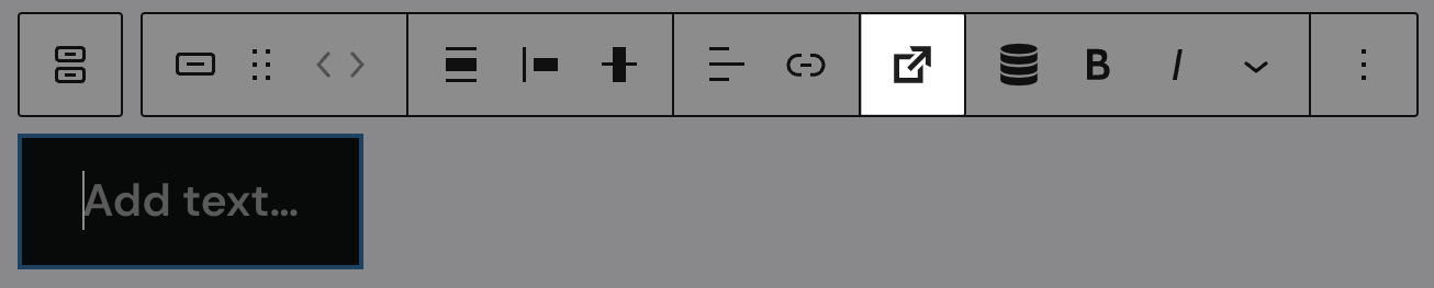
The toolbar of the block includes an additional Trigger button that allows assigning dynamic trigger actions. For details, see the Trigger documentation.
Advanced settings
The following advanced features are also available:
- Inline CSS: Add block-scoped CSS declarations without needing a selector
- CSS animation: Apply viewport-triggered CSS-only animations to the button