The Column block inside the Columns parent block inherits a modified 12-column Bootstrap CSS grid system, which allows for precise control over layout behavior at different breakpoints. Each column can be individually configured to adjust its width, offset, order, and visibility across devices.
Width
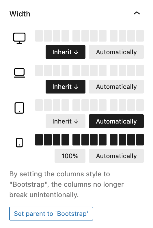
The Width panel lets you define the column span per breakpoint using a GridControl. You can either assign a fixed value, inherit the value from the previous breakpoint, or set it to auto. If the parent Columns block is not using the Bootstrap style, a warning appears prompting you to switch styles to prevent layout issues. A single click on Set parent to ‘Bootstrap’ applies the necessary style automatically.
Offset
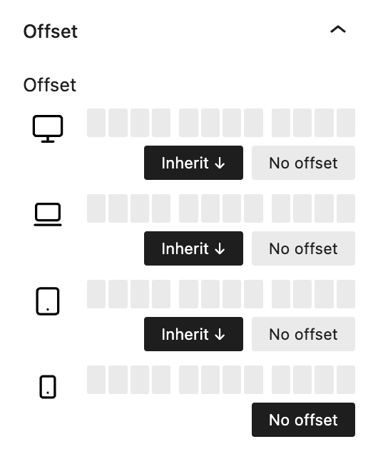
With the Offset setting, you can add spacing to the left of a column, again configurable per breakpoint using the same GridControl logic. Values can be explicitly set, inherited, or set to No offset.
Order
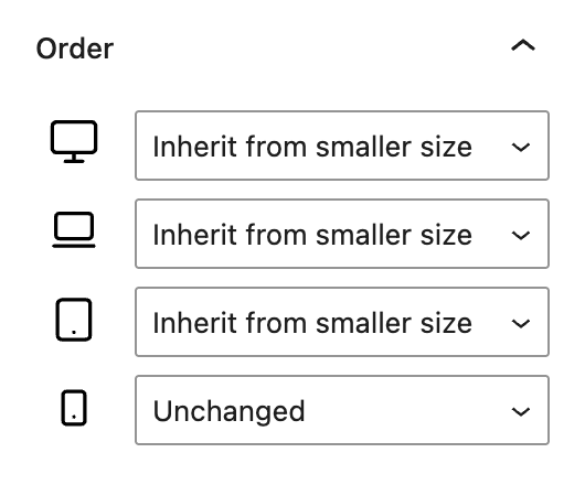
The Order setting allows you to control the visual order of columns for each breakpoint. You can select the column at the Start, in positions 1–6, or at the End. Like other settings, the order can also inherit from the lower breakpoint.
Hide
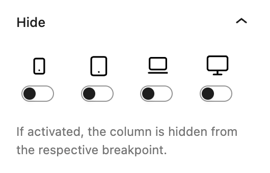
The Hide panel provides toggle controls to hide the column on specific breakpoints. This feature works similarly to the Hide block setting in Advanced settings, but is scoped specifically to individual columns.
Advanced settings
In addition to these layout features, the Column block also supports Inline Styling via the Advanced panel allowing for scoped styling without extra markup.