The native Columns block is significantly enhanced with the Greyd Plugin to support layout flexibility, shared height controls, background layering, and full design control. These features provide both visual and structural improvements without breaking core compatibility. Also see the Column Core Extension documentation for more details.
Settings
Background Element
The Background element can be an image, video, or animation. This feature is also shared with the Content Box block. You start by selecting the type of background via a button group: None, Image, Video, or Animation.
For all background types other than “None”, you can also configure opacity and scroll behavior. The scroll behavior determines how the background moves: it can scroll with the content, be fixed, or apply vertical/horizontal parallax effects. Since fixed and parallax behaviors can cause rendering issues on iOS, they are disabled on mobile by default. You can override this with a toggle and fine-tune the Parallax speed with a percentage-based control (−200% to +200%).
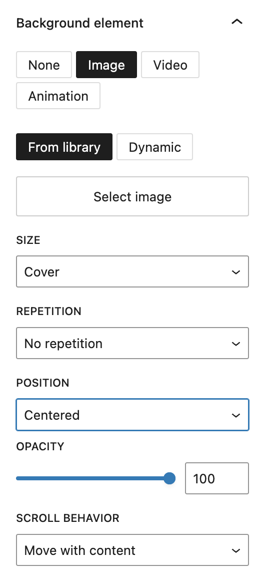
If you choose Image, you can select either a static image or a dynamic one in the sidebar. The dynamic images can be the featured image, website logo or any additional field on the post type that is a “file/media” field type.
A block toolbar button also allows replacing the image easily but only shows the selection settings.
Additional image settings include size (Cover, Contain, Initial), repetition options (horizontally, vertically or both), and positioning (Top, Center, Bottom and for each of these Left, Center, Right).
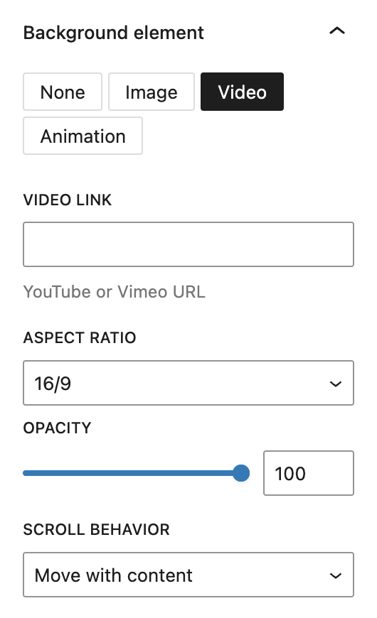
If you choose Video, you can embed a video from YouTube or Vimeo by pasting a URL. You can also define the aspect ratio (16/9, 21/9, 4/3, or 1/1).
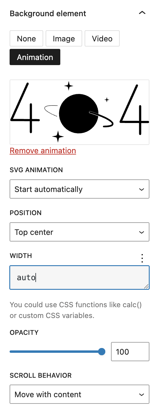
When using Animation, you can upload a .json animation file (see the Lottie documentation). Available settings include playback behavior at SVG animation (e.g. Start automatically, Start as soon as visible, Sync with scroll), positioning, and width. For width it’s possible to use CSS functions like calc() or custom CSS variables.
Overlay
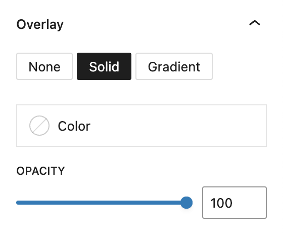
You can add an overlay on top of the background to tone images or add visual contrast. You choose between None, Solid, or Gradient. Once selected, the overlay can be styled using either a solid color or gradient picker, and you can adjust its opacity.
Pattern
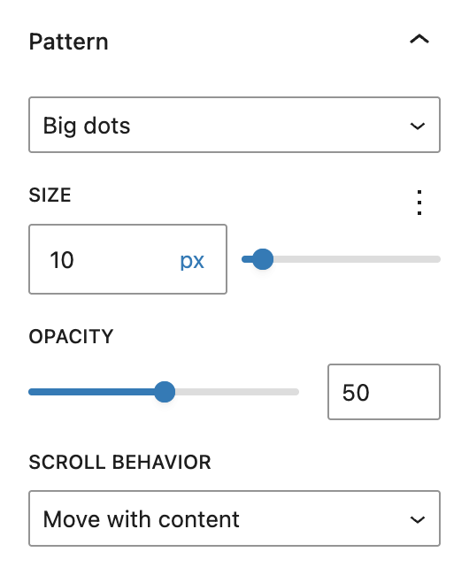
The Pattern layer allows you to add texture or watermark-style visuals. Choose from various preset patterns like dots, grid lines, crosses, or squares. You can also select Custom pattern to upload an image. Available options include size, opacity, and scroll behavior (move or fixed).
Separator
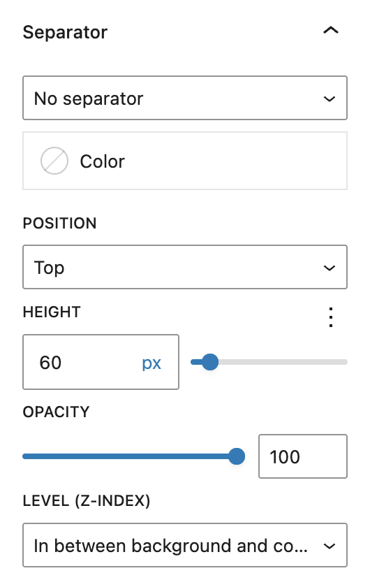
Finally, separators are decorative SVG shapes placed at the top and/or bottom edges of the block. You can choose from many shapes such as Waves, Clouds, Curves, or Triangles. If a separator is selected, you can configure its color, position (top, bottom, both, or asymmetrical), height, opacity, and stacking level (in between background and content or in front of background and content).
Styles
Block Style
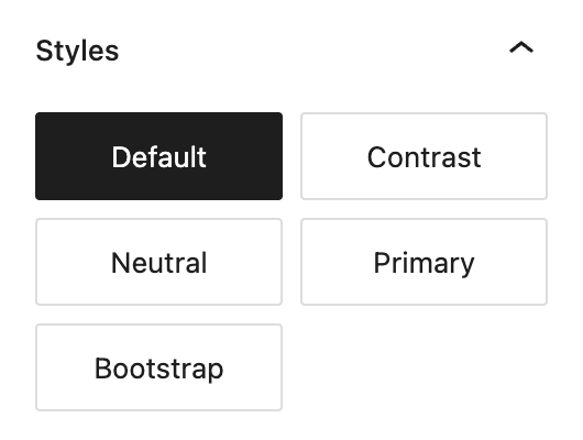
In the Block Styles section there’s an additional style called Bootstrap which adds some extra CSS to mimick behaviour from the Bootstrap framework.
Spaces
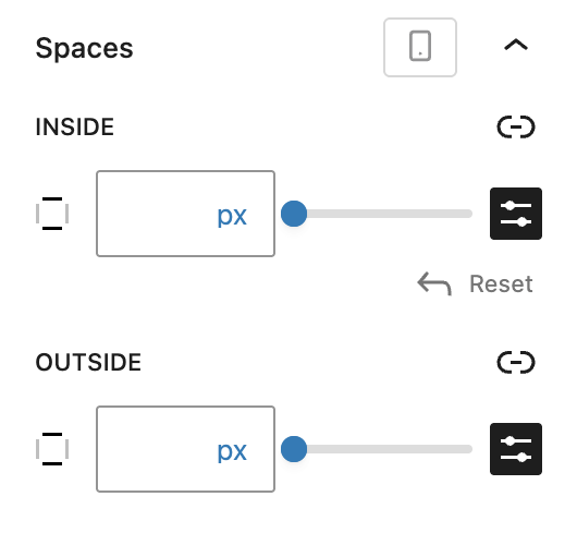
In addition to the core dimension controls, the Inside (Padding) and Outside (Margin) controls under Spaces offer some more flexibility as they can be configured per breakpoint.
Advanced settings
In the Advanced panel, you’ll also find the Stretch elements to same height option, which ensures consistent vertical alignment between columns or inner content like Content Boxes. You can choose to apply this stretching starting from a specific breakpoint (Tablet and larger, Laptop and larger or Desktop only).
Finally, the block supports Styles class, Hide per breakpoint, Disable element / Hide entirely, and Inline Styling for further layout and styling control. See the Advanced section documentation for more details.
Video
Hi, this is Sandra from GREYD. Today I’d like to show you the abundant options that the columns block offers you in GREYD.SUITE. This is a block that saves you from a lot of design plugins, as all these designs here are possible out of the box. So columns give your website its structure. When you add a columns block, you can select a layout right away or if you skip that step, a two-columns-layout will automatically be created.
So now you can make settings on different levels and we will start here with the parent column element. Here in the toolbar you can at first decide whether the column should use the content width as defined in the site editor, the wide width also defined in the site editor, or full width. You can also define the alignment of elements that will be placed in your columns. On the right you can again define the number of columns and decide whether you want the individual columns to be placed under each other automatically on smaller screens.
Next you can add an image, video or animation to your background and then set the size, opacity, scroll behavior and a couple of other settings. If necessary you can add a second layer, a color layer, either just one color or also work with gradients. You can define the opacity. After the same principle you can also add a pattern to your background, either one of the presets or a custom pattern, and define its size, opacity and scroll behavior.
With separators you can create intermediate areas. To do that, select which type of separator you’d like to have, define its size and opacity, and decide whether the separator should be between your content and background or in front of both. Down here you can define paddings and margins for different screen sizes and also individually for each side. As always you can add animations to this block.
In the advanced settings there are some interesting options. For example you can define what should happen when you have three columns with content boxes of different lengths. Do you want them to stretch to the same height or not? You can also change that individually per breakpoint. As always you can work with HTML anchors and CSS and you can hide the entire column in the frontend, which is a very handy feature if you are preparing a new section on your website that you don’t want to be visible yet.
Let’s move on to the design settings of the parent element. Here you can define colors for text, background and, if applicable, links in your columns. For the background you can again work with gradients. You can create as many color points as you like. When you place two color dots on top of each other, you can create hard edges. You can work with linear or radial gradients and, if necessary, change the angle. Down here it’s about padding, margin and block spacing. If you want to differ from your global settings as set in the site editor, you can do that here. You can also work with a border and/or border radius.
Now let’s have a look at the individual columns. Design settings are pretty much the same, but there are some important differences. With this option you can define that the content inside the column uses the content width and not automatically the maximum available space. If necessary you can also adjust the global settings here specifically for this column. Then you have the width settings to define the width of the column. You may wonder why you have two width options. This is because we added some necessary options to the native Gutenberg ones, but it’s not possible to integrate them directly. Both options work, but ours offer more possibilities.
For example you can define the width individually per breakpoint and say that this column should be larger on bigger screens, smaller on smaller screens and full width on mobile screens. You can also indent columns, again individually per breakpoint. You can change the order, which is very useful if you have two or three columns next to each other. Let’s say this one is the most important, but automatically on mobile screens when the elements stack, it becomes the second one. You can set it to be the first one on mobile and from a higher breakpoint place it in the middle. To make sure this works properly, you should define these settings not just for one column but for all of them. Sometimes it might also make sense to hide individual columns depending on the breakpoint. That’s what you can do here.
For more videos and information please visit our Helpcenter.