The Navigation block is enhanced by the Greyd Plugin with several custom features that give you deeper control over submenu behavior, anchor-based highlighting, and individual design customization. The Submenu block, Page Link / Custom Link block, which are child blocks of the Navigation block, also get enhanced features.
Settings
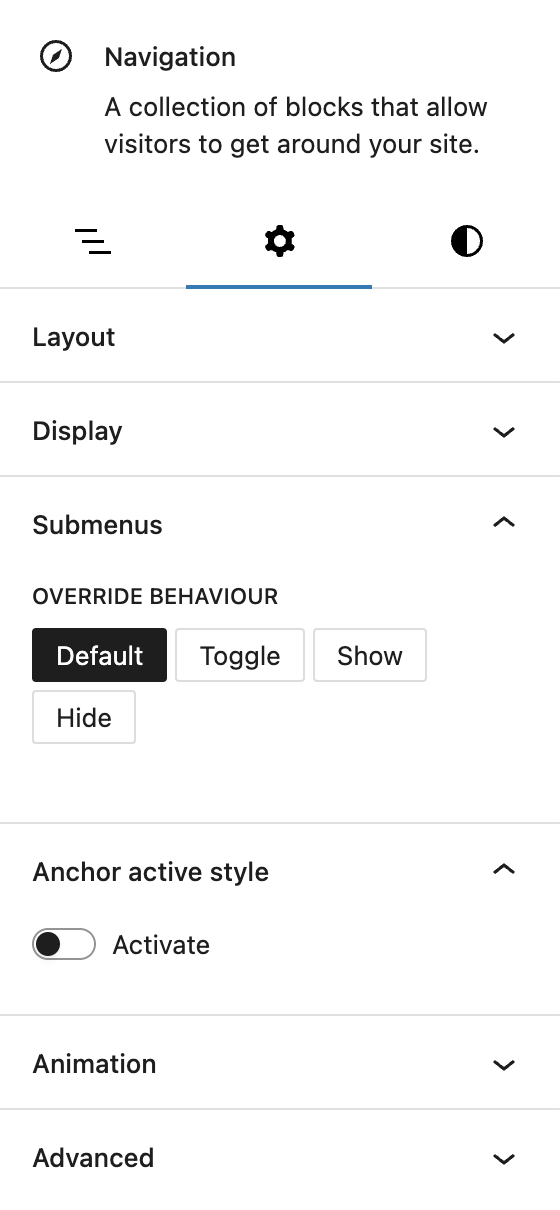
Submenu Behavior
Greyd introduces a Submenus panel that allows you to override the default WordPress behaviors (click or hover) used to show and hide submenus. When activated, this override disables the core submenu settings and replaces them with a dedicated Override behaviour control. You can choose between:
- Default: Keeps the original submenu behavior untouched.
- Toggle: Submenus open and close with a click.
- Show: All submenus are always visible.
- Hide: All submenus are hidden.
This gives you full control over how navigation behaves, especially useful for touch interfaces or accessibility-focused layouts. Please note that Show and Hide override the default submenu behaviours.
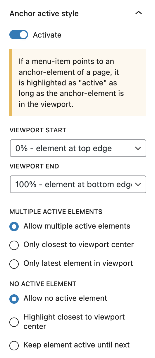
Anchor Active Style
If your menu contains links to anchor elements on the same page, you can use the Anchor active style feature to highlight those links dynamically while scrolling. The block will detect when the linked anchor element is within the viewport and visually mark the menu item as active.
You can enable this behavior with a simple toggle and fine-tune when it triggers using Viewport start and Viewport end settings, which define the visible area where the anchor is considered active (e.g. 20% from top to 80% from top).
To manage how multiple anchors behave at once, you can set rules under Multiple active elements, choosing whether all visible anchors are marked active, only the one closest to the center, or the last one entered. Similarly, if no anchors are visible, the No active element setting defines what should stay active — if anything.
Advanced Support
In addition to these features, the Navigation block supports the Styles class, Hide per breakpoint and Inline CSS. See the Advanced panel documentation for more details.
Styles

Styles
Several Block styles are added to enhance the visual appearance of the navigation items with just a click. The styles include Primary button, Secondary Button, Alternate button, Chip and Clear.
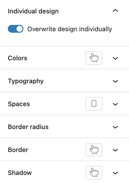
Overwrite Design Individually
For complete visual control, you can enable Overwrite design individually, which unlocks the full Custom Button Styles component for each menu item. In addition to the hover, the active pseudo-class is also available for the Colors, Border and Shadow settings.
Navigation child blocks
The child blocks of the Navigation block, which are Submenu, Page Link and Custom Link, are enhanced in the same way for both the Styles (block styles and overwriting design), as well as in the Advanced panel having the Styles class and Hide per breakpoint.