The Separator block is extended with the Greyd Plugin with additional layout options, styling controls, and more flexible visual presentation — especially when used responsively.
The Alignment control in the block toolbar has been extended to offer all alignment options: wide width, full width, align left, align center and align right. However, this setting only has a visual effect if a responsive Width under Sizes in the Styles settings.
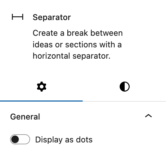
The Greyd Plugin also replaces the core Dots block style with a custom toggle called Display as dots. When enabled, this changes the separator from a solid line to a row of dots. Unlike the original core style, Greyd’s implementation offers extended options.
The Block styles are simplified: the default Dots style is removed and replaced with a single style named Bar, which applies to the default line separator.
In the Styles settings, styling controls allow for fine-grained visual adjustments depending on whether the separator is displayed as dots or a line:
- If Dots is enabled:
- Adjust the Size of the points
- Set the total Width of the dotted line
- If Dots is disabled:
- Control the Line weight
- Set the Width
- Apply Border radius for rounded edges
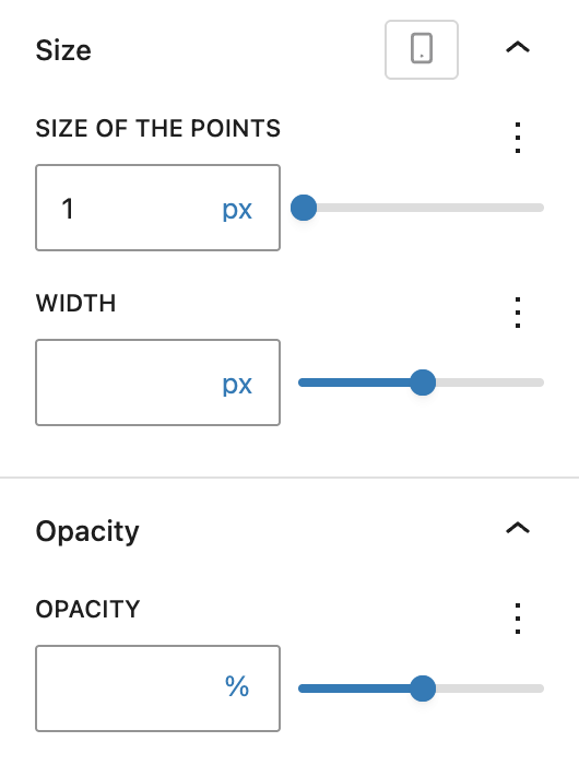
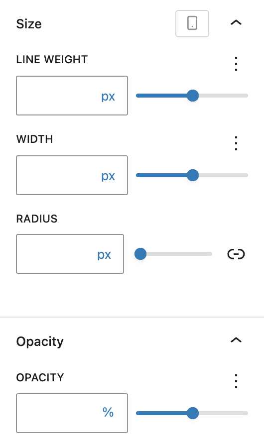
These settings can be configured per breakpoint. In both cases, Opacity can be adjusted using a responsive Range Unit Control component.
Lastly, the Advanced panel includes support for Styles class, CSS animation, Hide per breakpoint and Inline CSS. See the Advanced panel documentation for more details.