The Site Logo block is enhanced by the Greyd Plugin with responsive size controls, giving you full control over how your logo scales across different devices.
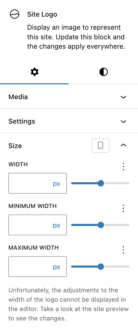
You can define the Width, Minimum width, and Maximum width using Range Unit Control component, which can be customized per breakpoint. These settings allow you to fine-tune the logo’s behavior within flexible layouts — ensuring it remains readable on small screens while fitting neatly into header designs on larger breakpoints.
The Advanced panel includes support for Styles class and Hide per breakpoint. See the Advanced panel documentation for more details.