The Spacer block gets provided a custom Scaling feature by the Greyd Plugin that turns a static spacer into a fully responsive layout tool.
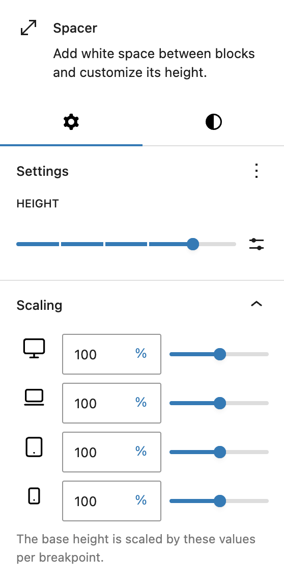
Instead of assigning a fixed height only, you define a base height and then adjust it per breakpoint — Desktop, Laptop, Tablet and Mobile. Each breakpoint scales the base value proportionally, allowing for smooth vertical spacing that adapts to different screen sizes without duplicating spacer blocks.
Additionally, the Spacer block supports Hide per breakpoint and Inline CSS. See the Advanced panel documentation for more details.