The Video block is extended by the Greyd Plugin with responsive and mobile-specific features that offer better control over video delivery and layout across devices.
Settings
One of the key enhancements is the Mobile video option, which lets you define an alternate video to be shown on smaller screens.
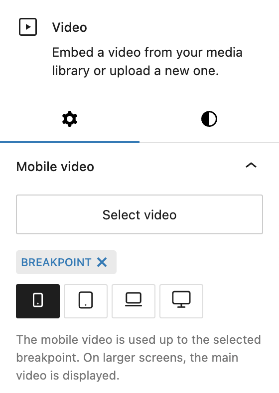
Using the Select video control, you can upload or choose a secondary video file from the media library. Then, define the Breakpoint at which this alternate video should be used — options include Mobile (default), Tablet, Laptop or Desktop. The selected mobile video will be displayed on screens up to and including the chosen breakpoint, while the main video plays on larger screens.
In the Advanced panel, the block supports the Styles class, CSS animation, Hide per breakpoint and Inline CSS. See the Advanced panel section for more details.
Styles
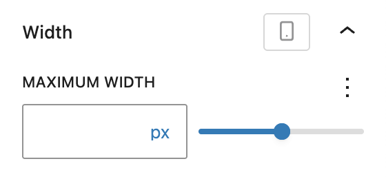
In the Styles section, you can set a Maximum width for the video block using a Range Unit Control component, helping you control layout flow in wider sections or prevent videos from stretching too far. The width can be set per breakpoint.