The Dynamic Image block is a flexible alternative to the native WordPress Image block. While it includes most features of the core block, it extends its functionality with powerful dynamic image sources. These dynamic features are based on the Greyd Plugin’s Dynamic Tags system, allowing you to pull images directly from post meta, user data, or other content contexts.

When inserted, the Dynamic Image block initially shows a small image icon with drag handles around its container. These handles allow you to manually set width and height. Unlike the core Image block, there’s no placeholder state—the block is meant to be populated with dynamic data.
The toolbar contains the standard block controls along with additional tools:
- Align: Supports none, wide with, full width, left, center, and right alignment.
- Caption: Toggles a rich text caption field below the image.
- Trigger: Allows you to attach interaction-based triggers (see Trigger documentation).
- Select image: Opens the dynamic/static image selector, identical to the sidebar control.
You can configure all settings, including alignment, caption, and dynamic image sources, even before selecting an image. If a static image is used, a live preview is shown. When a dynamic image is selected, the preview keeps showing the icon, and the name of the data source is displayed instead.
Settings

Under Select image, you can find the main feature of the Dynamic Image block, which offers the ability to choose between static and dynamic image sources.
- From library: Select any image from the WordPress media library.
- Dynamic: Choose a dynamic image source, such as the featured image of a post or a custom meta field (see Dynamic Tags documentation).
If you choose a static image, a Resolution selector appears to let you pick the image size (e.g., thumbnail, medium, large). For dynamic images, a Preferred resolution dropdown is available. This preference is taken into account if the requested resolution exists, but the final rendered size depends on what’s actually available.
Note: If you use a GIF image, only the “Full Size” option preserves the animation. Other sizes will only show a still frame.
The Size panel offers controls to define the image’s dimensions, which can be configured per breakpoint.
- Width and Height: Set individually using Range Unit Control component.
- Aspect ratio: Choose from presets like 1:1, 4:3, 16:9, or set to Custom when both dimensions are defined manually.
- Scale: Choose between Cover, Contain, or Fill.
When Cover is selected as the scaling method, you can control the visible part of the image using the Focal Point Picker.
You can optionally render a download link below the image.
- Show download link below: Enables the download feature.
- Link text: Customize the download link label.
- Display file type and size: Adds metadata next to the download link.
The block also supports Animations. In the Advanced section, you can find settings for HTML anchor, additional CSS classes, the Greyd Styles Class, toggles to hide the block per breakpoint and Inline Styling.
Styles
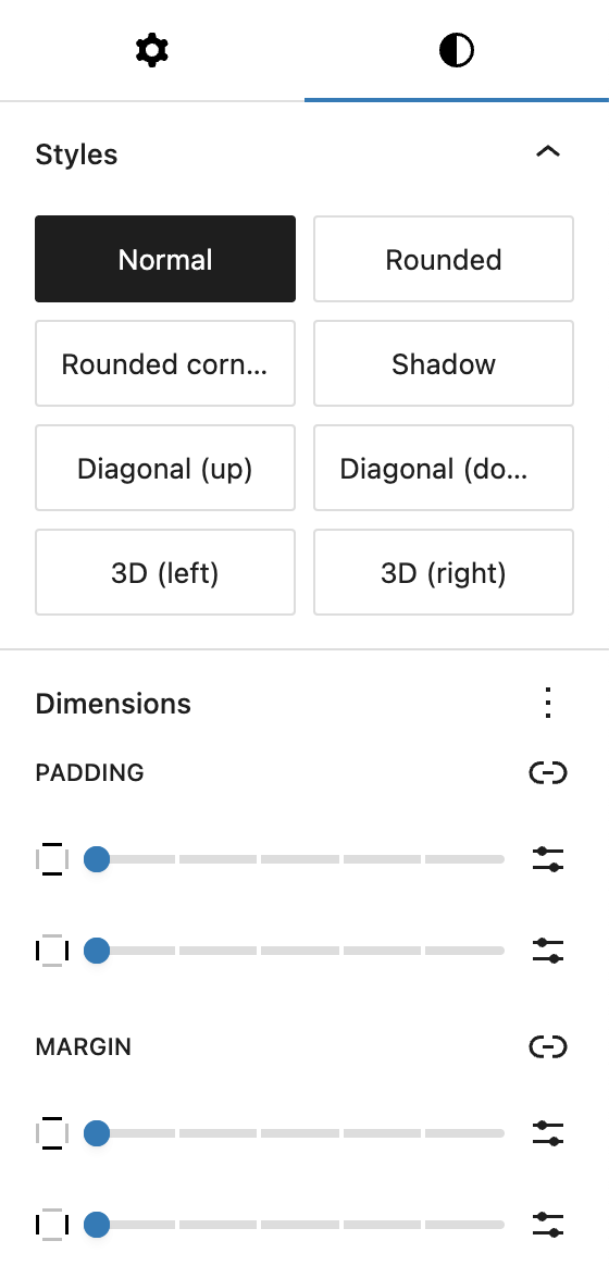
In the Styles tab, you can select one of several block style presets:
- Normal
- Rounded
- Rounded corners
- Shadow
- Diagonal (up)
- Diagonal (down)
- 3D (left)
- 3D (right)
You can also adjust Padding and Margin using standard dimension controls, giving you full layout flexibility.