We have created some custom components for our blocks. Beyond individual components, we have separate documentation for the settings in the Advanced section of each block, our Breakpoints feature and our implementation of the Pseudo-classes (normal, hover, active).
Button Icon Control
The ButtonIconControl component is a wrapper for settings related to setting an icon to a block.
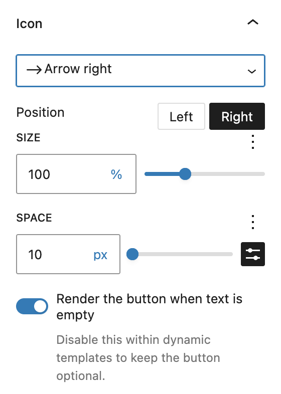
The dropdown to select an icon from the library is provided by the IconPicker component. In addition, the icon can be further positioned with the following options:
- Icon position: Choose whether the icon should appear to the left or right of the button text.
- Size: Adjust the icon size using different units, including %, px, em, and others. The default is 100%, which matches the current font size.
- Space: Define the space between the icon and the text using units like
px,%,em,rem,vw, andvh. - Visibility without text (optional): Enable or disable icon-only buttons. This option is particularly useful for dynamic templates. When disabled, the button will only display if text content is present. When enabled, the icon may display even if the text field remains empty. This option is only visible when an icon is already selected.
Custom Button Styles
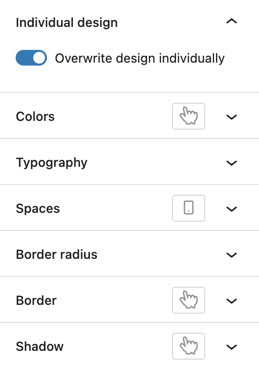
If a block is displaying buttons, input fields or links, the CustomButtonStyles component may be available. It offers to overwrite the current design on a per-block basis and when activating the toggle, several styling options appear:
- Colors: Text and background color, also for the hover state.
- Typography: Font size, font family, appearance (font weight), letter spacing, text decoration and letter case.
- Spaces: Padding with the Dimenson Control Spacing component, also per breakpoint.
- Border radius: Details see the Dimension Control Border Radius component.
- Border: Set border color, border width and border style, also for the hover state.
- Shadow: Details see the Drop Shadow Control component, can be styled different for the hover state.
For Colors, Border and Shadow the Active pseudo-class can also be available.
Dimension Control
The DimensionControl component is a wrapper for two common ways to set settings where up to four different sides can be configured individually: spacings like padding and margin, and border radius. For both options, a reset link is available below the settings if settings have been set.
Spacing Control

At the spacing control, the opposite sides are combined into one setting (top and bottom, left and right). If you want to change the spacing individually per single side, you can click the link icon on the right in the heading section to toggle the display mode.
You can type in a value in the input field or use the slider next to it. Depending on context, available units can be limited. The default available units are px, %, em, rem, vw, vh. The input field may have a mininum and maximum value set, depending on the block it’s used on. It’s also possible to use the spacing presets defined by the theme or in the editor.
Border Radius Control

The border radius control takes a numeric value which can also be adjusted by the slider. By default, the available units are px, %, em, rem, vw, vh. If the link icon on the right side is clicked, the mode switches from using one value for all four sides to four input fields for each corner (top left, top right, bottom left, bottom right). When individual sides are used, the slider is not available.
Drop Shadow Control
The DropShadowControl component provides all the settings you need to create shadows on the block.

You can choose the color of the shadow, by default the color is set to black. The following options with sliders adjust the position of the shadow, by setting it horizontally, vertically, how blurry the shadow should be and how far it stretches out from the element. The opacity is for the shadow color. The position is set to outside by default but can be used to be set to inside if needed.
Icon Picker
The IconPicker component provides a selection of icons. It can appear individually, or as part of the ButtonIconControl component.
You can pick from a variety of icons. For more information about the icons, see the Icons documentation.

Range Unit Control
The RangeUnitControl component offers various options to set different settings like sizes, width, height or similar settings. Some of the options are not available at every block, as they can be configured individually.

By default, the block shows an input field with a unit value. The units can be configured per setting, the default available units are px, %, em, rem, vw, vh. The input field may have a mininum and maximum value set, depending on the block it’s used on. Next to it is a slider to adjust the number value in a different way.
Some settings have the default spacing presets available, indicated by the black preset icon. Toggling this icon will change the input field and slider to the WordPress Core preset selector.
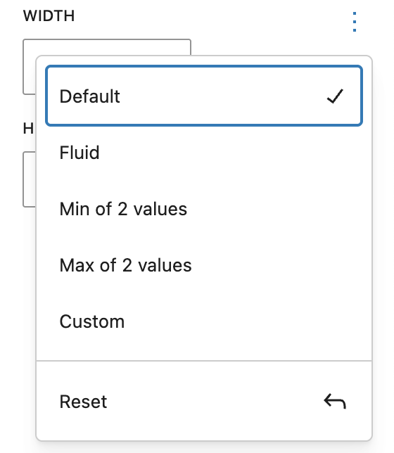
In the top right corner you can find a three dot menu, where you can choose a different mode to set the value. The following modes are available:
Fluid

In Fluid mode, you can add a minimum and a maximum value and the actual value will be calculated automatically between those two. It uses the CSS clamp() functionality.
Min of 2 values

Selecting Min of 2 values will calculate the smaller value of the two given ones. It uses the CSS min() functionality.
Max of 2 values
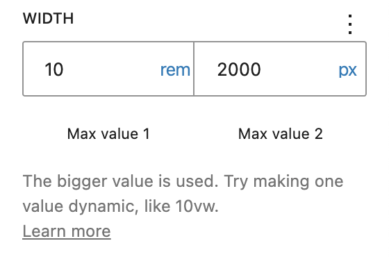
Selecting Max of 2 values will give you a similar experience to the previous one but this time it calculates the bigger value. It uses the CSS max() functionality.
Custom

The custom mode gives you the opportunity to set a custom value, allowing you to work with CSS variables or the calc() functionality.