Some components in the Greyd Plugin, like color, border or shadow, support styling variations based on their pseudo-class. These states reflect how a user interacts with the element — such as hovering with the mouse or clicking on it.

When an element supports pseudo class styling, you can define different styles for each state:
- Normal: the default appearance
- Hover: applied when the user hovers over the element
- Active: available for some elements, applied during interaction (e.g. on click)
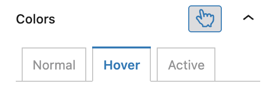
If a setting supports pseudo classes, it shows an icon of a hand with a pointing index finger. Clicking this icon activates pseudo-classes mode. The icon changes color to indicate that styling for interactive states is now enabled.
When active, you can configure individual styles for each state. If the icon is turned off again, the settings will revert to applying only to the default (normal) state.