The Hotspot block allows you to overlay interactive hotspots on images or animations. These hotspots can trigger popovers containing any block-based content. It’s ideal for creating rich visual explanations, infographics, or guided interactions.
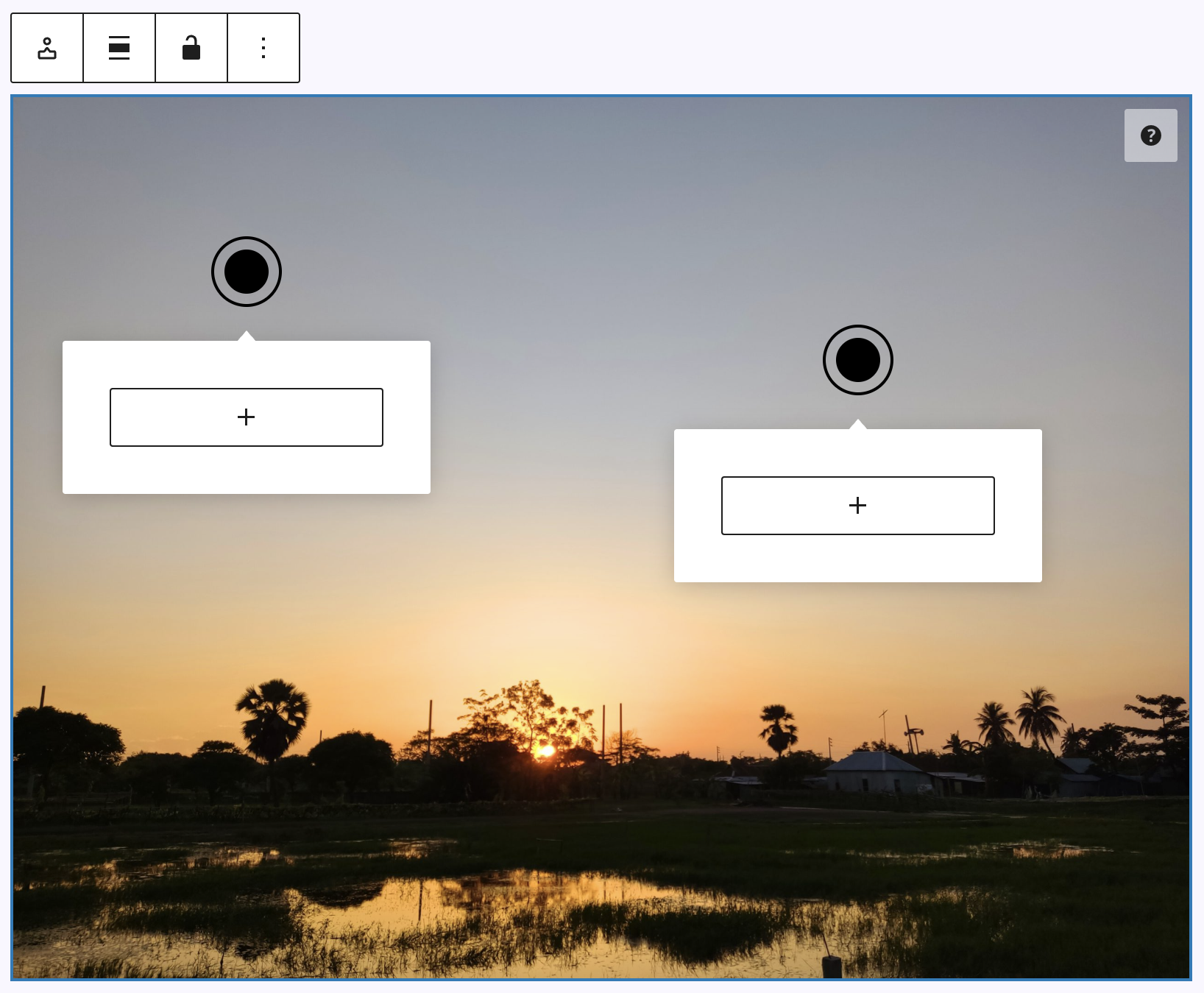
When adding the block, you first select an image or animation directly in the editor. Hotspots can then be placed by holding the Alt (Windows) or Option (Mac) key and clicking the desired position. You can reposition them by dragging, or remove them by Shift + Click. Clicking a hotspot opens its popover, where you can insert any blocks. To customize the look of a single hotspot, click on it to select the child block and adjust its settings in the sidebar.
In the block toolbar, there are two more settings: alignment (none, wide with, full width, left, center and right) and lock hotspot posistions, which allows to avoiding accidental movement of the spots.
Settings
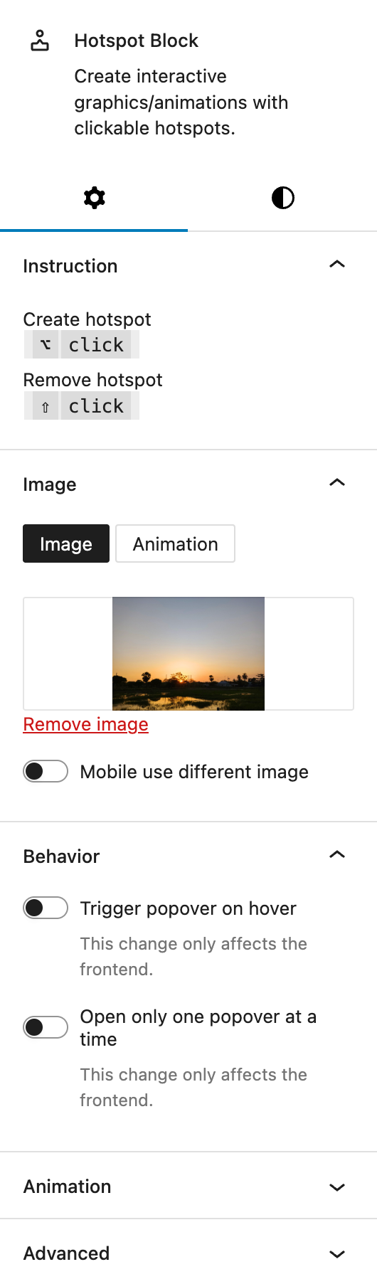
Under Instructions a short description explains how to place and delete hotspots using keyboard and mouse click combinations.
Under Image you can choose between a static image or a Lottie animation. Uploading is possible for both formats. There’s an optional switch for using a different image on mobile, which reveals an additional upload field if activated.
Under Behaviour Two options are available for frontend behavior:
- Trigger popover on hover instead of click. This refers to the Hotspot Spots.
- Allow only one popover to be open at a time.
The block also supports Animations. In the Advanced section, you can find settings for HTML anchor, additional CSS classes, the Greyd Styles Class and toggles to hide the block per breakpoint.
Styles
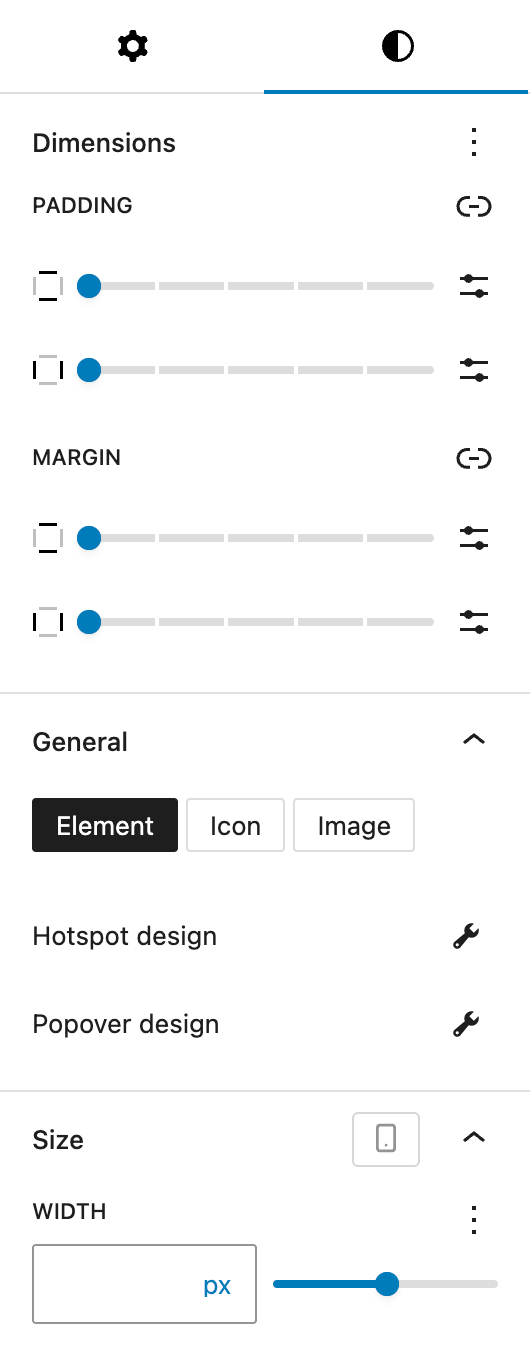
Under Dimensions, you can set padding and margin options for all sides provided by the WordPress Core component.
Under General, you can define the Hotspot design. Three display modes are available:
- Element: A basic filled circle with an optional outer ring. Available settings:
- Color: Inner and outer circle colors can be customized. You can also set different colors for hover and active states.
- Size: In addition to the general element size, you can also customize the space between the inner and the outer circle.
- Border Radius: Set rounded corners for the hotspot via the Border Radius component.
- Icon: Choose an icon from the icon picker. Additional setting:
- Icon Color: Set the color of the chosen icon. You can set different colors for hover and active states.
- Image: Upload a custom image to use as the hotspot marker.
All modes have the following settings available:
- Size: Adjust the element size with many options provided by the Range Unit Control component. You can also set different sizes for hover and active states.
- Animation: Choose from
None,Pulse,Flash, orFlutter.
The Popover design settings are the same for all modes:
- General: Define the position of the popover relative to the hotspot (Top, Bottom, Right, Left). Optionally, an indicator triangle can be displayed. You can set the distance between hotspot and popover.
- Color: Customize both the text and background color. You can also set different colors for the hover state.
- Size: Set maximum and minimum widths for the popover with the Range Unit Control component, as well as adjusting the size per breakpoint.
- Border radius: Set rounded corners for the popover via the Border Radius component.
- Border: Set border width, style and color and adjust it for the hover state.
- Shadow: Set a drop shadow for the popover with the Drop Shadow Control component.
- Padding: Set custom padding with the Dimension Control Spacing component, also per breakpoint.
Under Size, you can set the width of the image or animation with the Range Unit Control component, as well as adjusting the size per breakpoint.
Hotspot Spot child block
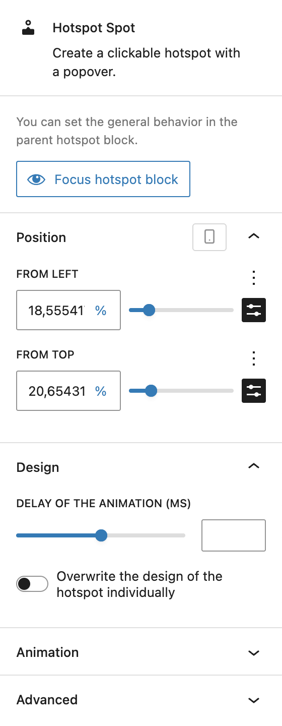
Each hotspot is a child block with its own settings. If you’re looking for other options, which are located at the parent Hotspot block, there’s a button that allows you to directly focus the Hotspot block which brings you to the settings mentioned above.
Under Position, you can manually adjust the spot placement. Values are defined in relation to the top left corner and offer various options with the Range Unit Control component. They can also be adjusted per breakpoint. If the positions of the hotspots are blocked, the fields are not editable. Instead, a button appears at the bottom of this section that allows to unlock all hotspots again.
Under Design, you can set a delay of the animation in milliseconds. It’s also possible to overwrite the design of the hotspot individually, clicking the toggle will provide you with all settings for the hotspot design and popover design mentioned in the above Styles section.
The block also supports Animations. In the Advanced section, you can find settings additional CSS classes, the Greyd Styles Class and toggles to hide the block per breakpoint.
Video
Hi, this is Sandra from GREYD. Today I’d like to show you how to include interactive graphics on your website super easily with our Hotspot block. With the Hotspot block you can place one or more hotspots on images or animations that can then be clicked by your website visitors. In your hotspots you can integrate any type of content like buttons, links, texts, images or even entire forms. So let’s have a look at the block in the backend. After placing it somewhere on your page select an image or animation first.
For animations please make sure that Lottie animations have not been disabled in your GREYD.SUITE settings as then it wouldn’t work.
Now you can click anywhere on your graphic and place a hotspot by holding the alt or option key.
On the right you will then find several settings that will apply to the entire graphic including all its hotspots. At first you can change the image or animation again and also define when an animation should be started.
Instead of the hotspot symbol you can also work with icons or an image. Depending on your selection you will then find different settings for colors, sizes, border radius and/or spaces.
With clicking on the hand symbol you can also design hover and active states for the hotspot, creating really nice effects like this one. On top of that you can also implement an idle animation. Here you can see an example.
Each hotspot now comes with a pop-over to be opened on click. As mentioned already, you can place any content in that pop-over — for example text information, other graphics and even forms.
For the pop-over you’ll also find various design settings applicable to all hotspots in your graphic. Define for example whether your pop-over should have such a little triangle. Decide where it should open and with how much distance to the hotspot itself.
You can define text and background colors — again with the possibility to create a hover effect. You can vary the size individually per breakpoint, the border radius, the border, you can add a drop shadow and change the padding.
Furthermore, you can edit the size of the image or animation and also vary that per breakpoint. Here you can define whether your hotspot should already open on hover and if you only want one hotspot to be opened at a time, so if another one is clicked the first one will automatically be closed.
By the way, you can also overwrite these general stylings for individual hotspots and/or their pop-overs. To do that, just click on one of the hotspots and activate this toggle and you will find the same options as shown earlier to change anything you like for this particular hotspot or pop-over. And you can also vary the idle animation individually, so that for example not all pop-overs pulse simultaneously, but the attention of the website visitor is drawn to one hotspot after the other.
And last but not least you can also remove hotspots from your graphic by clicking them and pressing shift.
For more videos and information please visit our Helpcenter.