The Popover block is a custom block that displays a button which opens a popover or pop-up when clicked. Both the button and the pop-up are fully customizable, allowing a wide range of popover styles and behaviors.
A Popover consists of a strict set of three blocks: the Popover wrapper containing exactly one Popover button and one Pop-up as child blocks. This structure cannot be altered—no other child blocks can be added to the Popover, and the Popover button and Pop-up blocks can only exist within a Popover.
The Pop-up itself can contain any other block, which means you can include any type of content inside it (see the Pop-up block documentation for details). Additionally, the Popover block can be used as a child block of the Navigation block to provide popovers in menus.
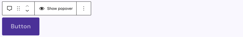
In the editor, the Popover block appears as a wrapper containing the Popover button and Pop-up blocks. By default, only the Popover button is shown. You can click Show popover in the toolbar to display the Pop-up in the editor and edit its contents. The toolbar includes only the Show popover button to preview and edit the pop-up contents.
Block Supports and Styles
Core supports include an HTML anchor and additional CSS classes for custom styling. Advanced supports (see Core Block Extensions documentation) allow you to hide the block on selected breakpoints.
The Popover block also includes three variations:
- Popover (default)
- Burger menu: makes the Popover button use the Burger variation and the Pop-up use the Offcanvas variation
- Dropdown menu: makes the Popover button use the Button variation and the Pop-up use the Dropdown variation
Settings
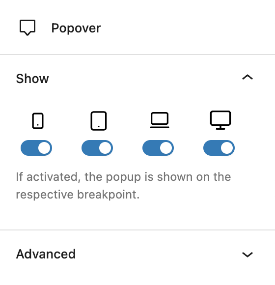
The Show panel contains a toggle control to determine whether the block is shown at each breakpoint, by default it is enabled for all breakpoints. This is essentially the inverse of the Advanced support “Hide per breakpoint” setting.
The Advanced panel contains settings for the HTML anchor, additional CSS classes and toggles to hide the block per breakpoint.
Video
Hi, this is Sandra from GREYD and today I want to show you the various possibilities that are offered to you by our popover block which exists in various variations. You can use it for example to create inline popups, to create dropdown menus or also burger and off-canvas or overlay menus. So lots of lots of possibilities. And how it works is what I’m going to show you in this video.
As already said, we have several variations of our popover block. What they all have in common is that you can first decide what screen sizes you want it to be visible. That way for example when used in the header template you can create burger menus that are only visible on mobile screens. In general, the popup block always consists of two parts. The first is the button or burger, which you can select here. And the second is the popup, overlay, off-canvas or dropdown.
Let’s start with the options for the popover button. If you select “button” here, you will find the regular styling and setting options of GREYD.Buttons. And if you switch to burger, you can then switch between different burger styles and also shapes. You can make some color adjustments for the burger and its background, also with hover effect and individually per breakpoint. There are settings for size, border radius, line weight, spacers, etc., so you can style the burger individually.
We then also have the second part and we will start with the first variation, which is the popup. You can easily define where you want the popup to be positioned and where you want it to come from. You have size options, again individually per breakpoint if you like. Same for spaces inside and outside. You can define whether and how you’d like to have the close button, or even have no close button at all. And then you have various design options, for example colors for text, background, close button and even for the backdrop, which is the page in the background of your popover. You can change colors, work with border, border radius, shadows, define the size of the close button and also set effects for the backdrop.
So much for the popup. You can place it inline anywhere on your page, also in the header, wherever you want. Same goes for off-canvas and overlays. Let’s just have a look at the frontend to see the difference. Here we have the overlay variant. Overlay already indicates that it lays above the content, while the off-canvas variation moves the content to the side. The options are more or less the same. The only difference is the positioning: left, top, bottom, right. And same for the off-canvas variation. By the way, you can always close or hide the animation here.
The last variation we have is the dropdown variation. The options are the same. The only difference is that you have a small triangle. You can’t see it right now, but there’s a small triangle where the popup opens and you can define its size and color.
So much to the settings. The rest is the same. As to what you put inside your popup or inside your dropdown or inside your off-canvas and burger menus, you are completely flexible. You can put any content you like in your popup and you can work just as usual with any block there is.
More infos, videos and FAQ tips in our Helpcenter.