The Popover button block is used exclusively as a child of the Popover block and cannot be placed on its own. Its purpose is to trigger the Popover’s Pop-up when clicked. While similar to the Button (Greyd) block, it adds dedicated options for Popover interaction and offers an additional “Burger” variation for navigation-style menus.
Two variations are available: the default Popover button and the Burger button. Both variations share some settings but also have settings for their individual needs.
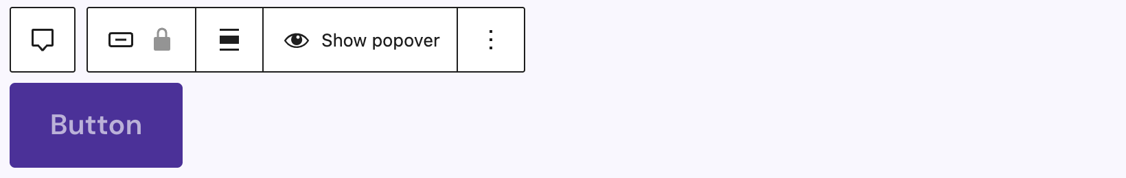
The toolbar provides the basic block controls, the Align control for horizontal alignment, and a Show popover button that reveals the Popover’s Pop-up in the editor so you can edit its content.
Both variations support Animations. In the Advanced section, you can find settings for HTML anchor, additional CSS classes, an input for an Aria Label, the Greyd Styles Class and toggles to hide the block per breakpoint.
Variation: Popover button (default)
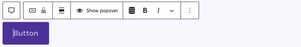
In the editor, the default Popover button renders as a RichText element inside a button, with its look and layout controlled by the Sidebar. RichText enables the full set of inline formatting tools. The toolbar for this variation also includes Dynamic Tags for context-aware labels.
Settings

In the settings panel under Icon, you can add an icon with the Button Icon Control component.
Styles
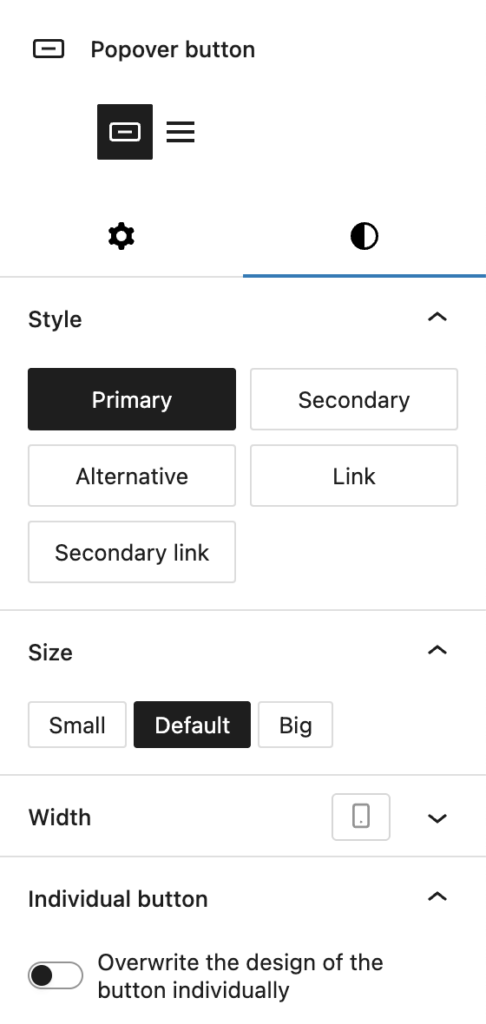
In the Styles section, you can select one of the default styles for the button, including:
- Primary
- Secondary
- Alternative
- Link
- Secondary link
Under Size you can pick a different size for both font and padding with these options:
- Small
- Default
- Big
Under Width you can set a specific width with the Range Unit Control component, which also can be adjusted per breakpoint.
To override the inherited design, enable Overwrite the design of the button individually to reveal the Custom Button Styles component control, which provides more granular styling options.
Variation: Burger
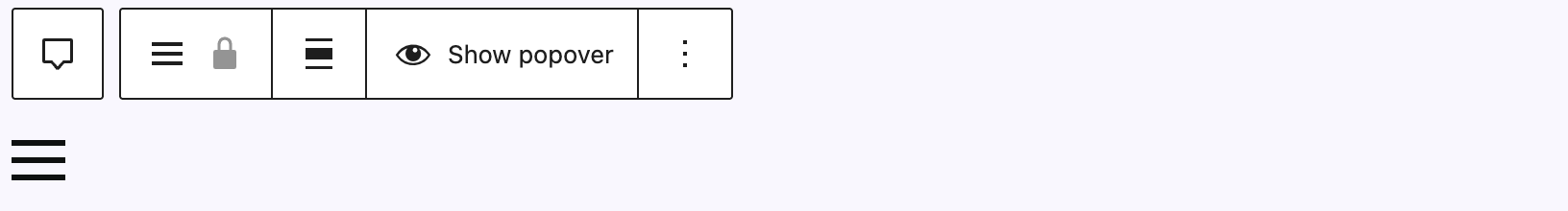
The Burger variation renders a hamburger icon instead of text (no RichText input). Clicking the icon in the preview toggles the configured shape change, mirroring the animation used when the Popover opens or closes.
Settings
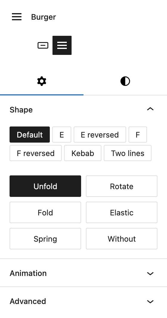
Under Shape, you can change the type of shape for the burger icon, with the following options available:
- Default: three horizontal lines
- E: middle line shorter, gap on the right
- E reversed: middle line shorter, gap on the left
- F: bottom line shorter, gap on the right
- F reversed: bottom line shorter, gap on the left
- Kebab: top and bottom line shorter
- Two lines: equal width
On the buttons below you can configure the on‑click Shape change animation with the following options:
- Unfold
- Rotate
- Fold
- Elastic
- Spring
- Without
Styles
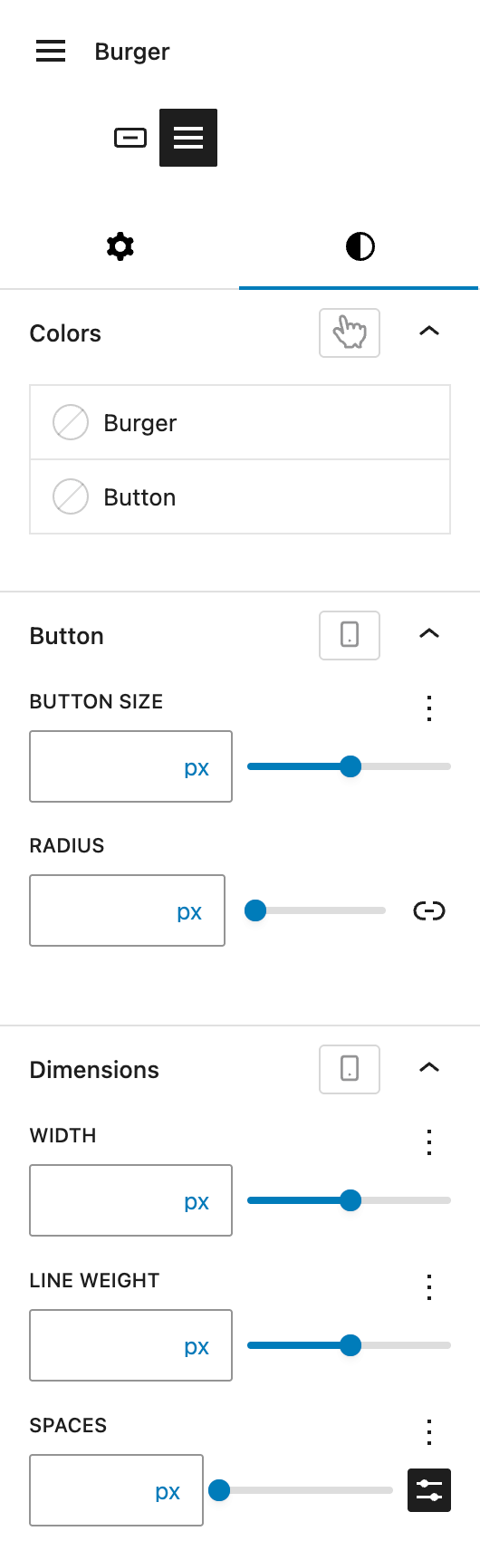
Under Colors you can set individual colors for the Burger icon and the Button background. Both options support the hover state.
Under Button, you can change the Button size, which reflects the height with the Range Unit Control component. You can also set a Border radius. Both settings can be adjusted per breakpoint.
Under Dimensions you can set a Width for the icon, the Line weight for the icon lines and Spaces for in between the icon lines. All settings can be changed with the Range Unit Control component and can be adjusted per breakpoint.