The Post Table block is a custom layout block for rendering query results as a table. It can be found in the “Greyd” category of the Inserter and is used inside a Query Loop, just like the Post Template or Post Slider variations.
Unlike those blocks, Post Table does not contain child blocks. Instead, each post is rendered as a row inside an HTML <table>, with full control over the column structure and styling.
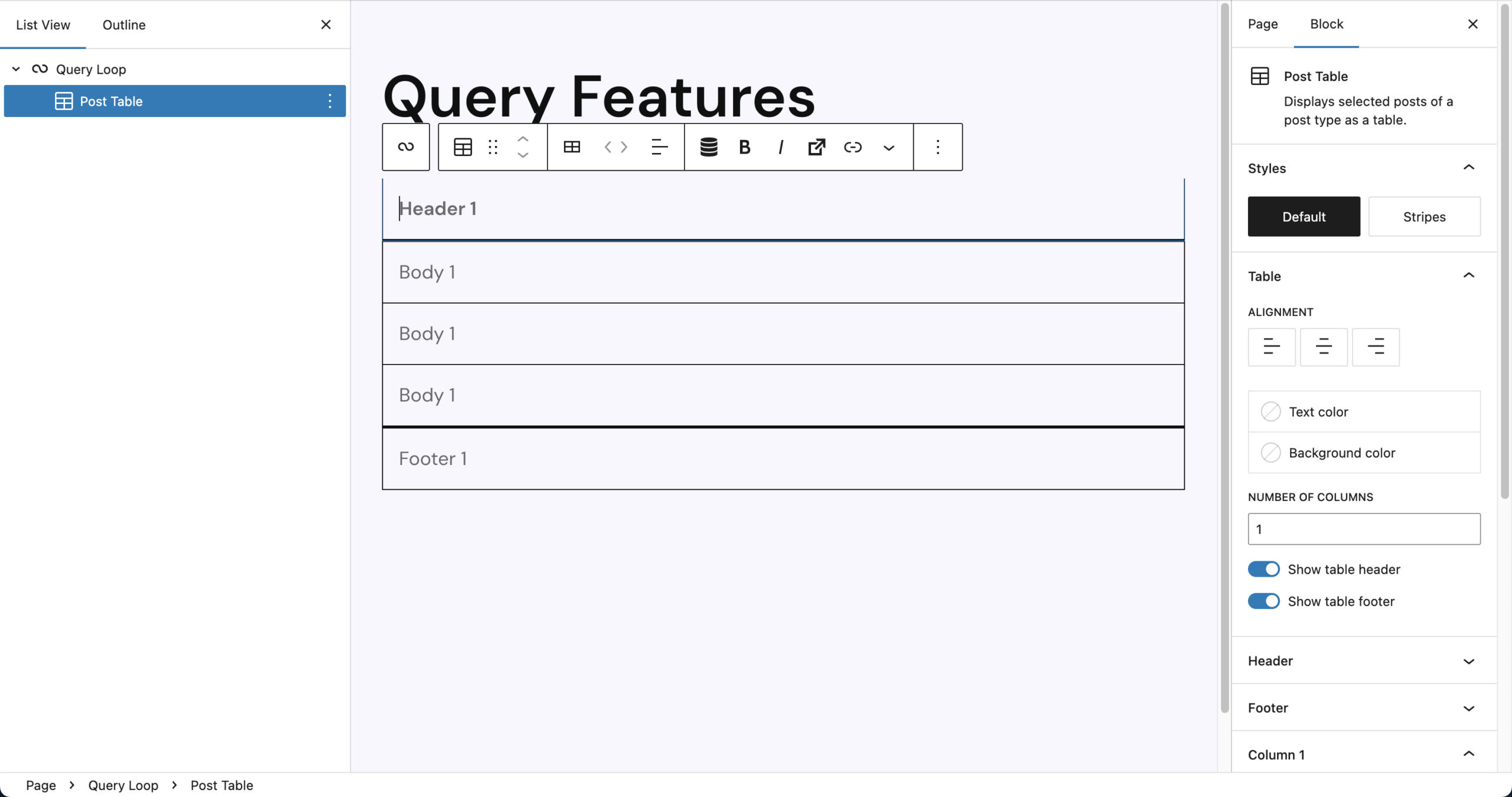
Inserting the Post Table adds a full Query Loop setup using Post as the default post type. The table includes:
- A visible header and footer by default
- One column with as many rows as there are posts
- Empty table cells that you can populate by clicking and entering RichText
The same content is repeated in every row, so Dynamic Tags are strongly recommended to output post-specific data.
Columns can be added, removed, or rearranged directly from the block toolbar. The toolbar includes basic block controls and RichText formatting. It also features tools to manage table structure and content:
- Insert Column Before / After, Delete Column
- Move Column Left / Right
- Column Alignment (same as Column X → Alignment)
- Dynamic Tags integration for rendering post content
- Trigger support for interactive actions
Settings
The Post Table block comes with many settings to fine-tune the design. The block also supports Animations. In the Advanced section, the following options are available: HTML anchor, additional CSS class(es), styles class, hide per breakpoint and inline styling.
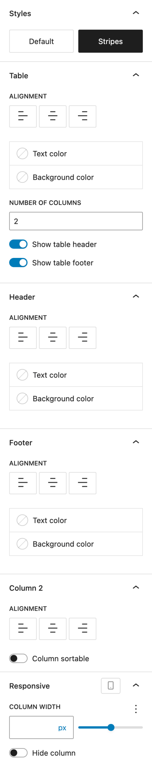
Under Styles, choose the overall table style:
- Default: Clean table layout with borders and no row background
- Stripes: Alternating row colors for better readability, only borders below header and above footer
Under Table, there are controls for general layout and appearance:
- Alignment: Sets default alignment for all columns (can be overridden per column or in the header/footer), options are left, center, right
- Text Color: Color for all text in the table
- Background Color: Background for all cells
- Number of Columns: Adjust column count. The toolbar offers more precise controls where the column can be placed.
- Show Table Header: Toggle the
<thead>row - Show Table Footer: Toggle the
<tfoot>row
If you enabled the header, you can customize the header row, all settings overwrite the settings set in the table section:
- Alignment
- Text Color
- Background Color
If you enabled the footer, you can customize the footer row, all settings overwrite the settings set in the table section:
- Alignment
- Text Color
- Background Color
Under the Column X (Column 2 in the screenshot) section, the settings change depending on what column is selected. You can see the difference in the number behind “Column”. All settings overwrite the settings set in the table section for the currently selected column:
- Alignment
- Column Sortable (adds frontend sorting using jQuery Table Sorter)
The Responsive section directly relates to the above “Column X” section. Changes you make here affect the currently selected column. These settings can also be adjusted per breakpoint:
- Column Width offers various options with the Range Unit Control component
- Hide Column on specific breakpoints
Video
Hi, this is Sandra from GREYD and today I’d like to show you how to display posts on your GREYD.SUITE website as a table. To do that just enter the block post table somewhere on your website. Post table is a variant of the native WordPress query loop. If you want to learn more about that in general or the GREYD.SUITE version post overview, please have a look at our tutorials in the Helpcenter since I will now focus on those functions that are relevant for the table.
At first, as usual in query loops you can select which post type you’d like to display and can of course also select from your custom post types here. And you will find the usual settings for the order and if you want to filter your post type. As soon as you click somewhere in your table you will get to the table settings and can define how many columns your table should have and whether or not you would like your table to have a header and/or a footer. All other settings already belong to the respective columns. You can for example set the alignment and define whether or not the user should be able to sort the table after that column in the frontend. You can also define the size of the column individually per breakpoint and even hide columns for certain breakpoints, that way creating really mobile responsive tables easily. All the other design settings in terms of colors, fonts, forms are defined in your global table stylings.
So now let’s fill our table with content. As you’ve seen, you can just enter your text directly here by typing it in, which mainly makes sense in the header or footer or if you want to have the same text in the entire column. Other than that, filling in your table with content works with Dynamic Tags — either with the symbol here or by just entering a hashtag. You will find all available Dynamic Tags — all the standards like the post title, author etc. — but also all your custom fields. For example, for my post type I have a price field and I can of course always add individual text directly in the editor. You can also work with all options from the toolbar including links that you can set here.
Other than that you can always edit your table by adding or deleting columns. There are also some very interesting Dynamic Tags especially for the header and footer. For example, you can build totals or averages, which is very interesting if you have numbers here. If you want to learn more about Dynamic Tags in general, there’s also a tutorial video on that in our Helpcenter.
For more videos and information please visit our Helpcenter.