The Search (Greyd) block allows you to build dynamic, interactive search interfaces directly within the Block Editor. It serves as a container for other search-related blocks such as filter dropdowns, search fields and sort options. Combined, these elements enable users to create powerful custom searches that work in real-time and integrate seamlessly with query loops.
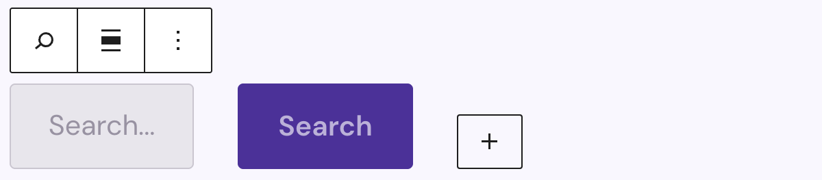
The parent block functions as a wrapper and defines the overall logic and layout of the search interface. It is particularly effective when used within a Query Loop block, as it allows search inputs to interact live with the displayed content. When used outside of a Query Loop, it redirects to the default search template.
Settings
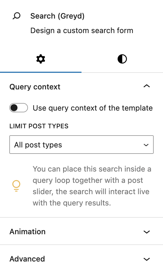
Under Query context, you can choose to use the query context of the template by activating the toggle. This is useful if you are using the block in archive or search templates, so you have to set fewer individual settings and rely on the context of the specific template. Additionally, you can limit the search to specific post types if the block is used outside of a Query Loop block.
When the block is placed inside a Query Loop that uses a Post Slider, it interacts directly with its results, and an additional setting allows you to hide results until a search is triggered.
The block also supports Animations. In the Advanced section, you can find settings for HTML anchor, additional CSS classes, the Greyd Styles Class and toggles to hide the block per breakpoint.
Styles
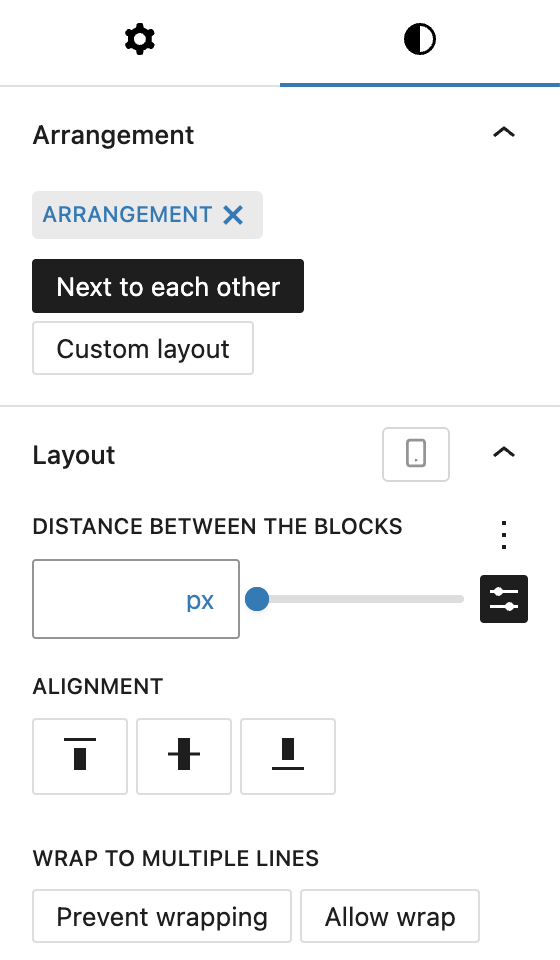
In the Styles Tab, you can define the layout of child blocks using the Arrangement setting. You can choose to place elements next to each other, which activates further layout options such as spacing, alignment (top, center, bottom), and line wrapping. Alternatively, the custom layout option allows for greater flexibility by mixing in other blocks like Groups or Rows.
Under Arrangement, You can choose to place elements next to each other, which activates further layout options such as distance between the blocks, alignment (top, center, bottom), and line wrapping of the elements. These layout options can be adjusted per breakpoint.
Alternatively, the custom layout option allows for greater flexibility by mixing in other blocks like Groups or Rows. The Layout options are not available with this setting.
Child blocks
The Search (Greyd) block comes with several child blocks which offer a variety of search configurations for the user.
Styles
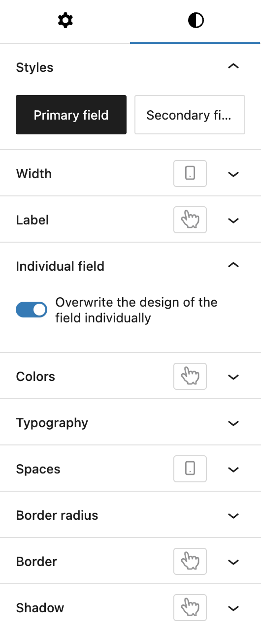
As several child blocks have the same styling options, here’s an overview of all settings. If there are additional settings, these will be noted in the respective section for each block. The screenshot was taken from the Search field block.
In the Styles tab, you can select from two base styles (primary or secondary field), which can be configured in the Global Styles. You can set the width of the field, also per breakpoint. For the label, you can adjust the font size and color, also for the hover state.
For the width and the font size you can choose from various options, see the Range Unit Control component.
You can also overwrite the design of the field individually, see the Custom Button Styles component for more details.
Child block: Search field
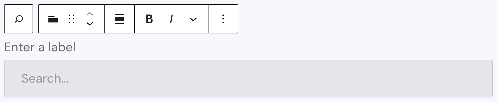
The Search field block provides the input field for user search terms. The label has limited editing options: bold, italic, subscript, superscript and uppercase. The placeholder text in the dropdown can also be changed and has no further styling options available.
Settings
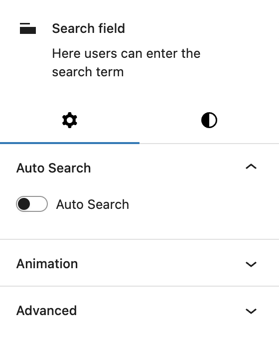
The Settings includes a toggle for enabling the Auto Search feature. When active, this feature displays live results as the user types below the input field. You can configure the number of results shown, sort order, loading text, no-result message, and whether clicking a result redirects directly.
The block also supports Animations. In the Advanced section, you can find settings additional CSS classes, the Greyd Styles Class and toggles to hide the block per breakpoint.
Styles
See the general styles section above for all details about the Search field styles tab.
Child block: Search button
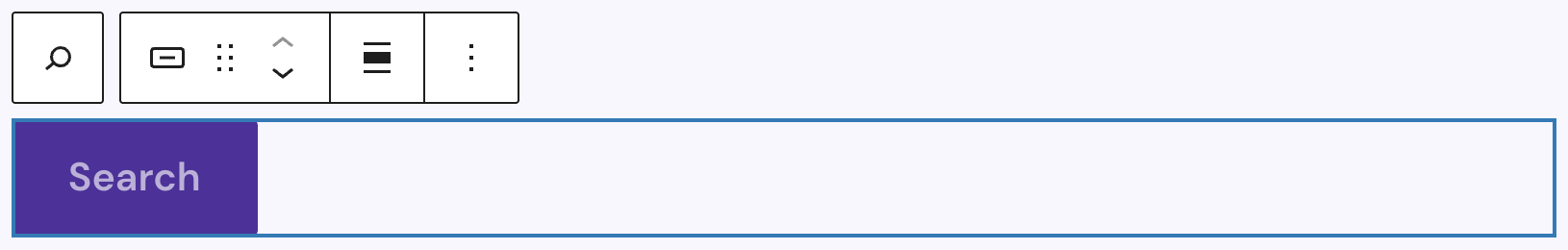
The Search Button triggers the search action.
Settings

Under Icon you can set an icon with all options available in the Button Icon Control component.
The block also supports Animations. In the Advanced section, you can find settings additional CSS classes, the Greyd Styles Class and toggles to hide the block per breakpoint.
Styles
Under Styles you can choose from five predefined button styles (Primary, Secondary, Alternative, Link, Secondary link). Under Size you can choose from globally defined presets (Small, Default, Big). You can also define the Width of the button and customize it per breakpoint. An individual styling panel is also available, see the general styles section above for more details.
Child block: Filter (Dropdown)
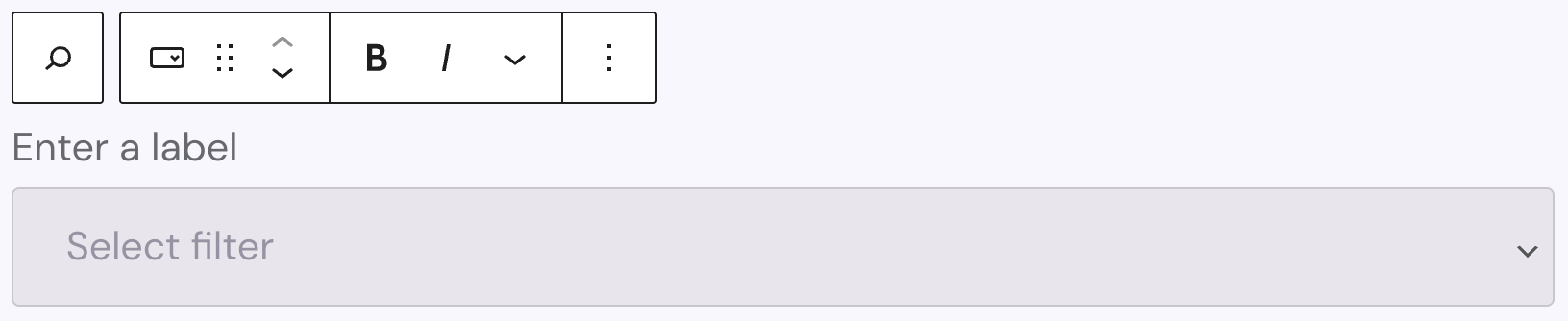
The Filter (Dropdown) block lets users filter search results based on available taxonomies, such as categories or tags. You can add a label and customize it with bold, italic, subscript, superscript and uppercasse options. The placeholder text in the dropdown can also be changed and has no further styling options available.
Settings
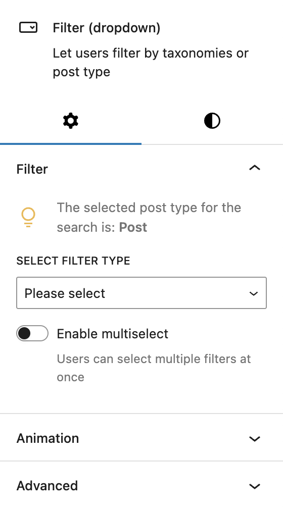
In the Filter section, you select the taxonomy to filter by and optionally enable multi-select. If the parent block is set to query all post types, there will be an additional dropdown to select a taxonomy from a specific post type. It can also be set to all post types.
The block also supports Animations. In the Advanced section, you can find settings additional CSS classes, the Greyd Styles Class and toggles to hide the block per breakpoint.
Styles
See the general styles section above for all details about the Filter (Dropdown) styles tab.
Child block: Sort (Dropdown)
The Sort (Dropdown) block lets users define how search results should be ordered. You can add a label and customize it with bold, italic, subscript, superscript and uppercasse options. The placeholder text in the dropdown can also be changed and has no further styling options available.
Settings
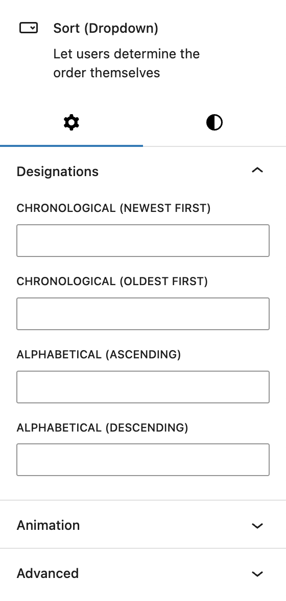
Under Designations, you can customize the labels for each sort option. Available sort methods include chronological (newest/oldest), alphabetical (ascending/descending) by default. If the Relevance and Post Views options are activated in the Advanced Search settings, two more fields become available: Relevance and Post Views. If nothing is added to the fields, the default descriptions will be used.
The block also supports Animations. In the Advanced section, you can find settings additional CSS classes, the Greyd Styles Class and toggles to hide the block per breakpoint.
Styles
See the general styles section above for all details about the Sort (Dropdown) styles tab.
Child block: Filter Buttons & Chips
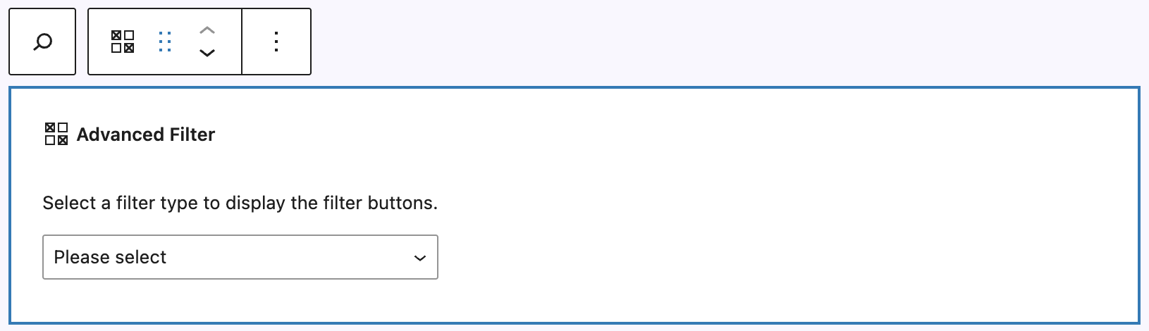
The Filter Buttons & Chips block is only available when the Advanced Search feature is activated. It allows the user to filter directly on a selected taxonomy of a post type. On insertion, a taxonomy needs to be selected. The post type can only be adjusted if the parent block is outside of a Query Loop, otherwise it only allows the selection of taxonomies assigned to the post type defined in the Query Loop. Once a taxonomy is selected, you will see a preview of the terms, if terms have been already added.
Settings
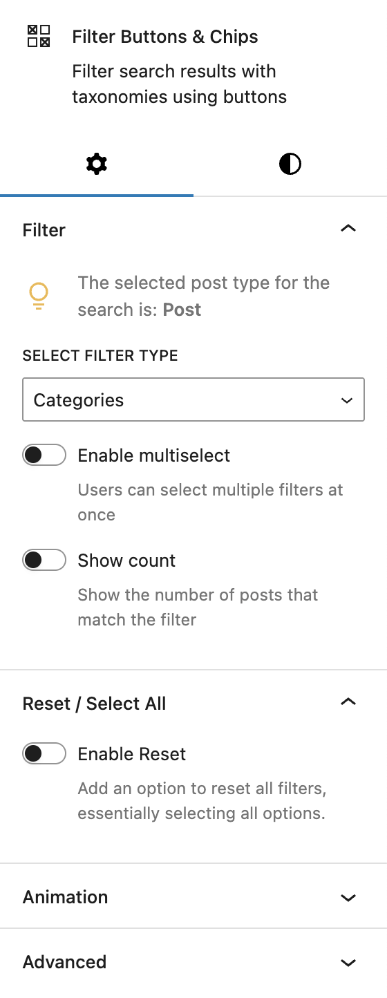
Under Filter, you can select the taxonomy you want filter options for at the filter type dropdown. In the screenshot the post type has already been selected to Post, as this block is inside a Query Loop block. If you’d use this block outside of a Query Loop block on it’s own, there would be another dropdown to select the post type.
It’s also possible to Enable multiselect, so multiple terms can be combined together, as well as show the number of posts with the Show count toggle.
Under Reset / Select All, you can choose to show an extra reset option with the terms for easier reset.
The block also supports Animations. In the Advanced section, you can find settings additional CSS classes, the Greyd Styles Class and toggles to hide the block per breakpoint.
Styles
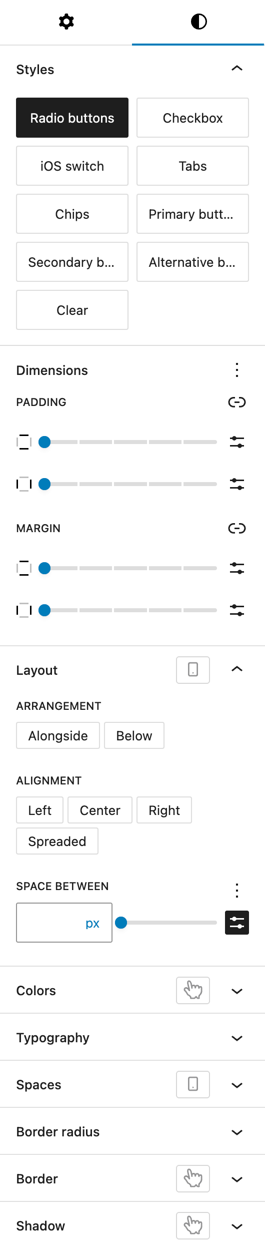
Under Styles, you can choose between various options how to display the terms of the selected taxonomy:
- Radio Buttons
- Checkbox
- iOS switch
- Tabs
- Chips
- Primary buttons
- Secondary buttons
- Alternative buttons
- Clear
Under Dimensions, you can set padding and margin options for all sides provided by the WordPress Core component.
Under Layout, you can define the Arrangement of the terms, either alongside (next to) each other or below each other. With Alignment, you define the overall Alignment of the terms, it can be either left, center, right or spreaded (space between each other). Under Space between, you can add additional space between the terms, with different options provided by the Range Unit Control component. All settings in this section can also be adjusted per breakpoint.
Under Color, you can set a different text and background color and also add different colors for the hover and active states.
Under Typography, you can customize the font size, font family, appearance (font weight), letter spacing, text decoration, and letter case.
Under Spaces, you can set a different padding inside the elements using the options provided in the Dimension Control Spacing component. You can also adjust the padding per breakpoint.
Under Border Radius you can define how rounded the corners of the field should be, see the border radius documentation.
Under Border you can set border width, style, and color, either for all four sides or individually. The border can also be styled differently for the hover state.
Under Shadow you can add a shadow to the input field, see the Drop Shadow Control component for more details.
Child block: Datepicker
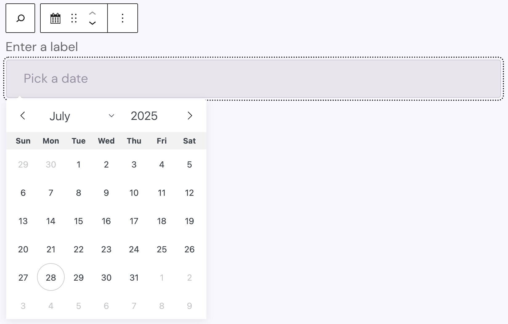
The Datepicker block is only available when the Advanced Search feature is activated. The Datepicker select window only appears if the input field is clicked on both back- and frontend, while the Datepicker is only functional on the frontend. A label can be added for the input field, which can be set to bold, italic, subscript, superscript and uppercase if needed. The Datepicker block uses the flatpickr JavaScript library.
Settings
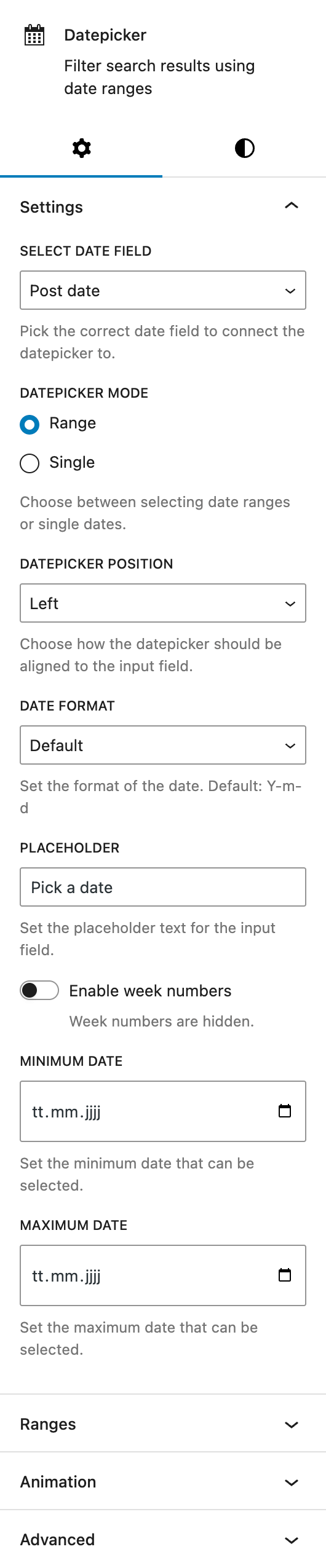
Under Select date field, you can choose the date field which the Datepicker functionality is going to work with in your posts. It can be either the Post date, a meta field that you need to specifiy the name for, or a dynamic meta field that you have configured via the Post Types functionality.
The Datepicker mode lets you choose between the range or single modes. The single mode lets you select a single date, while the range mode needs two dates to be selected in order to create a range that should be searched for.
Under Datepicker position you can choose where the Datepicker modal is going to be displayed in relation to the input field. Options are Left (default), Center and Right.
Under Date format you can choose one of the predefined date formats that will be used in the input field when a date or date range has been selected (only on the frontend). It’s also possible to set an individual format. The format options are based on the PHP DateTime Format.
Under Placeholder you can change the default preset text that is displayed in the input field.
Activating Enable week numbers will show an additional column on the datepicker on the left side that will show the week number associated with the week.
If the Datepicker mode is set to single, up to two more toggles will appear below: Enable time will also show a time picker and if it is activated, a second toggle 24 hour mode appears to switch between am/pm and 24 hour mode on the time picker.
Under Minimum Date and Maximum Date you can each select if the selection of the dates needs to be limited to a certain amount of days. The Minimum Date will reflect the earliest date that can be selected, while the Maximum Date reflects the latest day to be selected.
For more information about Ranges, see the section below.
The block also supports Animations. In the Advanced section, you can find settings additional CSS classes, the Greyd Styles Class and toggles to hide the block per breakpoint.
Ranges
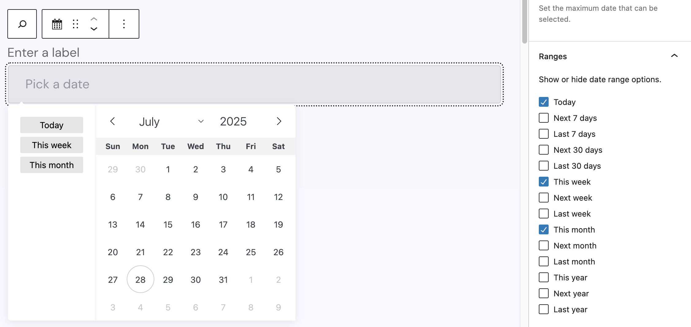
In the Settings under Ranges, there is a list of predefined ranges that can be displayed on the Datepicker for quick access to select common date ranges. The ranges appear on the left side of the Datepicker and when clicking on one of the buttons, the date range gets automatically added relative to today’s date. The selectable options include Today, next/last seven days, next/last 30 days, this/next/last week, this/next/last month and this/next/last year.
Styles
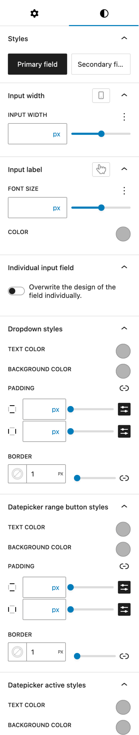
For the Styles, Input width, Input label and Individual input field options see the child blocks styles section, which explains the options in detail.
Under Dropdown styles you can adjust the Datepicker modal with the following options: text color, background color, padding and border.
Under Datepicker range button styles you can change the appearance of the range buttons, if you have activated them. The options include text color, background color, padding and border. These are for the buttons only.
Under Datepicker active styles you can change the appearance of the dates that have been selected in the Datepicker. In single mode, this will be the single date that is selected and in range mode it’s both the start and the end date that will get the text and background color you choose.