The Tabs block allows you to organize content into easily navigable tabs. It uses a parent–child structure where the parent block is the Tabs container, and each child block is an individual Tab. You can insert any other blocks inside a Tab content area.
New Tab blocks can be added directly in the editor using the plus sign in the tab bar. Within each Tab block, you can add content — of any block type — using the plus icon inside that tab’s content area.

Settings
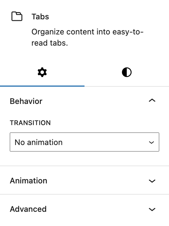
In the Behavior section, you can select the transition animation used when switching between tabs. Options include:
- No animation
- Fade
- Swipe horizontally
- Move vertically
The block also supports Animations. In the Advanced section, you can find settings for HTML anchor, additional CSS classes, the Greyd Styles Class, toggles to hide the block per breakpoint and Inline Styling.
Styles
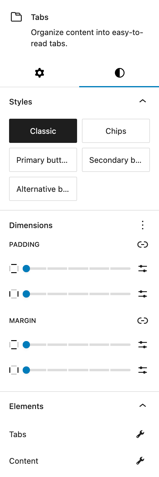
In the Styles section, choose from predefined base styles configured in Global Styles. The available options are:
- Classic
- Chips
- Primary button
- Secondary button
- Alternative button
In the Dimensions section, Core WordPress dimension controls allow you to set padding and margins for the entire Tabs block.
The Elements section provides separate style settings for Tabs and Content, see below for more details.

In the Tabs section you can define the style for the clickable tabs bar.
Under Layout, you can align the tabs row left, center, right or with space in between the tabs. The Space Between setting below lets you fine-tune the space between each tabs with the Range Unit Control component. All settings can be adjusted per breakpoint.
Under Responsive behavior, you can enable Stack on mobile devices to arrange tabs vertically on smaller screens.
Under Icon you can choose the position of the icon relative to the tab text (left or right). Icons can be set individually for each Tab child block.
Under Colors you can set background and text colors for the tabs. Colors can also be set for hover and active states.
Under Typography you can set the following settings:
- Font size
- Font family
- Appearance (font weight)
- Letter spacing
- Decoration
- Letter case
Under Spaces you can set inner padding for each tab with the Range Unit Control component. The padding can also be adjusted per breakpoint.
Under Border Radius you can define rounded corners for tabs.
Under Border you can configure border settings for the tabs. The border can also be changed for hover and active states.
Under Shadow you can Add a drop shadow to tabs. For more details see the Drop Shadow Control component.
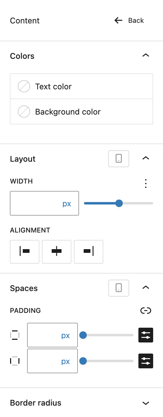
In the Content section, you can style the tab content area.
Under Colors you can set background and text colors for the tab content area.
Under Layout you can adjust width and alignment of the content. Alignment options are left, center, and right. Width can be set via the Range Unit Control component and all settings can be adjusted per breakpoint.
Under Spaces you can define padding for the tab content with the the Range Unit Control component and adjust it per breakpoint.
Under Border Radius you can define rounded corners for the content area.
Tab child block
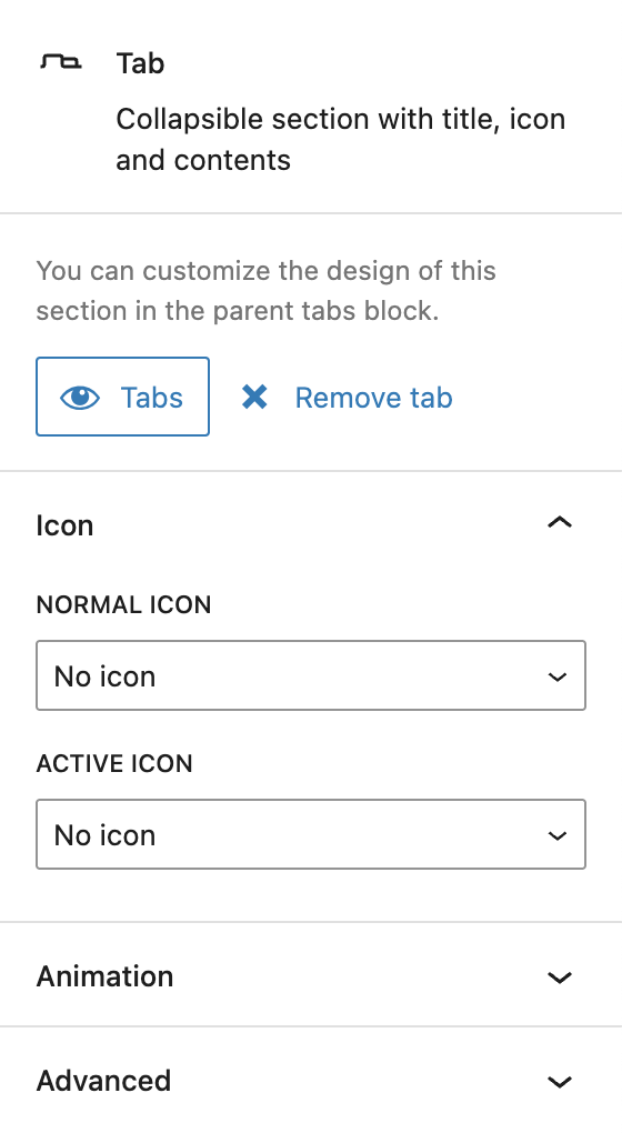
In the settings sidebar, each Tab child block includes a button to focus the parent Tabs block and a button to remove the selected tab.
Under Icon you can select an icon for the individual tab using the icon picker. You can set separate icons for the active state (when the tab is selected) and the inactive state (when the tab is not selected).
The block also supports Animations. In the Advanced section, you can find settings for HTML anchor, additional CSS classes, and toggles to hide the block per breakpoint.
Video
Hi, this is Sandra from GREYD and today I’d like to show you how you can use the tabs block to create nice tabs modules for your website. So let’s just add the tabs block to a page. Up here you can now define as many tabs as you like and type in the titles of your tabs and down here you can fill your tabs with any content you like. Let’s just put something in there so we can see something.
On the right you can choose from different styles for your tabs. Either work with the default, you can work with chips or also select from your various button styles. You can define whether or not and which kind of animation you want to have when the user switches between tabs in the frontend.
Now we have some design settings for both the tabs and the content area. For the tabs you can define the alignment and also the space between the tabs individually per breakpoint. If you later select an icon you can decide whether to position it on the left or right. The icon itself can later be defined here in the child element. You can select up to two icons, normal and active icon, and as just said you can define the positioning here.
Next is about colors for both the background and the text. Here you can define up to three different states: normal, hover and active, which is when the respective tab is open. We have some typography settings — font size, font family and some detailed settings. Under spaces you can define the padding, which in this case is this area here, again individually per breakpoint. If you like to, you can work with a border radius, border and/or drop shadow.
So let’s go back to the settings for the content area. Again we have text and background color settings and we have the width of this content area, again individually per breakpoint, and also the alignment. Under spaces again we have the padding, which in this case is this area here, again individually per breakpoint. And again you can work with a border radius.
For more videos and information please visit our Helpcenter.