This feature, internally labeled as Multiselects, is not directly visible or configurable to end users. Instead, it provides essential functionality for consistent styling and behavior of various input types in the frontend. While the name refers to multi-option dropdowns, the feature actually standardizes a broader range of form controls — namely single selects, multi-selects, radio buttons, and checkboxes.
The goal is visual and behavioral consistency across all supported form elements, regardless of browser or device. This is particularly relevant in forms, search filters, and any interface where users interact with selection controls. The feature is automatically active and deeply integrated into the Greyd.Suite, serving as a dependency for several core components.
Supported input types
The feature modifies and enhances the appearance and behavior of four input types: regular select dropdowns, multi selects, radio buttons, and checkboxes. These controls are rendered using consistent markup and styles defined in the plugin.
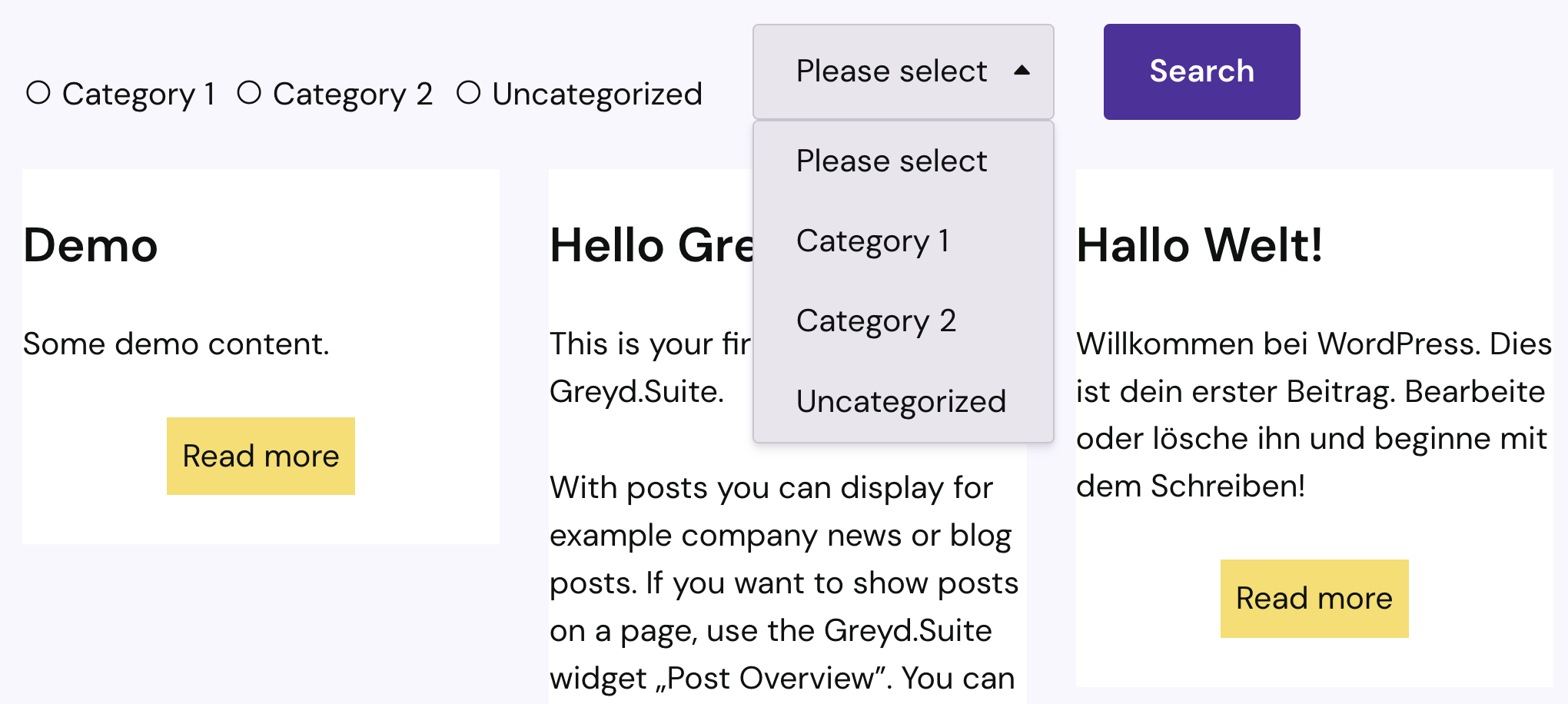
Single select
Standard HTML <select> elements behave inconsistently across browsers and devices. To address this, Greyd.Suite replaces native selects with a stylized version that matches the site’s CI. A dropdown icon is added, and the entire select interface — including the expanded option list — is customized for visual alignment with other input fields.
This styling is automatically applied to all standard select fields, especially those in forms or search filters.
Multi select
Multi-select dropdowns can be enabled by toggling the respective setting in a dropdown block, such as in Greyd Forms or the Search (Greyd) block. Initially, the element looks like a standard single select. Upon interaction, users can select multiple items from the list.
Each selected option appears as a “chip” inside the input area, complete with a small “x” for deselection. A checkbox icon next to each option reflects its current state — empty when unselected, filled when selected. Clicking the chip or the corresponding option again removes it from the selection.
This implementation is most common in form dropdowns and the filter or sorting sections of the Search block. While the behavior is consistent, visual variations may occur depending on the component (e.g., chips or filter buttons).
Radio buttons with multi select
Greyd Forms allows enabling multi-selection even for radio button fields. This is configured via the same toggle used in dropdowns. Once activated, users can select more than one option — despite the standard behavior of radio inputs being single select.
The visual representation remains unchanged. This behavior is exclusive to Greyd Forms. Please note that this feature is not accessible and should be used with caution.
For multi select filter chips and buttons in the Search block, refer to the dedicated documentation on Filter Buttons & Chips in Search (Greyd).
Checkboxes
Checkboxes remain functionally unchanged, but their styling is also unified. The feature ensures they match the site’s design tokens and CI, replacing browser-default styles with consistent visuals across platforms.
Usage in Greyd.Suite
This feature is foundational to several key blocks and helpers:
- In the Greyd Search block, it powers filter dropdowns and selection options.
- In Greyd Forms, it’s directly integrated into the Dropdown block and Radio Button block.
All variations are rendered via the internal RenderMultiselect helper, which ensures a consistent output across the plugin ecosystem.