Pop-ups in the Greyd Plugin are a flexible way to draw attention to specific content or actions across your entire website. Whether you want to promote a newsletter, highlight a limited-time offer, or inform users about something important, pop-ups help you surface that content without changing the structure of your individual pages.
These overlays can appear in different shapes and positions — covering the full screen, sliding in from a corner, or stacking neatly above your page content. This flexibility makes them a powerful tool to increase user interaction and improve conversion rates.
Pop-ups are not to be confused with Popovers. While pop-ups are globally managed and behave consistently across your site, Popovers are block-based elements configured per page. You can find more information in the Popover documentation.
Managing Pop-ups
You can manage all your pop-ups from the WordPress backend under Greyd.Suite → Pop-ups. This overview shows a list of all pop-ups you’ve created. Each pop-up is its own post and has individual styling and meta options.

In the list view, you can quickly see the name of each pop-up, the configured triggers, where it will appear on the site (e.g. all pages, selected pages, only posts), the defined rules and priority, and the publication date. To edit a pop-up, click Edit. If you want to remove it, click Trash.
Creating a Pop-up
To create a new pop-up, click the Create pop-up button at the top of the overview screen. A modal window will appear titled Create a new pop-up.
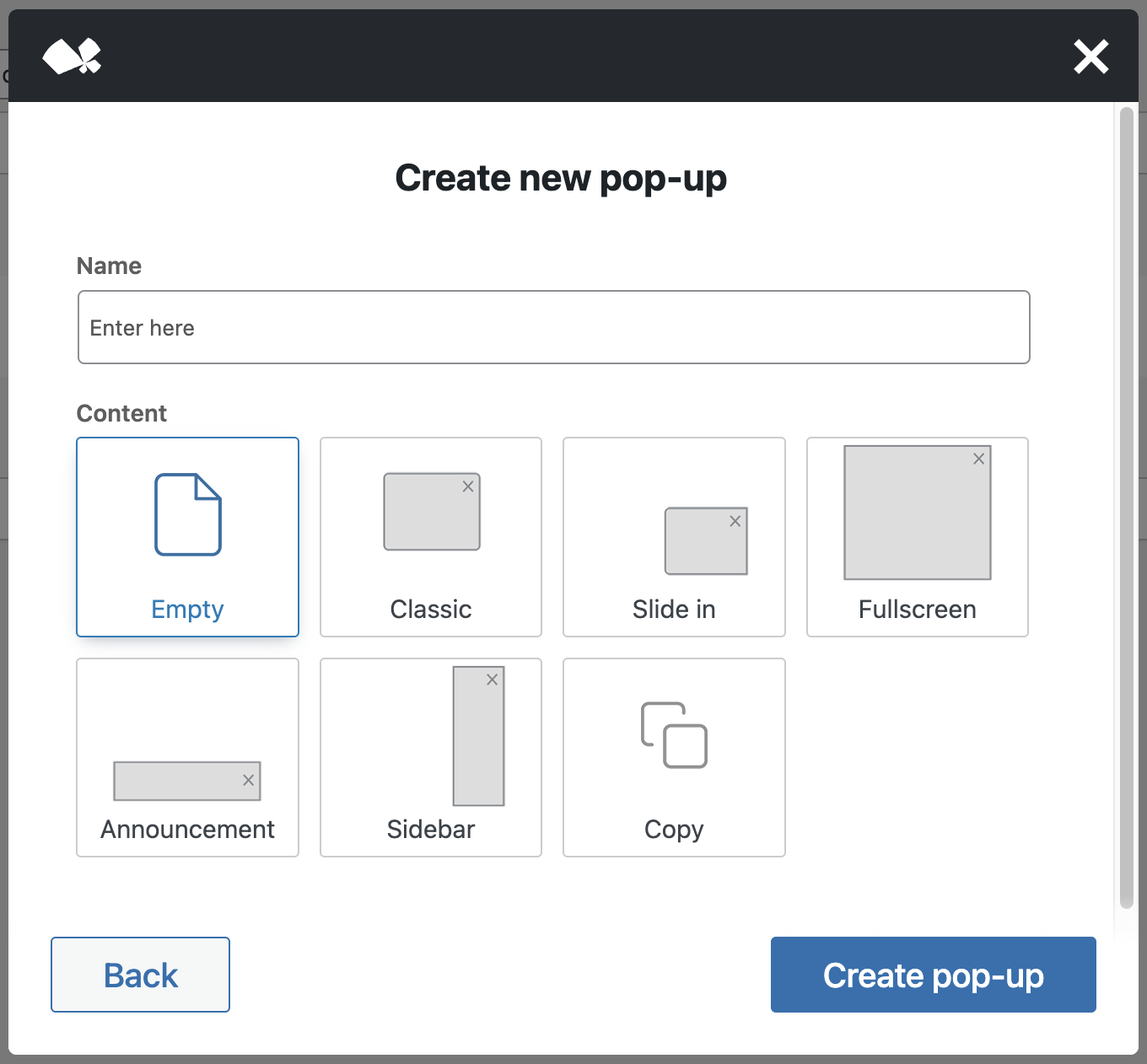
First, enter a name in the input field. You can change this later, but it helps to give each pop-up a clear identifier. Then, select a layout preset from the available options:
- Empty – a blank template.
- Classic – a centered, medium-sized pop-up.
- Slide in – slides in from the bottom right.
- Fullscreen – covers the entire screen.
- Announcement – a bottom bar style message.
- Sidebar – appears from the right and spans the full height of the screen.
- Copy – duplicate an existing pop-up by selecting it from a dropdown list that appears when selecting this option.
These presets help you get started faster by applying a ready-to-go structure. You can always adjust the design and behavior later on.
After setting a name and selecting a preset, click Create pop-up. If everything goes well, you’ll see a confirmation message: Congratulations, your pop-up has been created. The pop-up will be saved as a draft, meaning it won’t be visible on your site yet. You can now edit it to fine-tune its appearance and logic by clicking on the Edit pop-up button in the confirmation dialog.
Editing a Pop-up
When you open a pop-up for editing, you’ll see a slightly modified version of the block editor. Instead of a blank canvas, the editor shows a live preview of your website inside an iframe, with the pop-up rendered on top. This gives you an accurate preview of how it will look in context.

At the top, you’ll see the pop-up title you entered earlier. You can rename it here to keep things organized.
Inside the editor, a special block is available: the Close pop-up block. This is a dedicated button that closes the pop-up and is only usable within pop-ups.
On the right-hand side, you’ll find the Pop-up tab in the sidebar. If it’s not visible, make sure no block is selected, or manually switch from the block settings tab. Under the Pop-up tab, you’ll see a Style section, which contains the following areas:
- Layout
- Design
- Extended
These sections control the visual appearance and structure of your pop-up.
Scroll further down to find the Display metabox, where you configure behavior:
- Trigger – defines when the pop-up appears.
- Appearance – determines on which pages or post types the pop-up shows.
- Rules – allows conditional logic for when the pop-up should be shown.
- Advanced settings – for additional control options.
We’ll cover these configuration areas in more detail in separate articles.
Pop-up style settings
All style settings found in the right sidebar can be found in the separate Pop-up style settings documentation page.
Pop-up behaviour settings
All behaviour settings found in the Display meta box below the content can be found in the separate Pop-up behaviour settings documentation page.
Close pop-up block
Exclusively for the pop-ups post type, there’s a separate block called Close pop-up available. See separate the documentation for more details.
Video
Hi, this is Sandra from GREYD and today I’d like to introduce you to GREYD.Popups and show you how easily you can create individual popups in GREYD.SUITE. You’ll find GREYD.Popups on the left in our menu and we’ll then see an overview first of all existing popups including information on the triggers, where the popups appear, if there are any rules defined, priority, creation date, etc. When you click on “create new popup”, our wizard will open where you can enter the name of your popup. And you can either start from scratch or you can also work with a copy of an existing popup or you can work with one of our presets that already have some content and settings prepared, so that you don’t have to start from scratch. Let’s now have a look at the popup that I’ve prepared beforehand.
So in terms of the content for your popup you can work with the Block Editor and work with any core or GREYD.SUITE blocks as usual. And there’s one additional block that you’ll find, which is the close popup block that will add this little X icon to close the popup, that you can then define in colors and sizes individually. Or alternatively you could of course also work with a regular GREYD.Button and select the trigger “close popup” which is more or less the same. So much on the content of your popup.
Let’s now have a look at the general popup settings here on the right. Here under “layout” you can easily define the position and size of your popup, width and height. Custom, automatic or just 100 percent.
You can also work with paddings and margins. And you can also have individual settings for your mobile popup as well. Then here under “design”, you can define the colors for text, headlines, and the background. You can work with a hover effect if you want to, you can make a popup round with border radius, you can add a border and/or a drop shadow if you want to.
And last but not least, under “extended”, you can define what should happen to your page in the background when a popup is opened. You can activate or disable page overlay, that you can then define for example in color, different opacity, you can work with different effects such as blur or brightness and define that individually here. You can also define whether the popup should close when somebody clicks on the page overlay. You can disable scrolling on a page while the popup is active and here you can define how your popup should appear. You have different animations both for the body and popup itself and you can also always have a preview. Down here you can define what should happen if your content doesn’t fit into your popup. You can make it scrollable or define if the additional content should be visible or not.
Let’s now move on to when, how and to whom your popup should be visible. First, it’s about the triggers. You can define one or several triggers. For example you could activate the popup after x seconds on a page or after someone has scrolled to a certain amount of your page, after some seconds of inactivity, you could have an exit intent popup or you can also of course always have a button as a trigger. I’ve shown you how to use a button to close a popup. Of course you can also select the trigger “popup” and then select another popup on your page.
Next is about where your popup should appear. You can select normal, regular pages, special pages like the 404 or search page, or post pages. If you have any custom post types, you can also define custom post pages here. You can either show or hide popups entirely or also select some posts individually. If you want to, you can additionally set certain rules — one or several — that have to be met for your popup to be opened. For example you could define that at least 3 pages have to be visited before your popup is activated. Or you could make a popup dependent on a URL parameter and include it in a certain marketing campaign, or show it only to visitors who come from a special newsletter. You could also define that a certain page would need to be visited beforehand. With user role dependency, you can make your popup only visible to certain users. Or you could also make it dependent on time, device and/or the browser used by the user.
Down here you will find some additional settings. First is the priority: you can select a number between 1 and 10 and higher prioritized popups will always be visible above the other popups. With this option you can also define that all popups with a lower priority will be closed as soon as one of a higher priority is opened. This option here is actually quite handy: it sets a hashtag in the URL when the popup is opened, which makes it much easier to analyze your website activities in analytics tools like Google Analytics. So if you now open this page and trigger an exit intent, a popup opens and as you can see here this part was added to my web URL.
The last option is to make sure that the popup is only shown once, even if the conditions for the popup are met several times while the user visits your website. This prevents someone from seeing the same popup over and over again.
So much on GREYD.Popups. As you’ve seen, there are abundant possibilities, lots of design and admin features, while it is still very easy to create very individual custom popups.
For more videos and information, please visit our Helpcenter.