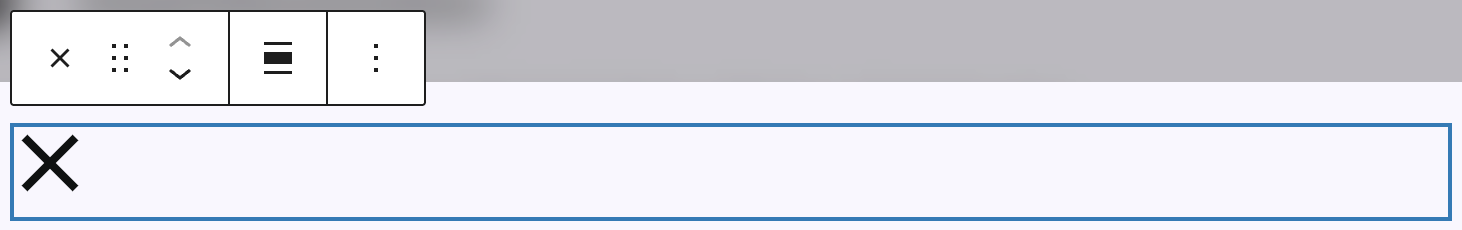
The Close pop-up block is a special block available only inside pop-ups. It allows users to close the currently open pop-up by clicking on it. By default, this block renders as a close icon.
Most pop-up presets already include a Close pop-up block by default. However, you can also add it manually. To do so, click on the plus icon in the upper left of the block editor inside a pop-up or click an empty area within the pop-up layout. Then, search for “Close pop-up”. Once it appears in the inserter, you can click to add it or drag it directly into the layout.
There’s an option in the toolbar to align the button. You can align it left, center, or right — or leave it unaligned using the “None” setting, which keeps it inline with the document flow.
Settings

When you select the Close pop-up block in the editor, the settings sidebar on the right will show several customization options.
The first section contains color settings. Here, you can set the icon color and background color using the standard color pickers. Both can be defined for the normal and hover state — use the small mouse icon above the color fields to toggle between the two modes. See the related article on pseudo-classes for more info.
Next, under Size, you can define the overall size of the button. Since it’s a square element, there’s only one input field for size but it is customizable to your needs with the Range Unit Control component. You can make this value responsive using the device icon to set sizes for different breakpoints.
The Thickness setting controls the line width of the icon itself. This is also a single-value input and supports responsive values. See the links in the previous paragraph for more information on the details.
If a background color is set, you will also see the Border Radius option. This setting affects only the background shape of the button. If no background color is set, you won’t see any visible effect. With a background applied, the border radius lets you round the corners of the square. For more information how to use this, see the Dimension Control component for border radius.