The behaviour settings can be found scrolling down to the Display meta box in the editing section where the pop-up preview is, if it’s not visible directly on your screen.
Trigger Settings
Trigger settings control when a pop-up is shown to visitors. It’s the first section in the Display meta box, which lets you define event-based conditions that trigger the pop-up.
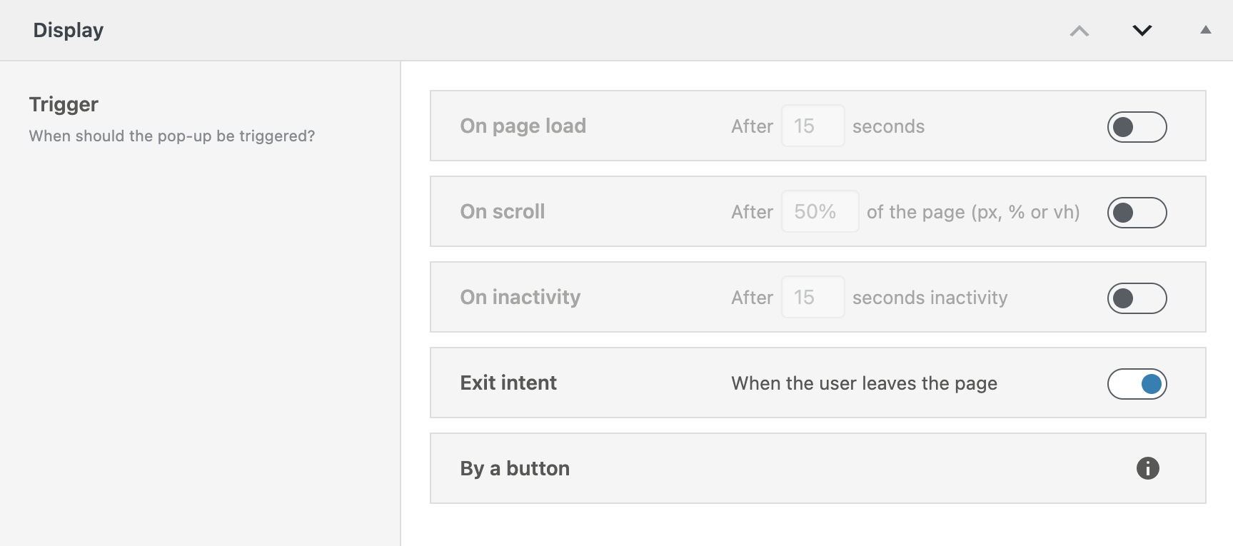
Each trigger has its own toggle on the right. You can activate multiple triggers at the same time. The pop-up will appear if any of the selected triggers are met.
On page load
Enable this trigger by toggling the switch on the right side of the On page load section. Once activated, the numeric input field is activated to be edited. Here, you can define a delay time in seconds. The pop-up will automatically be shown this many seconds after the page has finished loading.
For example: Set to 5 → the pop-up appears 5 seconds after the user enters the page.
This is ideal if you want to give users some time before interrupting them with a message or offer.
On scroll
Toggle this option to activate the On scroll trigger. This setting lets you define how far a visitor must scroll before the pop-up appears.
You can use the following units with your preferred number:
- % (percent) – percentage of the page height
- px (pixels) – fixed distance in pixels
- vh (viewport height) – portion of the current screen height
You need to insert the number together with your preferred unit in the input field. Example: 50% → pop-up shows when the user has scrolled halfway down the page.
This trigger is useful if you want to wait until the user is actively scrolling your content.
On inactivity
Enable the On inactivity trigger to show the pop-up after a period of user inactivity. Once the toggle is enabled, the input field becomes editable.
You can define how many seconds of inactivity should pass before triggering the pop-up. Inactivity includes no mouse movement, no scrolling, and no keyboard interaction.
Default value: 15 seconds. Example: If set to 15, the pop-up will show after 15 seconds of no input from the user.
This works well to re-engage users who are still on the page but no longer interacting.
Exit intent
You can enable Exit intent using the toggle on the right. No additional options are shown, because this behavior is handled entirely in the background by JavaScript.
The trigger activates when the mouse leaves the viewport—typically when the user moves toward the browser’s tab bar or attempts to close the page.
This is commonly used to capture attention just before users bounce away.
By a button
Although not a separate setting of the Display meta box, you can also trigger pop-ups using a button elsewhere on your site. This method doesn’t require any toggle inside the Triggers section to be activated.
To set it up:
- Go to a page, post, or template.
- Insert a Greyd Button block.
- In the button settings, change the action type to Pop-up.
- Select the pop-up you want to trigger from the dropdown list.
This makes the pop-up available on the page and allows it to be shown only when the user clicks the button. It will not appear based on the other trigger types unless explicitly enabled.
Note: The pop-up must be published or scheduled for the button to find and render it correctly.
Appearance
The Appearance settings control where your pop-up can be triggered — i.e., on which pages or post types it is available on the frontend. These settings define the visibility scope of the pop-up across your site. The Appearance panel is the second section, located directly under Trigger.
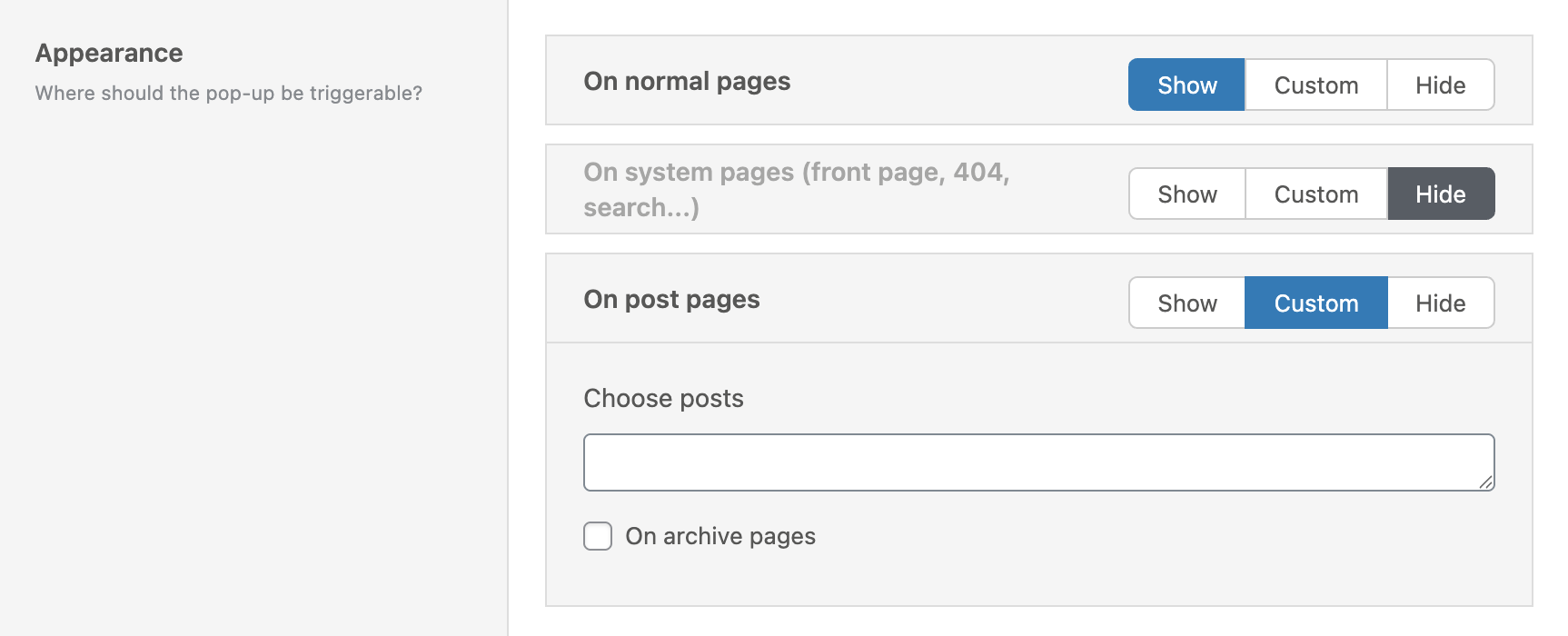
At the top of this section, you’ll see the prompt: “Where should the pop-up be triggerable?”
Each visibility group follows the same logic and gives you three main options:
- Show – the pop-up is eligible to appear on all entries of this type.
- Hide – the pop-up is explicitly hidden on all entries of this type.
- Custom – allows you to choose specific entries of this type.
On normal pages
This controls the visibility of the pop-up on all standard WordPress pages (post_type = page).
If you select Custom, a multi-select input appears labeled Choose Pages. Once clicked, a dropdown lists all existing pages by title.
You can:
- Select multiple pages by clicking them
- Remove selected pages using the small “X” inside the chips
Only the selected pages will be considered for pop-up display (assuming all other conditions such as Rules are also met).
On system pages
This category includes special template pages such as:
- Front Page
- 404 Page
- Search Results Page
If you select Custom, three individual checkboxes appear that let you individually select which of the system pages the pop-up should appear.
On post pages
This setting refers to the default WordPress post type: blog posts (post_type = post).
Again, you can choose between Show, Hide, or Custom. When choosing Custom, you’ll see:
- A Choose Posts multi-select
- A checkbox labeled On Archive Pages
By enabling the archive checkbox, you allow the pop-up to also appear on index/archive templates that list multiple blog posts.
On custom post types
Below the Post Pages section, you’ll find an entry for every other public post type registered on your site — which could be Products, Events, Portfolios, or any other custom type.
For each post type:
- You get the same Show, Custom, and Hide options
- If you choose Custom, a multi-select control appears
- You can choose individual entries of that post type to allow pop-up display
This modular logic ensures full control over the pop-up’s appearance across all types of content.
Rules
Rules define the conditions that must be met before a pop-up can be shown. The Rules section is the third section, located directly below Appearance.
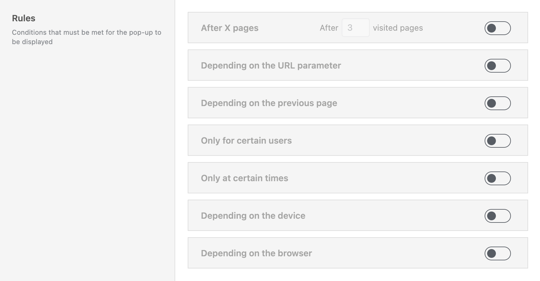
Each rule can be toggled on individually. If multiple rules are activated, all of them must be fulfilled at the same time for the pop-up to be displayed.
After X pages
Once this rule is activated, you’ll see an input field for the number of pages. This rule keeps track of how many pages the user has visited during their session.
For example, if you set the value to 3, the pop-up will only appear once the user has opened their third page on your site.
This is useful for preventing pop-ups from showing too early and instead targeting more engaged visitors.
Depending on URL Parameter
This rule allows the pop-up to show only if a specific parameter is present in the page URL. These are often used in tracking links, e.g., from Google Ads campaigns.
Once enabled, you’ll see three fields:
- Parameter name – e.g.,
utm_term - Condition type – a dropdown where you can select from these options: has the value, contains the value, has not the value, is set, is not set
- Value – the expected value or string fragment
Example: utm_term / contains the value / campaign1
This would trigger the pop-up only if a user comes from a campaign link containing that parameter value.
Depending on previous page
This rule evaluates the referrer — the page the user visited before landing here.
Once activated, you can configure:
- Condition – a dropdown where you can select from these options: contains, doesn’t contain, is, is not
- Value – the referrer string to check against, an URL or part of a URL
Note: This depends on the browser sending a valid referrer. It may not work in private mode or on strict devices.
Only for certain users
With this rule, you can target users by their login status or role. Once activated, a list of available roles appears, including:
- All standard and registered roles, like Administrator, Editor, Author, Subscriber, etc.
- Unknown – for not logged-in users
Use this to show pop-ups to guests, logged-in users, or specific roles like “Customer” if available.
Only at certain times
This rule limits when a pop-up appears based on the time of day. You can select from these five presets:
- In the morning (from 5 am)
- In the afternoon (from 12 pm)
- In the evening (from 5 pm)
- At night (11 pm to 5 am)
- Custom time
For Custom time, enter hour ranges using - and ,. Example: 12-13,15-16 → triggers from 12–13h and 15–16h. For time spans across midnight, use two separate ranges: 22-24,0-4.
Depending on the device
This rule allows you to show or hide pop-ups based on the visitor’s operating system. Available options:
- Windows
- OSX (macOS)
- iOS
- Android
- Unknown device
Depending on the browser
This rule restricts the pop-up based on the visitor’s browser. Options include:
- Firefox
- Chrome
- Opera
- Edge
- Internet Explorer
- Safari
- Unknown browser
Extended
The Extended settings section provides additional configuration options that define how a pop-up behaves when triggered. These settings are located below the Rules section.

Priority
This dropdown lets you set a number between 1 and 10, with 5 as the default value. This defines the pop-up’s priority relative to other pop-ups.
A higher number means the pop-up will appear above others on the page. If multiple pop-ups have the same priority, the post date is used as a secondary sort: newer pop-ups will take precedence and visually stack above older ones.
This is especially useful when multiple pop-ups could be triggered at the same time — e.g., when you want a small chip-style notification to appear above a larger full-width pop-up.
Hide lower priority pop-ups
This checkbox, labeled “As soon as the pop-up is triggered, hide all pop-ups with lower priority”, controls the visibility of other pop-ups. If enabled, once this pop-up is triggered, any other pop-up with a lower priority will be hidden immediately.
This ensures that the currently triggered pop-up gets the user’s full attention without interference.
Set hashtags in URL
If enabled, this checkbox adds a hashtag to the page URL as soon as the pop-up is triggered. This hashtag is derived from the pop-up’s title, sanitized and escaped to form a valid URL fragment (e.g., #newsletter-signup).
This feature makes it easier to track pop-up triggers using analytics tools such as Google Search Console, or for use in automation or debugging.
Show pop-up only once
This final checkbox controls whether the pop-up should not reappear after being closed. When enabled, the pop-up will only be shown once per session.
A session is tracked in the browser’s memory. It typically lasts until the browser is closed or the device is restarted. Once dismissed, the pop-up won’t appear again during the session.
This is useful for announcements or marketing messages you only want to show once. However, if you’re actively testing your pop-up’s appearance or behavior, consider disabling this option temporarily or duplicating the pop-up without this restriction.
Aria Label
To improve accessibility for your pop-ups, you can set an aria label in this field, which will enhance the user experience for users using assistive technologies.