The Post Slider is an enhanced variation of the core “Post Template” block and can be found in the “Greyd” category of the block inserter. You can transform a regular “Post Template” variation into a “Post Slider” at any time using the block toolbar or the sidebar — and just as easily switch back.
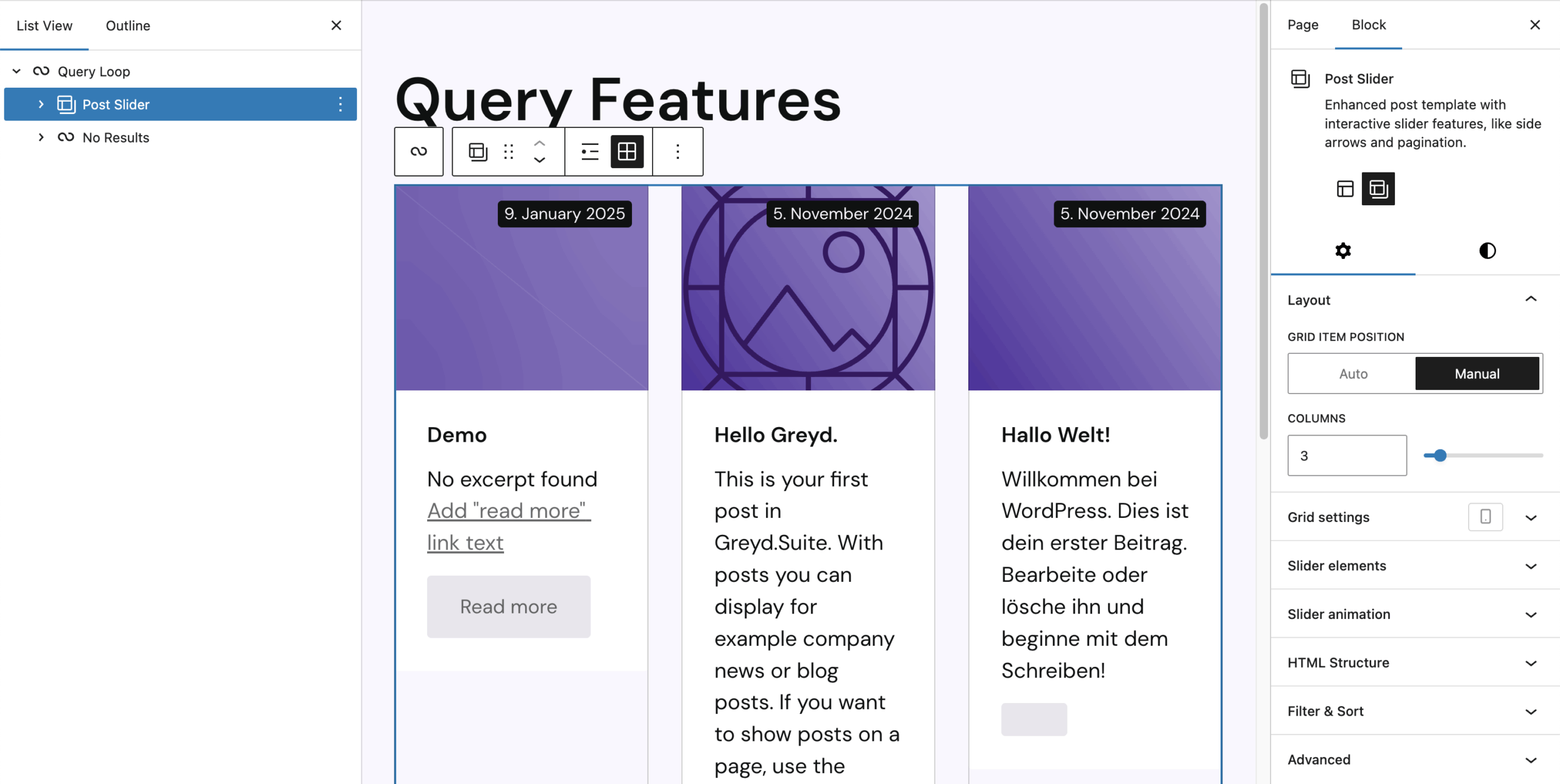
Unlike the default Query Loop behavior, which renders only one page of posts at a time and uses pagination links to fetch the next set, the Post Slider loads all posts across all pages in advance. Only one page is visible at a time, and the rest are placed in overflow to the left and right. Instead of reloading the page, the Post Slider uses JavaScript to slide through pages smoothly — providing a snappy and seamless experience without full reloads.
Once transformed, the block reveals several new Panels in the Sidebar to control layout, features, animations, and HTML output.
Grid Settings
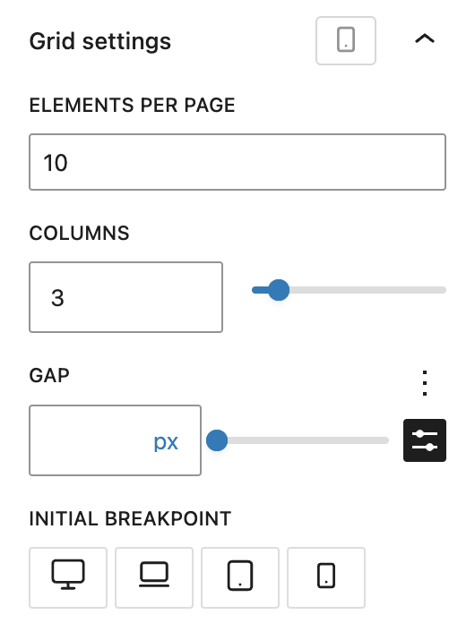
While core blocks already provide layout tools, this panel centralizes grid configuration with responsive breakpoints. It combines controls from the Query Loop and Post-Template blocks with additional options.
You can define how many elements appear per page, how many columns are used, and how large the gap between posts should be. Additionally, the “Initial Breakpoint” control lets you define which breakpoint should be applied on initial page load — especially useful to optimize loading behavior for mobile users.
Slider Elements
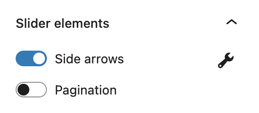
This section manages interactive elements like side arrows and pagination controls. Toggling an element reveals a wrench icon on the right side, clicking on the icon brings you to additional options for customizing its appearance and behavior.
Side Arrows
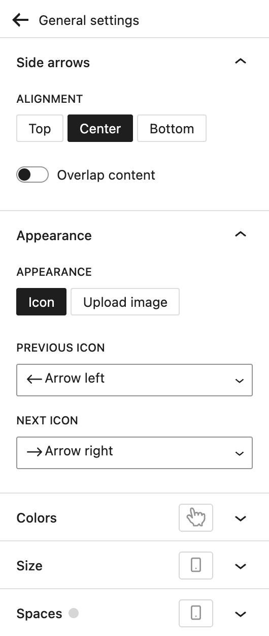
Arrows are placed to the left and right of the slider to navigate between pages. You can configure these settings for the arrows:
Alignment: The arrows can appear at the top, center (default) or bottom of the posts. It’s also possible to have them overlap on the content, so they don’t take up extra space outside of the posts.
Appearance: Here you can choose to either use icons for the arrows, or upload images for both the previous and the next icon.
Colors: If you choose to use the default icons, you can pick a specific icon color here. The background color is always available. Both color options support the hover pseudo-class, so you can define different colors when hovering the arrows with the mouse. There’s also an option for opacity, which can be very specifically configured as it supports the Range Unit Control component.
Size: You can set a specific width for the arrows with the Range Unit Control component and change it also depending on your breakpoints.
Spaces: Here you can set the padding, the space inside the arrow elements with the Dimension Control component. You can adjust the spacings depending on your breakpoints as well.
Pagination
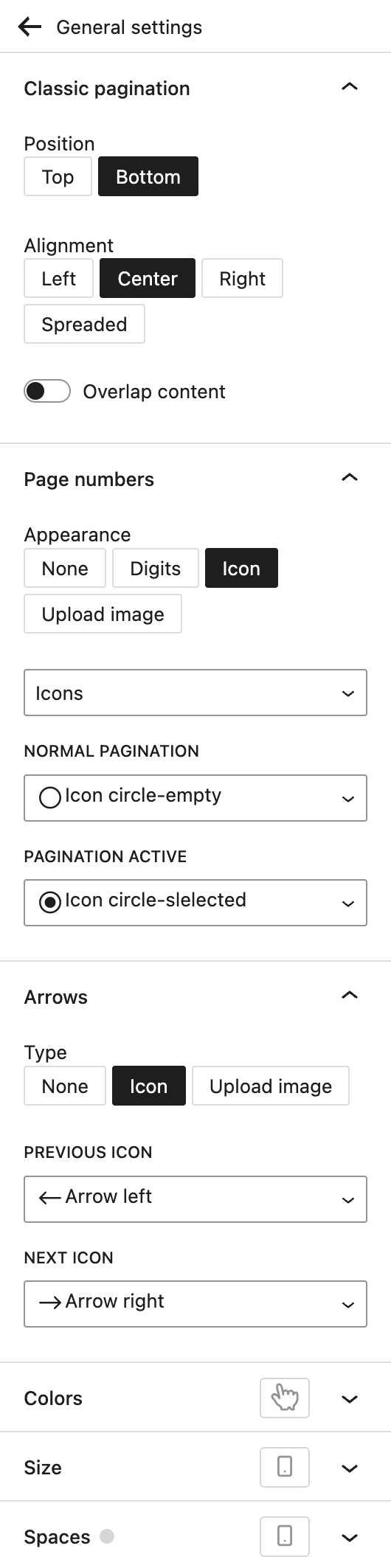
The Post Slider comes with it’s own pagination different from the Core pagination blocks. It supports page numbers and next/previous arrows that have many configuration options.
Position: Choose between showing the pagination above (top) or below (bottom, default) of the posts.
Alignment: Choose where the pagination should show horizontally. Options are left, center (default), right or spreaded — this means the elements will be strechted across the entire width of the posts.
Overlap content: toggle this to have the pagination sit on top of the posts and not separately below it.
Page numbers: By default, the page numbers show as circle icons, either empty or selected. Under Appearance, you can choose from the following options:
- None: completely hide the page numbers
- Digits: use numbers or letters which you can select from a separate dropdown
- Icons (default): choose between Icons and selecting specific icons, or circles or squares. Both circles and squares do not have any further options.
- Upload image: Upload your own images for both the normal and the active state.
Arrows: You can choose to hide the arrows, choose icons (default) for both previous and next arrows, or upload your custom images for both options.
Colors: If you choose to use the default icons or digits, you can pick a symbol color here. It also supports the hover pseudo-class, so you can define a different color when hovering the elements with the mouse. There’s also an option for opacity, which can be very specifically configured as it supports the Range Unit Control component.
Size: You can set a specific symbol size for the elements with the Range Unit Control component and change it also depending on your breakpoints.
Spaces: Here you can set the padding, the space inside the elements with the Dimension Control component. The “In between” setting changes the space between each of the pagination icons and supports various options through the Range Unit Control component. You can adjust the spacings depending on your breakpoints as well.
Slider Animation
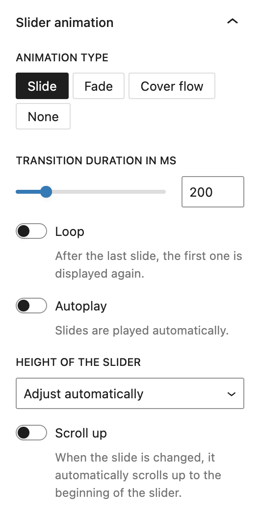
Since the Post Slider uses JavaScript for transitions, you can fine-tune how these animations work.
Animation Type: Choose between slide, fade, cover flow, or no animation.
Transition duration in MS (milliseconds): Change the length of the transition for slide and fade animation types.
Loop: Go back to the first slide after the last one.
Autoplay: Toggling this on gives you an additional option to set the interval in seconds that slides move forward automatically. Default is 5 seconds.
Height of the slider: Choose between adjust automatically, set the height to the highest slide or set a custom height with the Range Unit Control component.
Scroll up: Toggling this on ensures the slider scrolls into view when the page changes.
HTML Structure

By default, the wrapper is a <div> and posts are rendered as <article>. You can switch to other semantic HTML elements like <section>, <ul>, or <nav> for wrappers and <li> or <div> for posts. This doesn’t affect functionality but improves accessibility or allows for advanced custom styling.
Filter & Sort
This panel replaces older filtering options that were part of “Slider Elements.” You should now use the Greyd Search block together with the Post Slider inside a Query Loop to apply filtering and sorting features using block-based controls. See the search documentation for more details.
Video
Hey, this is Sandra from GREYD and in this video I’m going to show you how to create individual post overviews and sliders with GREYD.SUITE.
To build a slider or post overview, you always need a Query Loop. A Query Loop is there to display certain posts of a post type and it always consists of a post template and the content. There are different ways to start. For example, if we just add a Query Loop here, we can either start with a template or pattern. Or we can start blank and then you will see a couple of presets, among others our post sliders.
A post slider is basically a variation of the post template. So if you have a look at the structure we had before, we had the Query Loop and post template. And now we have Query Loop and post slider. Since this is a variation, you can directly start with post slider and automatically get this layout.
In order to see something in the preview, select some pattern or template. Now in the parent block, the Query Loop, you can set the alignment and how many items you want per page, how many offset, or how many pages you want to have. If you set zero, the Query Loop will create as many pages as necessary to display all your posts.
On the right you will find more options. Depending on the width, you can say that the inner blocks should use the content width as defined in the site editor. This option is only necessary if you place your post slider in an archive or search template. In all other cases, you select which post types you want to use for your post overview. For example, I’ve got a post type “movies”. Then you can define the order of posts and further narrow them down with filters — by taxonomy, authors or keywords. If this is not enough, we offer more advanced filter options. For example, exclude a taxonomy, only include terms of the current post, or exclude them. You can filter by meta fields, by date, or select individual posts to include or exclude. Advanced sorting options are also available — by meta fields, most popular posts, random, etc. And you can combine filters and sorting.
Now let’s go into more detail with the post slider. You can switch between list view and grid. For each breakpoint you can define how many elements per page, how many columns, and how much space between them. This makes it simple to create responsive grids.
You can always switch between post templates and post sliders. You can also add filters in the frontend so users can filter posts themselves. Place the filter on top, below, left, center, or right, and define the design, size, and spacing. Users can also sort posts themselves with a dropdown. You can customize the labels, which is useful for multilingual sites.
You can add arrows to switch between pages and place them anywhere: top, bottom, beside posts, or overlapping the content. You can use icons or upload custom images, and define colors, hover effects, size, and spacing. Alternatively, you can add classic pagination with digits or icons, top or bottom, overlapping or not, again with lots of design options. You can also define the animation of page transitions, enable looping, autoplay, and set the speed. On mobile you can enable automatic scrolling so that when a new page loads, the view jumps to the first post instead of staying at the bottom.
To display your individual post content, use GREYD.SUITE dynamic tags. Either place a dynamic template or individual elements like headline and image in your post slider, then connect them to your post content using the dynamic tag icon or a hashtag. You can display post titles, dates, featured images, custom fields, or general tags like site title, user name, or date. You only need to configure this once — it applies to all posts in the loop.
When you click on a linked post in the frontend, you see the post page defined by the post template. Post templates are regular WordPress templates you edit in the site editor. You can use default placeholders like post content, or GREYD dynamic tags like author. For custom post types, you can create individual single templates, so each post type can have its own layout.
If you combine the post slider with GREYD.Search, you get an interactive live search. The results of your post overview update instantly as you filter. GREYD.Search also provides more advanced design options and filter features, like date pickers. To enable this, just add the GREYD.Search block inside the same Query Loop as your post slider. Or start directly with the live search block, which includes both by default.
So as you’ve seen, you have lots of different possibilities to design and create individual post overviews and sliders. There are more tutorials in the Helpcenter on working with templates, creating post types, and building searches. One tutorial in particular shows the entire process — from creating a custom post type to styling post templates, to building post sliders and overviews. Definitely have a look in our Helpcenter.
For more videos and information please visit our Helpcenter.