The Theme Adaptor ensures consistent styling for essential UI components like buttons, form fields, tabs, and accordions — even when the Greyd Theme is not active. It allows you to maintain the Greyd design system across any theme without additional configuration. This feature is especially useful for developers who want to retain a unified design language when working with custom or third-party themes.
Built-in theme support
By default, the Theme Adaptor comes with pre-configured styling support for the following themes:
- Ollie
- Twenty Twenty-Four
- Twenty Twenty-Five
For these themes, the plugin automatically loads customized CSS files to match their design characteristics. These adaptations are included directly in the plugin and require no user setup.
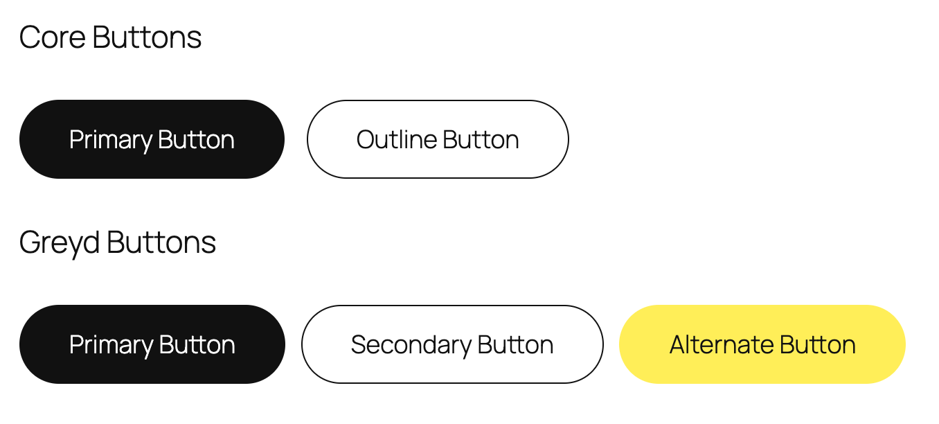
The above screenshot shows the adaption of the button styles with the Twenty Twenty-Five theme.
How it works
When the Greyd Plugin is active but the Greyd Theme is not, the Theme Adaptor auto-loads a set of default styles from the plugin’s internal assets. These styles ensure that Greyd UI components still render correctly in the frontend.
Before loading default files, the plugin checks if custom overrides exist in the active theme:
- It looks for a
/greyd/css/directory in the active theme. - If not found, it checks the parent theme.
- If neither theme has custom files, it loads defaults (or built-in support for Ollie/Twenty themes).
This setup allows for a clean override hierarchy. You can replace or extend the default look by placing your own styles in your theme’s /greyd/css/ folder. These user-defined files are prioritized and used instead of the plugin defaults.
File overview
The following CSS files are available for customization:
root.css— Contains all design system variables like colors, spacing, fonts, and sizes. This file is essential.buttons.css— Adds detailed styling for buttons (primary, secondary, tertiary).inputs.css— Controls the design of input fields and labels.editor.css— Styles elements specifically inside the block editor.
To override any of these, create the file(s) in /greyd/css/ inside your theme or child theme. The plugin will automatically load them, no enqueueing necessary.
How to set it up (step-by-step)
To apply custom Greyd styles in your theme, download a copy of the files and follow these steps:
- Create Folder: In your theme root, create a directory:
greyd/css/. - Add
root.css: Add aroot.cssfile with CSS variable definitions. These control your color scheme, fonts, and layout settings. - Optional: Add
buttons.css,inputs.css, andeditor.cssfor more granular control. - Test & Iterate: Reload your site. The plugin will pick up the custom styles. You can now tweak individual components without altering global styles.
For a more detailed instruction, see the Match your external theme styles with Greyd blocks.