The Trigger feature in the Greyd Plugin lets you define what happens when a user interacts with a block or text element on your website. You can assign links, scroll effects, downloads, popups, or even custom JavaScript triggers — all directly from the editor.
Although it appears as one feature, it consists of two distinct but closely related functions:
- Link Selection, which defines what should happen on click or hover — from classic links to dynamic actions like scrolling or opening popups.
- Trigger Events, which allow you to define and control custom behaviors, such as showing or hiding blocks or interactive elements that respond to named triggers.
Both parts are deeply integrated into the block editor and enable structured, semantic, and accessible frontend behavior — no extra code required. The following sections explain each function in detail and show how to use them effectively.
See the Trigger Filters and Manual Trigger events documentation on what filters are available for triggers and how to manually add trigger events to other HTML elements.
Link Selection
With this feature, you can attach frontend actions to blocks or inline text that are triggered upon user interaction (typically a click). Supported blocks include:
- Core Button
- Greyd Button
- Group
- Content Box
- Dynamic Image
In addition, any text segment inside a RichText field (such as paragraphs or headings) can be turned into an interactive link.
To apply a link:
- Edit any page or post and focus on one of the supported blocks, or insert a new one.
- For inline text, highlight the desired text with your cursor.
- In the toolbar, click the link icon (a square with an arrow pointing to the top right).
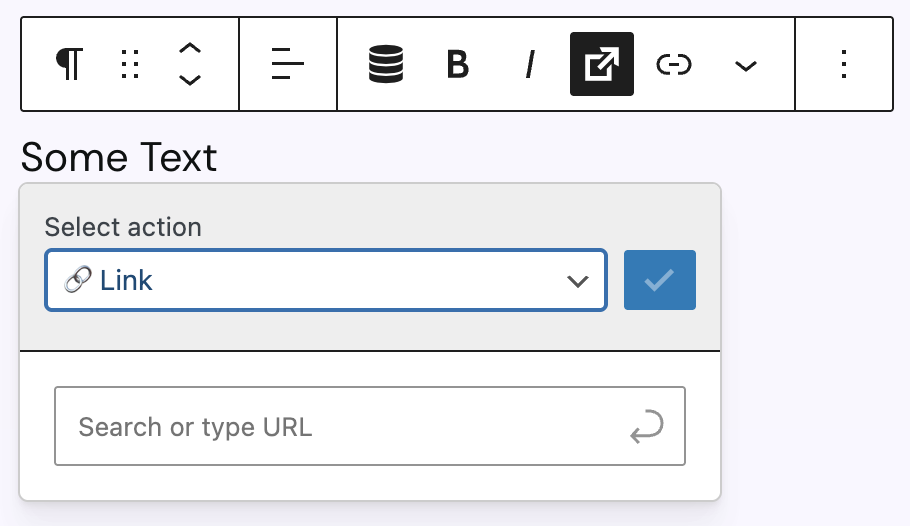
This opens a modal where you can select the link action type. Available actions include:
- Link
- Dynamic Link
- Scroll to
- Popup
- Back
- Download
- Trigger Event
Each action type has different configuration options. You can find more details about each available action in the next section.
Once selected and configured, you need to click the blue button with the checkmark to save the changes. If this was successful, you will see a preview of the link in the modal. From the top-right icons, you can:
- Delete the link (red X icon)
- Edit the link (pencil icon)
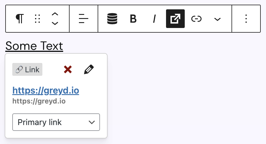
If you applied the link to inline text, you will also see a dropdown to select a visual style: Primary link, Secondary link, Primary button, Secondary button, or Alternative button. Refer to the Greyd Global Styles documentation for style details.
Link Action Types
Link
This is a static link to an internal or external URL. To set it up, you can either start typing to search existing content on your site or enter a custom link manually. Confirm the selection by clicking on a suggestion or pressing Enter. Once saved, a summary of the link appears in the interface.
Clicking the pencil icon opens advanced settings:
- Edit the link label and URL separately.
- Advanced options include:
- Open in new tab → adds
target="_blank" - No forwarding information (noreferrer) → adds
rel="noreferrer" - External link → adds
rel="external"(can be combined withnoreferrer)
- Open in new tab → adds
Use the copy icon to copy the link to your clipboard.
Dynamic Link
Creates a link dynamically based on the page context (e.g. current post or meta field values). A list of context-based options is shown automatically.
There are two options available for a dynamic link:
- Open in new tab → toggles
target="_blank" - Link text → used as the
titleattribute in the frontend, improves accessibility and screen reader support
Email addresses and phone numbers are automatically recognized and converted with mailto: or tel: prefixes, respectively.
Scroll to
Scrolls to a specific element on the current page. The two options “Page top” and “Page bottom” are always available. In between there may be some more options like a target ID or anchor block, if these are available on the post.
It creates an anchor-style link (e.g. #contact). As an alternative, these links can also be added manually via the standard “Link” action with #id (see above).
A note on the scroll behaviour: The scroll animation is theme-dependent. Greyd Theme applies scroll-behavior: smooth; by default. You can customize this via CSS: https://developer.mozilla.org/en-US/docs/Web/CSS/scroll-behavior
Pop-up
Opens a selected pop-up when the element is clicked. Pop-ups are rendered on-page automatically when used. See the Pop-ups documentation for more details.
Back
Uses the native browser function history.back() to navigate to the previous page. Please note: If there is no browser history (e.g. in a newly opened tab), nothing happens.
Opens the device’s default email client and prepopulates the respective fields from the following options:
- Email: recipient address
- Subject: subject line of the email
Download
Starts a file download for the user. You can choose a file from the media library.
Trigger Event
Triggers a custom frontend event, used to build dynamic behaviors like accordions, tabs, or modal toggles. Options include:
- A dropdown to select an event by name from available context-based triggers.
- Trigger already on hover: fires the event on mouse hover instead of click
- Trigger page-wide: fires the event globally (across Dynamic Templates or multiple instances on the page)
Rendering Behavior
How links are rendered depends on the block type and action type the trigger is added to:
- RichText fields: Trigger actions are replaced via regex with actual
<a>tags during rendering. - Greyd Button: Stores the attribute
role="trigger"inblock_content, which is dynamically replaced with a true<a>element during rendering. - Dynamic Image: For link-type actions, the image is wrapped in an
<a>tag. For JavaScript-based actions (e.g. trigger events), specific attributes likeonclickare applied to the block. - Core Group / Core Button / Content Box:
- For real links: a hidden
<a>element with classhidden-trigger-linkis rendered inside the block’s container and the container gets the classhas-trigger. - For JavaScript actions: attributes like
onclickare added directly to the container.
- For real links: a hidden
This ensures semantic correctness, accessibility, and SEO compatibility, even when using fully dynamic content.
Trigger Events
Trigger Events allow you to build interactive elements like accordions, tabs, or dynamic toggles. This works by connecting a “Trigger” (e.g. a button) with one or more “Actions” (e.g. show a content box).
How to configure a Trigger Event:
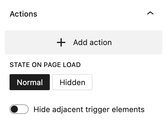
- Select a Group or Content Box and scroll to the “Actions” section in the sidebar.
- Click Add Action.
- Define the trigger:
- Name: must be unique and descriptive, e.g. “trigger-01”
- Action: select from the following options:
- Show
- Hide
- Hide and show
- Fade in
- Fade out
- Fade in and out
- Open
- Close
- Open and close
These actions affect visibility and animation style. Show/Hide apply changes immediately. Fade variants add opacity transitions. Open/Close variants apply sliding animations.
You can define multiple actions for a block. At the bottom of the panel, set the On Load state:
- Normal: Element is visible when the page loads.
- Hidden: Element is hidden on load and only appears via trigger.
The toggle Hide Adjacent and Trigger Elements enables hiding all sibling blocks with defined trigger actions, creating tab or accordion behavior automatically. This avoids manually assigning complementary triggers to each group.
Video
Hi, this is Sandra from GREYD. I’d like to show you today how to use for example buttons on your website to trigger events, like hiding or showing something. To create such a trigger event, you need two modules: first the element to which the event should apply. You can work with content boxes or templates here. And in your content box or template you place your content as usual. I’ve already prepared some example content.
Then you open the tab “actions” in the content box or template, create an event and give a unique name to your trigger that you can reference later in the trigger picker. Then you define what should happen with your content box or template when the trigger is clicked. You have different possibilities to hide, show, open or fold your element. And if you use single actions like hide or show, the event can only be triggered once. For example, you can use it to show an element which will then remain visible. Otherwise you can use one of the double options. With those, the trigger button can be used several times and will alternate hiding and showing the element with each click.
Down here you define the starting state when the page is loaded. If you are using a single action, you should select the opposing event here. For example, if your action is “show”, then the initial state should be “hidden”. Otherwise nothing will happen. The last option here enables you to also trigger neighboring elements, for example if you have several content boxes in a column, you can hide all of them as soon as the triggered content box is shown.
And that’s it already. Now we need the trigger itself. We therefore use our featured trigger picker, which is available for example for buttons or content boxes. Select the option “trigger event” and then select the trigger we’ve just defined or enter a new one. Here you can also trigger already on hover. And this last option here triggers the event page-wide, which is important for example if your trigger button is placed in a template whereas the trigger event is placed outside the template.
For more videos and information please visit our Helpcenter.