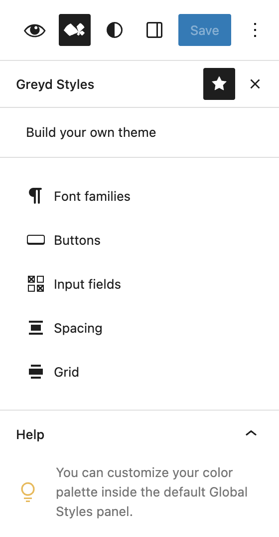
The Greyd Global Styles panel extends the capabilities of WordPress Core’s global styles and offers fine-grained control over typography, spacing, button design, and responsive behavior. These settings are available within the Site Editor and provide a centralized way to style elements across your entire site.
Font Families
The Font Families section exists primarily for backwards compatibility with earlier versions of the Greyd Theme and Greyd.Suite Classic Theme. Currently it is recommended to upload and manage fonts using the WordPress Core Font Library, accessible via Global Styles → Typography → Fonts section. At the bottom, there’s also a direct link to the Global Styles, from where you can enter the Typography section.
Buttons
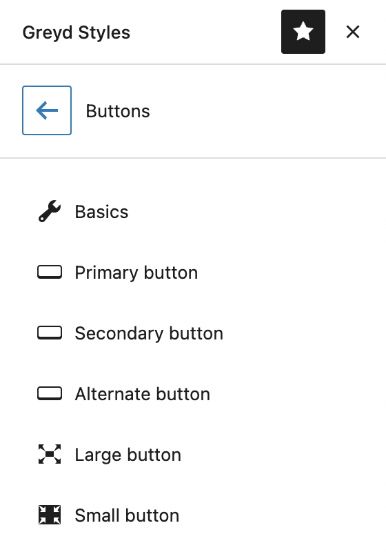
The Buttons section allows you to define global styles for both Core button blocks and, if the Greyd Plugin is active, Greyd Buttons as well. The configuration is divided into several areas:
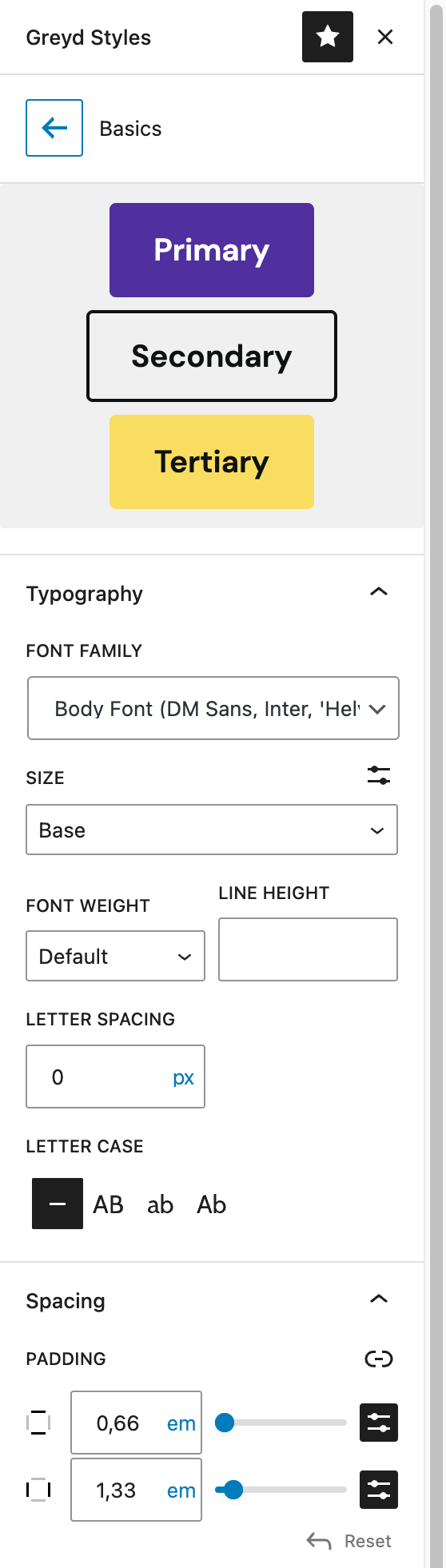
The Basics area lets you configure general typography settings:
- Font family
- Font size (ability to switch between preset and custom value)
- Font weight
- Line height
- Letter spacing (allowed units:
px,em,rem,vh,vw) - Letter case
Under Spacing, you can configure the padding for all buttons. For more information about the setting’s capabilities, refer to the components documentation.
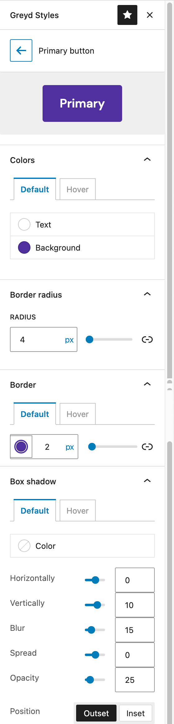
For each of the predefined styles — Primary, Secondary, and Alternate — you can set the style for all buttons here:
- Colors
- Text color
- Background color (solid colors and gradients available)
- Border Radius
- Border
- Box shadow
For the colors, border and box shadow you can change the settings when the buttons are hovered by switching to the Hover tab.
For more information on the Box Shadow settings, see the components documentation.
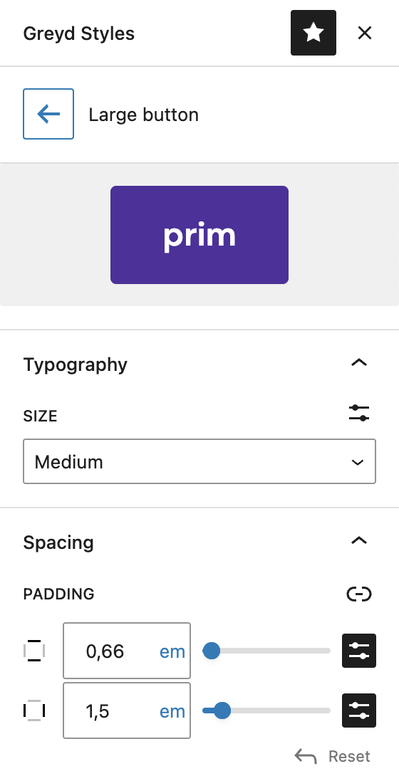
In addition, you can customize the Large and Small preset button sizes. You can adjust the font size by selecting a preset font size or change it to set a custom size.
The padding option is also available, for more information about this setting’s options see the components documentation.
Input Fields
The Input Fields section lets you apply consistent styling to all native form elements across your site, such as comment fields or default inputs without custom styling.
The Basics area provides controls for typography and padding, just like the button section.
You can customize Primary and Secondary input styles with options for colors, borders, border radius, and box shadows — each with separate settings for default and hover states. The input styles have the same options available as the button Primary, Secondary and Alternate styles, with the addition of an additional color setting for the Placeholder.
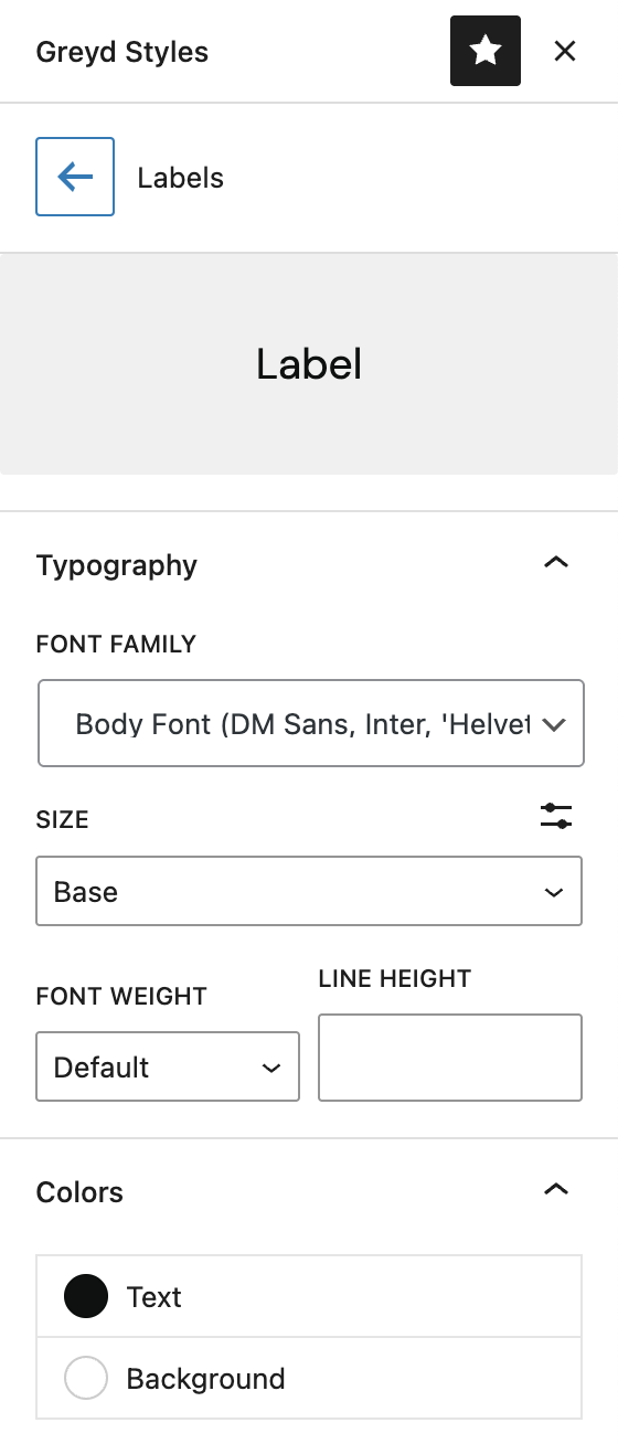
The Label section defines global typography and color options for form field labels, keeping input labels visually consistent across templates and patterns. The available settings are for font family, font size, font weight, line height and text and background color.
Spacing
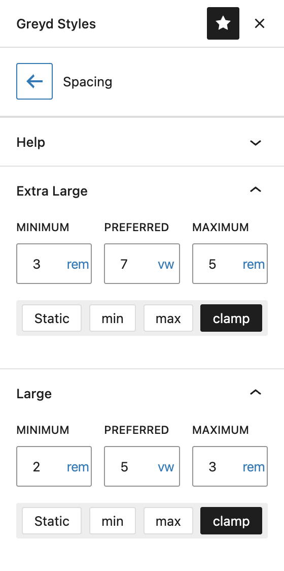
This section allows you to control the theme’s spacing scale, which is used for paddings, margins, and block gaps. The values are defined in the theme.json file and can be configured in four modes:
- Static: A single fixed value, such as
1rem. - min: The browser chooses the smaller of two defined values.
- max: The browser chooses the larger value.
- clamp: Offers responsive flexibility with three values — minimum, preferred, and maximum. The spacing adjusts based on screen size but always stays within the defined range.
Every preset can be individually changed:
- Tiny
- Small
- Medium
- Large
- Extra Large
Grid
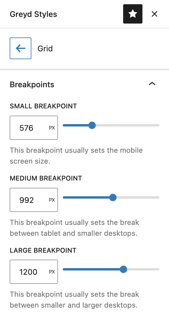
The Breakpoints section is only available in the Greyd Theme (not the Greyd WP version). It allows you to override the default breakpoint values for small, medium, and large screen sizes. Only pixel values are supported at this time.
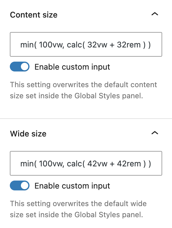
You can also define your Content Size, which controls the primary content width on your site. In contrast to the core setting that supports only static values, the Greyd Theme enables the use of min, max, and clamp modes for more fluid responsiveness.
The Wide Size setting works similarly and affects blocks that support wide alignments. Adjusting this value ensures consistent design behavior across full-width layouts.
In the Spacing section (no screenshot) we used to offer some general spacing options. These are now deprecated and we suggest you to use the WordPress Core features which you can find at the Global Styles → Layout section.
Video
Hi, this is Sandra from Greyd and I’d like to show you in this video how to use the global styles in Greyd Suite to set the design of your website globally. So let’s just open the site editor that can be found here in the WordPress menu under Appearance and go to Styles.
At first you can switch between different theme styles, thereby really easily changing the entire look and feel of your website. And here you will also find a style book, which is a preview of all blocks that are available as they are currently designed globally. But we are now going to take a closer look at the global styles.
Before we start you need to know that there are actually two global style segments. We have this one and we have the global Greyd styles. Why is that? Well, the WordPress global styles in our opinion are currently not yet enough. So there are lots of options we want to offer to you, but unfortunately at the moment it’s not possible to include them directly here, which is why we have this second panel here. And yeah, let’s just dive in and start with colors.
We are in WordPress global styles and can here define our color palette that we can later use in all blocks on our website and we can define lots of colors here. And also if that’s not enough you can even add more here. You could in theory also create gradients globally for your website, but you need to know that they are hard-coded. So when you for example define a gradient with that yellow here and then you later change the yellow in your color palette to orange, the gradient will still remain yellow. This is why we can recommend to deal with gradients individually in the blocks where you’d like to have them, for example in columns or content boxes, because there our settings are coded dynamically and they always refer to your current global style. So whenever you change that yellow to orange then the gradient will also change accordingly.
Now you can select from this color palette and say for example, I want this color for any text on my website. I want that color as a background. Very nice. And yeah, there are lots of elements that way you can choose from a color palette. But that’s the first thing when we say there are not enough options here. For example, if you take a look at the button here, you can have text color, background color, you can add a gradient, but there’s no hover effect, for example. For links there is a hover effect. So it’s not really fully complete in our opinion, and that’s exactly why we’ve added lots of options here. We’ll have a closer look at that later.
Now, let’s take a look at typography and therefore we will switch to the Greyd styles first, because here you can upload or define up to three different fonts globally for your website: body, heading and highlight font. You can select from lots of website fonts, modern fonts and Google fonts and here we have also added an option to host Google fonts locally, which is very important for European websites or for websites that are available in Europe for GDPR reasons. So that’s just one click here, very easy. And of course, you can also work with custom fonts and just enter the font name here and upload the font file that you receive from Adobe or Google or whatever and upload it here.
Then we can move on with font sizes. Here we have up to, I think it’s seven, default sizes from huge to tiny that you can define globally and later use in your blocks. And you can either work with fluid typography, so you add a min and a max value and the browser automatically does the rest for you. There’s also a very interesting tutorial video on that, because this has a lot of possibilities for responsive web design without having to deal with breakpoints all the time. For now, just you know, you can do it fluid or of course, you can also work with static values.
By the way, whatever you define here and generally in the Greyd styles, please do not forget to click on save because that’s another thing where it’s currently not possible to integrate in the native save procedure. So there’s an additional save button here. So we have the font, we have font sizes and now let’s have a look at typography here in the Greyd and the global styles. As same with the color, you can now define which of my fonts do I want to use for text and in which size? Which of my fonts do I want to use for headlines? You can also define h1, h2, etc. individually and some typography settings.
You could define buttons globally here, but we highly recommend to deal with buttons in the Greyd styles since we have lots of additional options here. At first, there’s some basic settings that apply to all button variants, which is the font size, font weight, spacings and all these kind of settings. And then you can define up to three different button variants that you can later, when you add a button somewhere, always select between your different button styles. So there are three ones: primary, secondary and alternative. You have lots of color options. You do have a hover effect everywhere. You can work with border radius, border, shadow, etc. Three times. And there are also some individual settings for large and small buttons in terms of size. Here you have the presets that we’ve earlier defined and spacings.
Same, not only for buttons, but also for input fields, for example, in forms, in search fields and these kind of things. Here again, you have some basic settings. Well, that’s the same as we’ve just seen with buttons. And here you have two variants, primary and secondary, again with hover effect, border radius, border, etc. And you can also define the labels globally for your entire website.
You could theoretically define each and every block that you have globally here in the global styles. But there are several reasons why we recommend not to do so. First one, for example, let’s stay with the button example. You already see there are different kind of buttons and this does not really work well if you set something here and you have different settings there. It might not work properly. But that’s not the biggest issue. The biggest issue in our opinion is that these settings here apply only to that particular block. And you can imagine that there are several types of buttons on a website. For example, you can have regular buttons in the content, but you can also have submit buttons in forms. And usually you want all buttons to use the same settings or maybe you work with the variants. But if you define a button globally here, that doesn’t mean that your submit button in the form will have the same styling. Same for texts, for example. Quotes will look completely differently. Texts in forms will look completely differently or in search blocks or whatever. So yeah, just so you know, you can use these settings here, but they are really just for this one individual block.
So let’s move back to the Greyd styles and have a look at spacings, which is really interesting. You might already have noticed that in several blocks, like for example this group or box here, you often, when it’s about spaces or sizes, see presets. You can always enter individual values, but you can also just work with these presets. And in Greyd Suite, you can define these five presets completely individually and with lots of options. These extra large, large, medium, small and tiny are exactly these five presets that we’ve just seen. You can of course work with static values. You can work with min and max and you can also use this advanced clamp option here. It is a little bit complex, but it offers you a lot of possibilities in terms of responsive web design. And this is exactly why we have a dedicated tutorial video on that in our Help Center.
There is some more in the global styles on the layout. Here again, you can see the spacings. You can define the padding and margin and block spacing for your website globally here. Block spacing is the space in between, for example. You can work with those presets here, padding, margin for your website. And what’s also very interesting is the content and wide width that you can set globally here. If you’ve worked with a page builder, also with the previous version of Greyd Suite, you might be familiar with the concept of rows. There is row xl, l, m and s usually. And that’s kind of similar. Content width, as the name already indicates, is the width, the default width of your content that’s comparable to row l, as you might have known it from other tools. This is the width globally defined that your content takes. And you also have a wide width that you can add. And of course, there’s also full width. In your blocks itself, you can choose none, which means exactly content width, wide width or full width. And in the blocks itself, you can also always say, I don’t want to work with the global styles, global settings, but I want to define everything individually.
Additionally, in GreydHub, the management platform, you can also import and export your global styles and then migrate it to other pages or other sites. And here you can also add global CSS to your website. And last but not least, if we go back to the Greyd styles and open the grid settings, you will see that you can even customize the breakpoint settings that are used for your entire website. You have the default values here, but you can customize this as you like. And further down, you will also find a very interesting option. You may remember, we just talked about the content and wide width layout settings here in the global styles. And as you can see, you can also define those values in a static way. And if you want to use this feature in a more advanced way, you can override these settings with the settings here in the Greyd styles, since you will find min, max, and clamp settings here as well.
For more videos and information, please visit our help center.