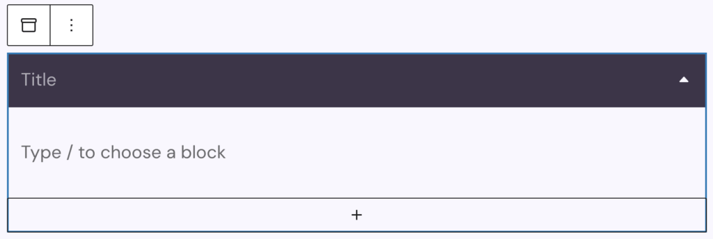
The Accordion block allows you to display collapsible content on your page. It uses a parent–child structure where the parent block is the Accordion, and each child block is an Accordion Section. You can insert any other blocks inside an Accordion Section.
Accordion Sections can be added directly in the editor using the plus sign at the bottom on the parent block, the first section is added automatically on insertion. For every child section, you can insert content — of any block type — using the plus icon inside that section or using the slash command and typing in the block to insert, like in the regular editor.
Settings
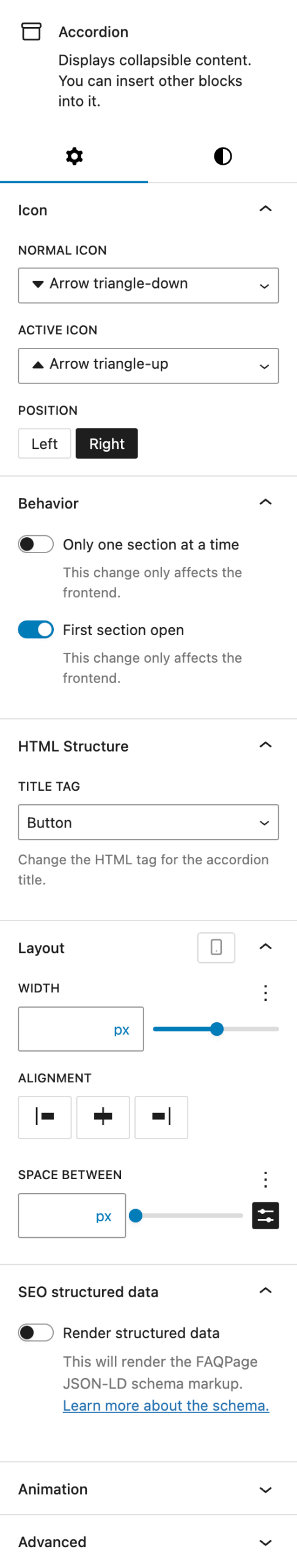
In the Icon section, you can choose an icon using the icon picker. You can define one icon for the collapsed state and another for the expanded (active) state. Additionally, you can set the icon’s position relative to the accordion title. The default position is on the right, but you can also place it on the left.
The Behaviour section contains toggle controls for frontend interaction options:
- Only one section at a time: Ensures that only one accordion section can be open at once. This setting only affects the frontend.
- First section open: Opens the first accordion section by default on page load. This setting also only affects the frontend.
In the HTML section, you can choose the HTML tag for the accordion’s title. This determines both semantics and accessibility. Options include:
- Button (default)
- Heading levels H1 through H6
- Div
The Layout section allows adjustments to the width, alignment, and spacing of the accordion. All settings can also be adjusted per breakpoint:
- Width: Adjust the width using the Range Unit Control component.
- Alignment: Set the accordion’s position to left, center, or right.
- Space between: Adjust spacing between accordion sections using the the Range Unit Control component, spacing presets are also available to choose from.
In the SEO Structured Data section you can enable JSON-LD structured data for SEO purposes by activating the Render structured data toggle. This can improve search result presentation for FAQ-style content. For details, refer to: Google FAQ Structured Data Guidelines.
The block also supports Animations. In the Advanced section, you can find settings for HTML anchor, additional CSS classes, the Greyd Styles Class and toggles to hide the block per breakpoint.
Styles
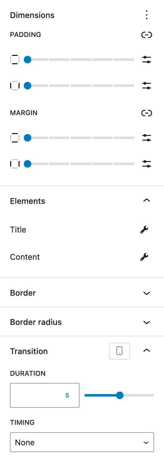
The Dimensions section is provided by WordPress Core and allows configuration of padding and margins for the entire accordion block.
In the Elements section, you can access specific styling settings for both the Title and the Content parts of the accordion. See the screenshots and details below for more information on both sections.
Outside of the Title and Content sections, you can also set Border and Border Radius for the Accordion Section elements.
In the Transition section, you can define the duration in seconds and timing for the open/close animation of the Accordion. Timing options include:
- None
- Ease-in-out
- Ease-in
- Ease-out
- Linear
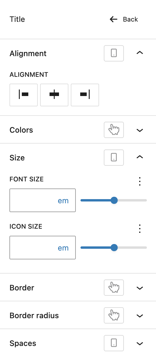
In the Title section, these settings are available:
- Alignment: Control the horizontal alignment of the accordion title. Options include left, center, and right. These options can be set per breakpoint.
- Colors: Choose text and background colors for the title element. Both hover and active state colors can be defined.
- Size: Adjust the font size of the title text and the icon size. Both can be defined per breakpoint.
- Border: Define border styles for the title element, also for hover and active states.
- Border Radius: Define the border radius for the title element, also for hover and active states.
- Spaces: Set the inner padding for the accordion title, you can also adjust it per breakpoint.
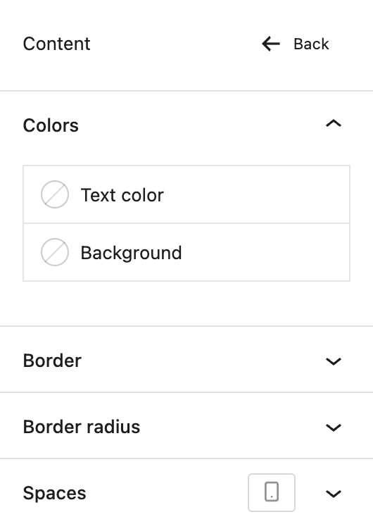
In the Content section, these settings are available:
- Colors: Choose text and background colors for the content section. Hover and active state colors can be set separately.
- Border: Define border styles for the content section.
- Border Radius: Define the border radius for the content section.
- Spaces: Set the inner padding for the accordion content area, it can be adjusted per breakpoint.
Accordion Section block
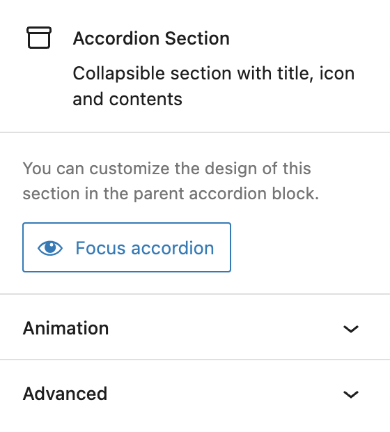
Within each Accordion Section (child block), a dedicated button is available to quickly focus and select the parent Accordion block in the editor. The Accordion Section blocks do not have specific settings, everything is configured on the parent block.
The block also supports Animations. In the Advanced section, you can find settings for HTML anchor, additional CSS classes and toggles to hide the block per breakpoint.
Video
Hi, this is Sandra from GREYD. Today I’d like to show you how to build modules that can be opened and closed fast and easily with our accordion block.
At first, place the accordion block anywhere on your page. With the plus symbol you can then add as many sections as you like. You can edit the title as usual with the Block Editor and also use the Block Editor to add and edit the content to be shown within the individual sections.
On the right you will then find several settings for your entire accordion. For example, you can change the icon and also have different icons for the active — so the open — or the normal — the closed — state. This option here makes sure that only one section can be opened in the frontend, which means that as soon as a different section is clicked the other one will be closed automatically. And you can also have the first section pre-opened when the page is loaded.
Let’s move on with some design settings for the title and content sections of your accordion. For the title you can for example edit the text and background color and define different looks for the normal and active state and even create a hover state for both of them. Also, you can edit the border radius, spaces and font size. Some settings even offer different options for different screen sizes.
The same goes for the content sections. Here you can edit the text and background color as well as the padding and space below the section individually per breakpoint.
For more videos and information please visit our Helpcenter.