The native WordPress Archives block is extended with several custom features that allow for deeper customization and broader use cases. These enhancements include post type filtering, taxonomy-based archives, design controls, and optional icons. All settings are integrated directly into the block sidebar.
Settings
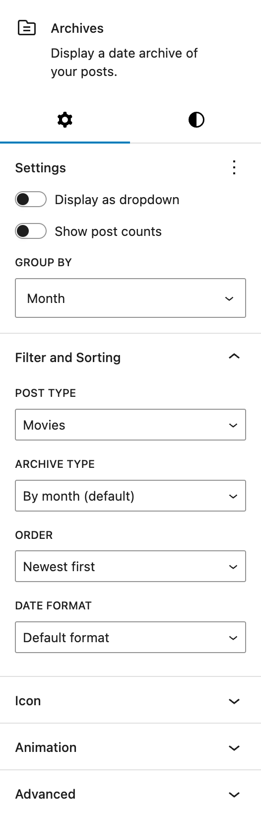
The WordPress Core settings for the Archives block are under the Settings section.
Below that you can find the Greyd Filter and Sorting section. By default, the core block displays date-based archives. With the Greyd Plugin, you can choose a specific Post Type, including custom types (see the Post Types documentation), and define how the archive list should be generated.
When a Post Type is selected, the Archive type dropdown lets you choose between:
- Date-based archives: By month, By year, or By day
- Taxonomy-based archives: Any taxonomy linked to the selected Post Type
For date archives, two additional settings appear:
- Order: Choose between Newest first or Oldest first
- Date format: Select from a wide range of formatting options
For taxonomy archives, different options become available:
- Order: A → Z, Z → A, Most posts first, or Fewest posts first
- Show subcategories: Toggle to include child terms in the output
If the archive items are displayed as links or buttons (i.e. not using the dropdown display), you can add an icon. See the Button Icon Control component for more details.
Styles
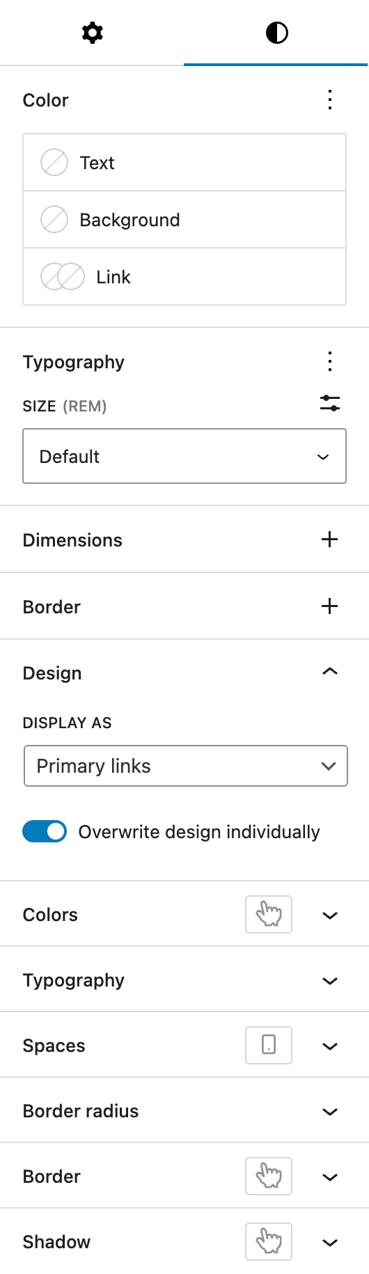
Under Color, you can change the text, background and link colors. These settings are provided by WordPress Core.
Under Typography, you can set any typography settings, with size being shown by default. More can be selected via the three dot menu on the right of the section heading.
Both Dimensions and Border are also provided by WordPress Core.
The Design panel below the default core styling options offers control over the visual style of archive items, using variations defined in your Greyd styles.
If archive items are displayed as links or buttons:
- Display as: Primary links, Secondary links, Primary buttons, Secondary buttons or Alternative buttons
- Size: Small, Default or Big
If using the dropdown mode:
- Display as: Primary input field or Secondary input field
You can also enable Overwrite design individually, which unlocks fine-grained controls. See the Custom Button Style component for more details.